I have a whole 40 minutes to wait for a takeaway. Need music.
You are using an out of date browser. It may not display this or other websites correctly.
You should upgrade or use an alternative browser.
You should upgrade or use an alternative browser.
Let's try and get 1,000,000 replies to this post
- Thread starter The Ancient Mariner
- Start date
Dr. Eddies Wingman
Brighter than thousand_suns
I have a whole 40 minutes to wait for a takeaway. Need music.
We also played this one in our after-work jam session

Good plan, I'll do that after survivor business.
Black Wizard
Pleb Hunter
I have a £50 Sainsbury's delivery which I got £10 discount on coming tomorrow eveningI have a whole 40 minutes to wait for a takeaway. Need music.
£50? Aren't students supposed to live on pasta and tinned tomatoes? Or is that a year's supply?
Black Wizard
Pleb Hunter
I get paid to be a student.
That's a good deal.
CriedWhenBrucieLeft
Meme Only Account
Scots isn't a language, it's a variety.
No, he meant variety Wiz. Pendant. It's status is pretty debatable as a language, but it's more (in the case of Broad Scots) than just a dialect (probably). Still, most people (outside the UK) would have a problem understanding it, let's be honest.I think the word you're looking for is dialect Loosey.
Black Wizard
Pleb Hunter
I have trouble understanding it. So I left.
CriedWhenBrucieLeft
Meme Only Account
It? Sainsbury's?
Saapanael
Ancient Mariner
We also played this one in our after-work jam session
Damn, Sabaton is pretty good.
CriedWhenBrucieLeft
Meme Only Account
All I hear is Nazis.
Black Wizard
Pleb Hunter
Shouldn't we all?
CriedWhenBrucieLeft
Meme Only Account
No, not all of us Wiz. You, for one, should stay clear of listening to Nazis.
Dr. Eddies Wingman
Brighter than thousand_suns
The Nazis shall also listen.
Nuts, they shall hear.
Nuts, they shall hear.
Denmark has almost disappeared from the map compared to the mighty space it usually takes up, and China now dwarfs Russia instead of vice versa.
Neither is entirely a correct statement. Denmark takes up virtually no space at all unless you count in Greenland, which is not usually done. Also, while Russia is significantly bigger than China (17.075.400 km² vs 9.571.302), it hardly dwarfs it - China is the fourth largest country in the world.
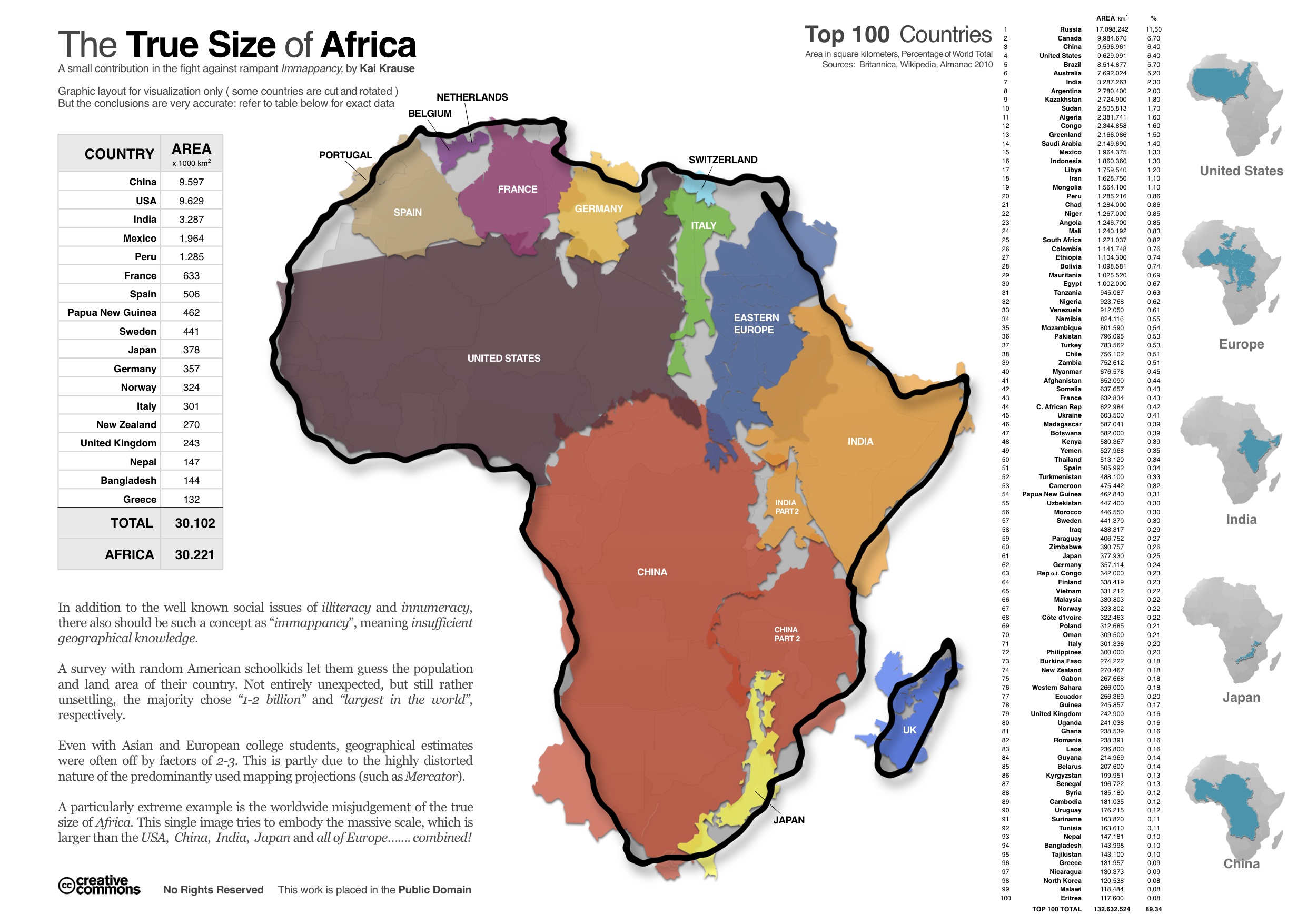
The map is still cool, but I personally think that this one is much more eye-opening:
Dr. Eddies Wingman
Brighter than thousand_suns
I object strongly to the way Europe is shown in the graphic on the right - there is a profound lack of Nordic countries there!
That being said: The main picture illustrates a good point. The most common map projection - the Mercator projection - really distorts the size of countries located at different distances from the Equator. It is a neat projection because it conserves direction - but it misrepresents area to the extent that Greenland appears to be just as large as Africa. However, the map projection can hardly be blamed if American school children believe the USA is the world's largest country, because even in the Mercator projection, it is easy to see that Russia is larger.
Now I have never thought knowledge of areas, population numbers or names of capitals is what constitutes the difference between well educated and poorly educated, but it's always fun to bash the 'Muricans with things like "X out of Y Americans think that A is the capital of B" I assume many Americans have a laugh at similar things coming from Europe.
And btw, Norway is not the capital of Sweden.
That being said: The main picture illustrates a good point. The most common map projection - the Mercator projection - really distorts the size of countries located at different distances from the Equator. It is a neat projection because it conserves direction - but it misrepresents area to the extent that Greenland appears to be just as large as Africa. However, the map projection can hardly be blamed if American school children believe the USA is the world's largest country, because even in the Mercator projection, it is easy to see that Russia is larger.
Now I have never thought knowledge of areas, population numbers or names of capitals is what constitutes the difference between well educated and poorly educated, but it's always fun to bash the 'Muricans with things like "X out of Y Americans think that A is the capital of B"
I assume many Americans have a laugh at similar things coming from Europe.And btw, Norway is not the capital of Sweden.
CriedWhenBrucieLeft
Meme Only Account
Is it just a wee town in Sweden or something?And btw, Norway is not the capital of Sweden.
Dr. Eddies Wingman
Brighter than thousand_suns
No, it's the other way around. Sweden is a Sami village in Northern Norway.