After a recent discussion, I found that I never really paid much attention to album covers outside Maiden. One of the reasons is that, from cursory glances, they tend to look the same, either a random fantasy painting for power metal bands or some gory stuff for death metal or abstract things for progressive, etc. So I felt maybe I should change that and listen to what other people have to say about album covers they like.
Just to make it clear,
this is not a ranking thread.
This is not a poll.
This is not a rate/review thread.
This is not a survivor.
I'm just asking you to post some of your favourite metal album covers and tell us why you like them. Don't describe the album cover, because we all have eyes to see them, but tell us why you like it. It doesn't have to be your number one album cover, it's not about figuring out whether it's your sixth or seventh favourite album cover and it's not about which cover is better than which other. It's just about posting the artwork and talking about it in a non-competitive, non-essentialist and non-exclusive way. And it's not about whether you like the album itself. It's about the cover artwork.
I'll start out with a few that spring to mind for whatever reason.
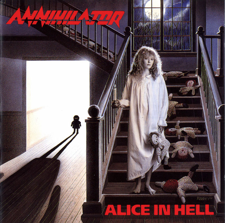
I don't actually know if I would say this is a great piece of art by any merit, but it does convey a great, haunting atmosphere that gets stuck in my mind. Sure: Girls in white and dolls are horror film clichés, but they are so for a reason. There is a story in this picture that gets your imagination going, but it's vague enough to leave you making up your own ideas about it.
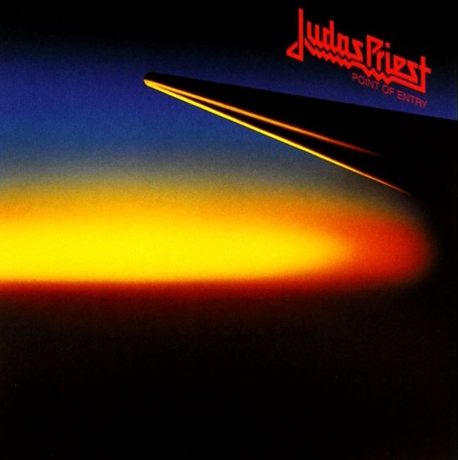
I know that Priest themselves don't think very highly of it, but I've always liked this one. It derives an unsettling effect from its subtlety, and I can't detach it from the time it was made: Back in 1981, people actually were afraid of nuclear war and were afraid to see something like this in the sky some day. To me, it looks like a view taken from a window on a plane, and as a frequent flyer, I do occasionally think back to this cover and what it would be like if I'm sitting in a plane while nuclear holocaust is starting. Very effective.
Just to make it clear,
this is not a ranking thread.
This is not a poll.
This is not a rate/review thread.
This is not a survivor.
I'm just asking you to post some of your favourite metal album covers and tell us why you like them. Don't describe the album cover, because we all have eyes to see them, but tell us why you like it. It doesn't have to be your number one album cover, it's not about figuring out whether it's your sixth or seventh favourite album cover and it's not about which cover is better than which other. It's just about posting the artwork and talking about it in a non-competitive, non-essentialist and non-exclusive way. And it's not about whether you like the album itself. It's about the cover artwork.
I'll start out with a few that spring to mind for whatever reason.
I don't actually know if I would say this is a great piece of art by any merit, but it does convey a great, haunting atmosphere that gets stuck in my mind. Sure: Girls in white and dolls are horror film clichés, but they are so for a reason. There is a story in this picture that gets your imagination going, but it's vague enough to leave you making up your own ideas about it.
I know that Priest themselves don't think very highly of it, but I've always liked this one. It derives an unsettling effect from its subtlety, and I can't detach it from the time it was made: Back in 1981, people actually were afraid of nuclear war and were afraid to see something like this in the sky some day. To me, it looks like a view taken from a window on a plane, and as a frequent flyer, I do occasionally think back to this cover and what it would be like if I'm sitting in a plane while nuclear holocaust is starting. Very effective.


")


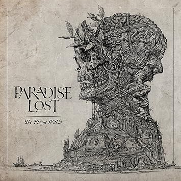
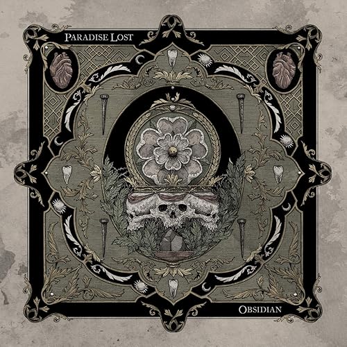
 I've always find these... well, while they might be far from being my favourites or even that impressive per se - given how many amazing album covers there are, after all - I definitely see them as very intriguing. They also reflect the mood and sound of their representative music perfectly.
:format(jpeg):mode_rgb():quality(90)/discogs-images/R-3801663-1345055144-2747.jpeg.jpg)


:format(jpeg):mode_rgb():quality(90)/discogs-images/R-3574659-1504795811-3736.jpeg.jpg)


:format(jpeg):mode_rgb():quality(40)/discogs-images/R-10776199-1512366325-2099.jpeg.jpg)