General album artwork appreciation

Perun

His name struck fear into hearts of men
Staff member
After a recent discussion, I found that I never really paid much attention to album covers outside Maiden. One of the reasons is that, from cursory glances, they tend to look the same, either a random fantasy painting for power metal bands or some gory stuff for death metal or abstract things for progressive, etc. So I felt maybe I should change that and listen to what other people have to say about album covers they like.

Just to make it clear,

this is not a ranking thread.
This is not a poll.
This is not a rate/review thread.
This is not a survivor.

I'm just asking you to post some of your favourite metal album covers and tell us why you like them. Don't describe the album cover, because we all have eyes to see them, but tell us why you like it. It doesn't have to be your number one album cover, it's not about figuring out whether it's your sixth or seventh favourite album cover and it's not about which cover is better than which other. It's just about posting the artwork and talking about it in a non-competitive, non-essentialist and non-exclusive way. And it's not about whether you like the album itself. It's about the cover artwork.

I'll start out with a few that spring to mind for whatever reason.
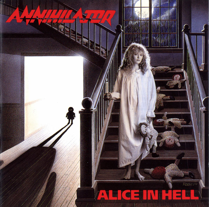
folder.jpg


I don't actually know if I would say this is a great piece of art by any merit, but it does convey a great, haunting atmosphere that gets stuck in my mind. Sure: Girls in white and dolls are horror film clichés, but they are so for a reason. There is a story in this picture that gets your imagination going, but it's vague enough to leave you making up your own ideas about it.
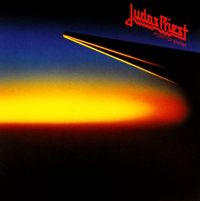
point-of-entry-alt-cover.jpg


I know that Priest themselves don't think very highly of it, but I've always liked this one. It derives an unsettling effect from its subtlety, and I can't detach it from the time it was made: Back in 1981, people actually were afraid of nuclear war and were afraid to see something like this in the sky some day. To me, it looks like a view taken from a window on a plane, and as a frequent flyer, I do occasionally think back to this cover and what it would be like if I'm sitting in a plane while nuclear holocaust is starting. Very effective.
 
As with a lot of Maiden's (80s in particular) cover art, I really think the bold use of primary colours contrasting darkness is very striking on Priest album covers, taking a comic book art approach, and sums up a youthful and vibrant NWOBHM movement.

The most striking I think is Screaming for Vengeance:
220px-Judas_Priest_SforV.jpg


Defenders of the Faith is another good one, this time adding in blue as well as the black background, which gives more depth and looks less flat and 2D than Screaming for Vengeance.
220px-Defenders_of_the_Faith.jpg


However, I find it very fitting that Priest chose dominant red and yellow again for their last album, Firepower, an album which saw new life breathed into the band, and (arguably) recalls a taste of their 80s music. The image almost mirrors Screaming for Vengeance, with the direction of travel reversed, and a slightly more up-to-date realistic art approach.

JudasPriestFirepower.jpg
 
point-of-entry-alt-cover.jpg


I know that Priest themselves don't think very highly of it, but I've always liked this one. It derives an unsettling effect from its subtlety, and I can't detach it from the time it was made: Back in 1981, people actually were afraid of nuclear war and were afraid to see something like this in the sky some day. To me, it looks like a view taken from a window on a plane, and as a frequent flyer, I do occasionally think back to this cover and what it would be like if I'm sitting in a plane while nuclear holocaust is starting. Very effective.
It reminds me of the sort of photo of half a blurred thumb a child takes with an old disposable camera. The sort of photo I still take actually.

However, I find it very fitting that Priest chose dominant red and yellow again for their last album, Firepower, an album which saw new life breathed into the band, and (arguably) recalls a taste of their 80s music. The image almost mirrors Screaming for Vengeance, with the direction of travel reversed, and a slightly more up-to-date realistic art approach.

JudasPriestFirepower.jpg
Yes, the simplicity of it is good. I like album art to have a focal point without getting bogged down in lots of minutiae overwhelming the image.
 
I like these two very much. On par with 80's Maiden covers.
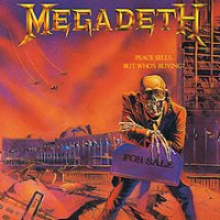
220px-Megadeth_-_Peace_Sells..._But_Who's_Buying-.jpg
I like coloring, mascot's cynicism, concept and ideas execution. However, musically not so much.

220px-Megadeth-RustInPeace.jpg
Same here. Great looking mascot, colors, and ideas execution. There's no dissonance: great cover and great music, band at their peak.
If I must choose, Peace Sells.. I like a bit more. You can feel cynicism and menace of the war.
 
Last edited:
However, I find it very fitting that Priest chose dominant red and yellow again for their last album, Firepower, an album which saw new life breathed into the band, and (arguably) recalls a taste of their 80s music. The image almost mirrors Screaming for Vengeance, with the direction of travel reversed, and a slightly more up-to-date realistic art approach.

JudasPriestFirepower.jpg
About this one, I'm pretty sure it's supposed to be a creature thing like in Screaming for Vengeance and Defenders of the Faith, but I without focusing I see it as this group of laser firing stuff (things and stuff) moving forward. I really like it, sometimes an artwork looks better far away and you begin to like it less when actually examining the details, but not with this one, it looks awesome both as a robot and as a bunch of laser cannons :)
 
obzen.jpg
And here is one I absolutely love, a perfectly clear image... And totally fitting to the title too, the man looks so serene, and I'm not going to lie I just like to do this shape with my hand sometimes (don't worry, I don't use my other two hands while doing it...)

Now, maybe my favourite thing here is the texture of the hand. It always looks to me like some stained glass, rather than blood, and so the hand gives the impression that it's very rigid, actually a ruby is probably the better description with all the different shades, and also citing Bleed: "The ruby fluid of life unleashed".
obZen - Wikipedia

And here is the full artwork for a comparison, which I like a lot less. It loses a lot of the simplicity, and it was fine when I didn't see it as blood but now everything is so vulgar.
 
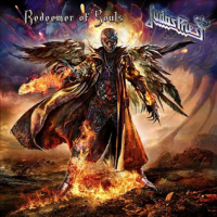
I like a lot of Priest album covers (SFV,DOTF, Firepower and even RID), but the one cover I think is very good too - is the one for Redeemer Of Souls - the colours blend quite well, the background adds a lot to the artwork. This fire creature (which comes from ''the redeemer'' right hand) is a nice detail.

JudasPriestRedeemerSouls.png

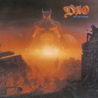
Another album cover that I like a lot is the one for DIO's The Last In Line - the action set to be in ancient times, with his mascot waiting ahead for the people to determine their fate - from the cover it seems that he will destroy the evil inside all people.

DioTheLastInLine.jpg

When we talk about album covers, I should mention at least one album cover from HammerFall - the one for Built To Last is a favorite of mine - the colours used for the background (orange sky and green land) are rightly chosen. The castle and their mascot on top of the tower are top. Again, the details are awesome - book and scales. Fantastic album cover!

Album_cover_for_the_2016_HammerFall_album_'Built_to_Last'.jpg
 
point-of-entry-alt-cover.jpg


I know that Priest themselves don't think very highly of it, but I've always liked this one. It derives an unsettling effect from its subtlety, and I can't detach it from the time it was made: Back in 1981, people actually were afraid of nuclear war and were afraid to see something like this in the sky some day. To me, it looks like a view taken from a window on a plane, and as a frequent flyer, I do occasionally think back to this cover and what it would be like if I'm sitting in a plane while nuclear holocaust is starting. Very effective.

I didn't really think about this when I saw the topic title, but that is very effective cover indeed. Often overlooked, but when I saw it here along with the thoughts summed up above, I probably look at it in the new light. Granted, I've always liked the use of colours in it, as with most of the Priest albums, even if their artwork itself doesn't really appeal to me that often.

Aesthetically, Point of Entry is a bit like a Priest version of Dark Side of the Moon. Kinda. Eh. Just a thought that came to my mind.

--

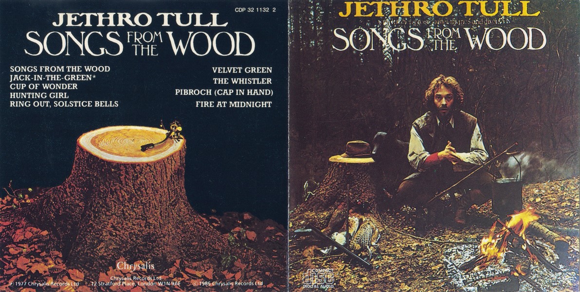
These aren't metal albums, but I hope you'll pardon me... :p I've always find these... well, while they might be far from being my favourites or even that impressive per se - given how many amazing album covers there are, after all - I definitely see them as very intriguing. They also reflect the mood and sound of their representative music perfectly.
Front.jpg


That's what it looks and sounds like. Quite literally, songs from the wood.

Aaaand may I wave the Finnish flag just a little bit? Here's a cover of the album "Varjot ja lakanat" (Shadows and Sheets - translates rather nicely!) by Finnish rock artist Hector, released in 1988. Once again, it's the rather ethereal imagery and use of colours. As Seventh Son is favourite Maiden cover art, you might see bit of a pattern here.

R-3801663-1345055144-2747.jpeg.jpg
 
I love the covers Necrolord has done for Dissection, Wintersun, Sacramentum, Bathory, Antestor, Emperor, Ensiferum and many, many others. He clearly loves blue (like myself) and they are all very fitting to the album themes.

Derek Riggs, Roger Dean, JP Fournier and Jef Bertels have also made many cool ones.
 
When we talk about album covers, I should mention at least one album cover from HammerFall - the one for Built To Last is a favorite of mine - the colours used for the background (orange sky and green land) are rightly chosen. The castle and their mascot on top of the tower are top. Again, the details are awesome - book and scales. Fantastic album cover!

Album_cover_for_the_2016_HammerFall_album_'Built_to_Last'.jpg'Built_to_Last'.jpg
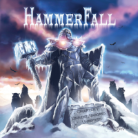
Hammerfall have had some nice artwork over the years but, much like their music, the cover art has tended to converge on the same thing (not including 'Infected'). The mascot (Legion?) hasn't changed since the first album and he's just presented in slightly different poses and backgrounds for each album. This is in contrast to Eddie who is something of a chameleon being depicted in different ways for each album while still being recognizably Eddie. The Hammerfall album covers are generally pretty cool and I particularly like the cover for 'Chapter V: Unbent, Unbowed, Unbroken' for its simplicity and minimalist use of colour:

1590411254297.png

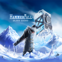
I also had a poster of the 'Blood Bound' artwork for a while (and might still have it somewhere actually):

1590411313815.png


So there are some nice pieces of art in Hammerfall's discography, but 25 years on the concept is very stale.


View attachment 11968
And here is one I absolutely love, a perfectly clear image... And totally fitting to the title too, the man looks so serene, and I'm not going to lie I just like to do this shape with my hand sometimes (don't worry, I don't use my other two hands while doing it...)

Now, maybe my favourite thing here is the texture of the hand. It always looks to me like some stained glass, rather than blood, and so the hand gives the impression that it's very rigid, actually a ruby is probably the better description with all the different shades, and also citing Bleed: "The ruby fluid of life unleashed".
obZen - Wikipedia

And here is the full artwork for a comparison, which I like a lot less. It loses a lot of the simplicity, and it was fine when I didn't see it as blood but now everything is so vulgar.
Bloody hell. I think both versions are quite hideous. That's a poor CGI version of Uncle Fester there. Very strange artwork. I don't like it at all.
 
I'm just asking you to post some of your favourite metal album covers and tell us why you like them. Don't describe the album cover, because we all have eyes to see them, but tell us why you like it. It doesn't have to be your number one album cover, it's not about figuring out whether it's your sixth or seventh favourite album cover and it's not about which cover is better than which other. It's just about posting the artwork and talking about it in a non-competitive, non-essentialist and non-exclusive way. And it's not about whether you like the album itself. It's about the cover artwork.
@MindRuler
 
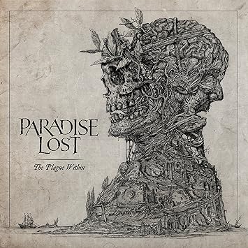
Two Paradise Lost album covers have really caught my eye for their intricate pen and ink-like graphic design, moving away from photography, and almost resembling tattoo art, with a nod to Japanese and Chinese culture. While being tremendously eye-catching, I like that this more abstract style in some ways enables the music the speak for itself, rather than distracting the listener with a single focal point or simplistic photograph, and speaks of greater depth and complexity in the music.

R-3574659-1504795811-3736.jpeg.jpg


61qd1aN1BnL.jpg


These first two are variously credited to 'Valnoir - whom I assume is graphic artist Jean-Emmanuel "Valnoir" Simoulin, and Metastazis, which is a design studio founded by Valnoir. They've produced cover art for a number of other bands including Amorphis and Behemoth.

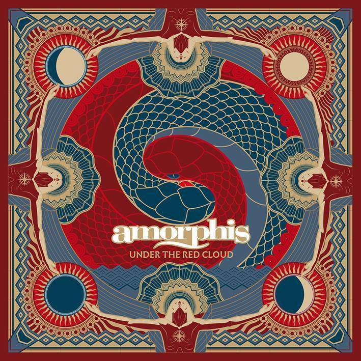
I'd already been planning to post Amorphis' Under The Red Cloud cover art on this thread as being in a very similar style, and it turns out it's also the work of Valnoir/Metastazis.
amorphis-cover.jpg
 
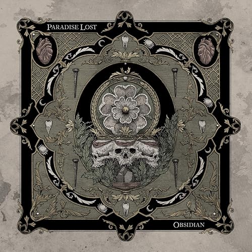
And then three further Paradise Lost album covers followed in a similar vein, but by different artists. Tangled foliage, sharp points and skulls/other pieces of dismembered anatomy reflect the bleakness of the band's songs. I'm still liking the white rose at the centre of the Obsidian, artwork, though, the symbol of Yorkshire, and a reminder that Paradise Lost are still essentially that band from Halifax at heart. (If you've been to Halifax, it's fecking bleak up there at times, and I'm not just talking about the moorland landscape and weather). Looks like a fair bit of religious imagery in there too (nails, snakey crown of thorns etc).

R-10776199-1512366325-2099.jpeg.jpg

91kYrAg%2B7WL._SY355_.jpg


91hntxTJnML._SS500_.jpg
 
ced46802126d71b9de220120b538e3cd.jpg


Danzig III: How The Gods Kill fold-out artwork by H.R. Giger of Alien fame. It’s a slight reworking of his 1976 painting Meister und Margarita, with an erect penis covered up by a Danzig-branded dagger. The original painting follows:
4545962823_21e008c9d8_b.jpg
Always loved Giger’s stuff. Can’t say the same about Danzig, though.
 
evergrey.jpg
When I saw this album cover printed in a metal magazine, I wanted to buy it.
The dark atmosphere of it intrigued me. Evergrey's debut album happened to be a great album as well.
 
Two Paradise Lost album covers have really caught my eye for their intricate pen and ink-like graphic design, moving away from photography, and almost resembling tattoo art, with a nod to Japanese and Chinese culture. While being tremendously eye-catching, I like that this more abstract style in some ways enables the music the speak for itself, rather than distracting the listener with a single focal point or simplistic photograph, and speaks of greater depth and complexity in the music.

R-3574659-1504795811-3736.jpeg.jpg


61qd1aN1BnL.jpg


These first two are variously credited to 'Valnoir - whom I assume is graphic artist Jean-Emmanuel "Valnoir" Simoulin, and Metastazis, which is a design studio founded by Valnoir. They've produced cover art for a number of other bands including Amorphis and Behemoth.
And then three further Paradise Lost album covers followed in a similar vein, but by different artists. Tangled foliage, sharp points and skulls/other pieces of dismembered anatomy reflect the bleakness of the band's songs. I'm still liking the white rose at the centre of the Obsidian, artwork, though, the symbol of Yorkshire, and a reminder that Paradise Lost are still essentially that band from Halifax at heart. (If you've been to Halifax, it's fecking bleak up there at times, and I'm not just talking about the moorland landscape and weather). Looks like a fair bit of religious imagery in there too (nails, snakey crown of thorns etc).

R-10776199-1512366325-2099.jpeg.jpg

91kYrAg%2B7WL._SY355_.jpg


91hntxTJnML._SS500_.jpg
@Brigantium that must be most of Paradise Lost's discography you've posted here. :p
 
ced46802126d71b9de220120b538e3cd.jpg


Danzig III: How The Gods Kill fold-out artwork by H.R. Giger of Alien fame. It’s a slight reworking of his 1976 painting Meister und Margarita, with an erect penis covered up by a Danzig-branded dagger. The original painting follows:
4545962823_21e008c9d8_b.jpg
Always loved Giger’s stuff. Can’t say the same about Danzig, though.
Giger is amazing.
 
This is a cover from a Edguy compilation album (which contains 5 new songs)....

The colours are rightfully chosen and blend quite well. Great details (snake rod, living trees, owl, stone slabs with artworks on them). And the jester is done very well. Overall, a superb artwork.

monuments.jpg
 
Back
Top