Best Eddie

Oh shit, I've actually found a way to go back and read his grumpy comments. It's on the web archive: http://web.archive.org/web/20110429103332/http://www.derekriggs.com/ When you open an artwork, the comment displays as the page title (in my case it's on the browser tab). Pictures don't work but you can trace it by the file name, they are the same on the current page.


It was about one of the Bruce's artwork. "Bruce didn't want to pay me for this." This one: http://derek.server311.com/derekriggs.com/assets/brazldik.jpg Another comment on the Accident of Birth mascot: "It was a crap eddie rip off, invented by Bruce. Doomed not to work." :D
Thank you Srogyy, a lot of interesting info. Did you notice that according to Derek, the TNOTB cover has nothing to do with Purgatory, contrary to Bushell's Running Free? Derek says it was planned for NOTB single, not Purgatory.
 
Alright, time to get this underway. I had 59 responses, but someone's stuttered and I actually got it twice, so I have tossed the extra response. Some really curious results in here, and certainly none had 100% universal appeal. However, the ranges are really neat. Only three covers had a result of 9.00+, only two had under 3.00, so the distribution is fairly even. I'm looking forward to the results. There won't be as much work in these as there was in the Overall Rankings thread, but I will try to make some guesses as to why each cover ended up where it did.

For reference, tie breakers are most 10s; if there is a second tie breaker needed, it will be most 9s, etc.


84. The Angel and the Gambler (Synthetic Dimensions)
Overall: 2.47/10

The_Angel_and_the_Gambler.jpg


No real surprise here. One of the least-liked Iron Maiden songs (and the song/album does influence the perception of the cover, believe me) combined with outdated CGI art? And it's not just that. What's with the random flame in the lower corner? Why does the "The Angel and the Gambler" font look off-centre? Why do the dice look like they were just poorly pasted in by the artist? There's definitely a lot going on here, and not much of it's great. Though, to be fair, the actual shape of the Eddie head isn't terrible. Still, this loses marks on almost any possible scale.

Your votes:
10: 0
9: 0
8: 0
7: 0
6: 2
5: 7
4: 3
3: 10
2: 18
1: 18

Overall Rankings:
84: The Angel and the Gambler - Single - Synthetic Dimensions
 
83. Ed Hunter (Synthetic Dimensions)
Overall: 2.98/10

Ironmaidenedhunter.jpg


I actually think this one is much worse than The Angel and the Gambler, but hey, it wasn't entirely up to me (just 1/58th up to me). The Eddie is out of focus, the background wall looks like crap, the font for Ed Hunter looks like puke, the "Double Album" font blends with the puke-yellow Eddie arm right behind it. Sure, it is the same misuse of CGI, but this is just worse. Like I said, the quality of the underlying music affects whether or not people vote prominently for the cover, because while The Angel and the Gambler is garbage, at least it's in focus. Maybe it's because you actually could see the shit CGI better. More people actually gave this a 1 than the previous one, but someone gave this piece of shit a 9. A fucking 9. Who did that? You're wrong, get new glasses.

Your votes:
10: 0
9: 1
8: 1
7: 2
6: 4
5: 7
4: 5
3: 6
2: 13
1: 19

Overall Rankings:
83 - Ed Hunter - Compilation Album - Synthetic Dimensions
84 - The Angel and the Gambler - Single - Synthetic Dimensions
 
82. Virus, first alternate (Unknown)
Overall: 3.02/10

Single30b_virus2_a_small.jpg


You know, the way this starts doesn't look so bad. Except it's out of focus, the "Virus" text is too small, and why is there part of the fucked up Eddie-face in the lower left corner, just a little square? Visually it reminds me of The Evil That Men Do cover with the foggy Eddie-head but the execution just fails. I really don't like that The X Factor Iron Maiden nameplate either, looks like junk and it's just pasted in here with no thought. Deserves its low grade, so low that even some of the shit CGI is higher than this turd.

Your votes:
10: 0
9: 0
8: 3
7: 4
6: 2
5: 7
4: 3
3: 5
2: 15
1: 19

Overall Rankings:
82 - Virus, first alternate - Single - Unknown
83 - Ed Hunter - Compilation Album - Synthetic Dimensions
84 - The Angel and the Gambler - Single - Synthetic Dimensions
 
Alright, time to get this underway. I had 59 responses, but someone's stuttered and I actually got it twice, so I have tossed the extra response. Some really curious results in here, and certainly none had 100% universal appeal. However, the ranges are really neat. Only three covers had a result of 9.00+, only two had under 3.00, so the distribution is fairly even. I'm looking forward to the results. There won't be as much work in these as there was in the Overall Rankings thread, but I will try to make some guesses as to why each cover ended up where it did.

For reference, tie breakers are most 10s; if there is a second tie breaker needed, it will be most 9s, etc.


84. The Angel and the Gambler (Synthetic Dimensions)
Overall: 2.47/10

The_Angel_and_the_Gambler.jpg


No real surprise here. One of the least-liked Iron Maiden songs (and the song/album does influence the perception of the cover, believe me) combined with outdated CGI art? And it's not just that. What's with the random flame in the lower corner? Why does the "The Angel and the Gambler" font look off-centre? Why do the dice look like they were just poorly pasted in by the artist? There's definitely a lot going on here, and not much of it's great. Though, to be fair, the actual shape of the Eddie head isn't terrible. Still, this loses marks on almost any possible scale.

Your votes:
10: 0
9: 0
8: 0
7: 0
6: 2
5: 7
4: 3
3: 10
2: 18
1: 18

Overall Rankings:
84: The Angel and the Gambler - Single - Synthetic Dimensions

And why does Eddie have a huge hand coming out of his head LOL

In all seriousness, this thread is great, with some solid observations. Well done so far! ;)
 
Bet: apart maybe from the "Twilight Zone" single, I don't expect any hand-made illustration to rank lower than any CGI one (except for the 50/50 Brave New World cover). And I'm already surprised that Dance of Death is not in the last place. :D

Besides, thank you for this thread! ;)
 
81. Futureal (Synthetic Dimensions)
Overall: 3.33/10

Futureal_%28Iron_Maiden_album_-_cover_art%29.jpg


Once again, I actually think this is worse than The Angel and the Gambler. Eddie actually looks like more shit here. And it's kind of offensive, look at it - it's a terrible CGI version of the Somewhere in Time Eddie. Where are the SiT fans? Why aren't they burning Synthetic Dimensions to the ground? Anyway. Check out the fire in the lower right corner and the way way the Eddie is awkwardly cut out to sit over it. Terrible. The "Futureal" font is also quite hard to read. And the whole thing is so dark, why are you even bothering? True garbage. Lots of people gave this a 3, though, which is why it inches a little higher. And literally, the only feasible excuse is "Well it's garbage, but the song is OK. So 3 instead of the 1 it deserves."

Your votes:
10: 0
9: 0
8: 1
7: 4
6: 3
5: 8
4: 6
3: 16
2: 7
1: 13

Overall Rankings:
81 - Futureal - Single - Synthetic Dimensions
82 - Virus, first alternate - Single - Unknown
83 - Ed Hunter - Compilation Album - Synthetic Dimensions
84 - The Angel and the Gambler - Single - Synthetic Dimensions
 
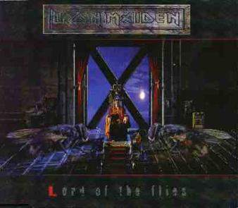
80. Lord of the Flies (Syme)
Overall: 3.40/10

Single29_lordoftheflies_a_small.jpg


Phew...OK. So. This is a crap quality image, but I actually own this single (found it randomly somewhere), so I can tell you that it's just garbage. The Eddie is barely distinguishable from the outside, the huge flies are poorly pasted, and why is the L red? There's that shit The X Factor Maiden plate. Yeah, this just feels like nobody cared about the source material. "What's in the title? Lords and flies? We can do that!" without recognizing that the song really isn't about flies or lords, but is in fact about the Hobbesian state of nature, and the unstated influence of the titular/Biblical devil. Someone loved it though - this has our first 10 vote.

Your votes:
10: 1
9: 0
8: 0
7: 2
6: 9
5: 6
4: 5
3: 12
2: 10
1: 13

Overall Rankings:
80 - Lord of the Flies - Single - Syme
81 - Futureal - Single - Synthetic Dimensions
82 - Virus, first alternate - Single - Unknown
83 - Ed Hunter - Compilation Album - Synthetic Dimensions
84 - The Angel and the Gambler - Single - Synthetic Dimensions
 
79. Dance of Death (Patchett)
Overall: 3.45/10

Iron_Maiden-Dance_of_Death.jpg


I remember when the cover was revealed, and we all thought it was a big joke. The way the story goes, the CGI characters were intended to be far more complex, and the version eventually released was a mockup of what it might look like, and Steve said, "Brilliant, that's fucking the cover!" Patchett actually asked not to be credited, but this is the Internet, and we know these things. The underlying Eddie actually isn't bad, but there's so much shit tossed in here, impossible necks and weird ass stuff. I'm not going to get into the figures anymore than that - they speak for themselves - but I am going to point our three really weird things. One, what the fuck is in the flames in the background on the left, behind the hooded figures? Looks like part of a shield. Two, why does the scythe cut off the lower part of the N in Iron maiden? And three, the Dance of Death font is cool, but running over the white ground makes it not stand out well - a huge no-no. Anyway, I don't think this is the worst ever - but it feels like such a wasted opportunity.

Your votes:
10: 1
9: 1
8: 1
7: 5
6: 8
5: 2
4: 5
3: 5
2: 15
1: 15

Overall Rankings:
79 - Dance of Death - album - Patchett
80 - Lord of the Flies - Single - Syme
81 - Futureal - Single - Synthetic Dimensions
82 - Virus, first alternate - Single - Unknown
83 - Ed Hunter - Compilation Album - Synthetic Dimensions
84 - The Angel and the Gambler - Single - Synthetic Dimensions
 
Futureal and Ed Hunter definitely beat Angel and the Gambler imo. They're all ugly but I prefer the plain portrait style to the mess of CGI sprites.
 
Alright, time to get this underway.
:clap::bigsmile::applause::yey:

Pardon me. Anyways, I was actually ranking the album and single covers myself personally, and got 75 total, including most of what's in this poll except for stuff like alternate covers for singles and whatnot. So here's where these ended up out of 75:

The Angel and the Gambler - #69: Yeah, it's pretty shit. I give it a 2.5/10.

Ed Hunter - #72: It's pretty bad. Not what I'd want on a compilation album, which is what people getting into Maiden would be seeing. 2.5/10.

Virus, first alternate: Did not include this because it's an alternate, but I wanted to so bad. I actually really like this one. It's not perfect, but it's certainly better IMO than where it's landed. Somewhere between 6 - 8 on my scale.

Futureal - #59: It's bad, but at least it's better than TAATG and Ed Hunter. 3.5/10

Lord of the Flies - #39: All of The X Factor era covers are together, but this is my favorite of them. Eddie being far away in the distance of the image adds a darkness to it that I like. Around 7/10.

Dance of Death - #57: I definitely don't think it's as bad as everyone seems to think, but then again, when you look at what we could have had, it falls short. Very. 4/10.

Interested to see how this list progresses!
 
78. Virus - second alternate (Patchett)
Overall: 3.57/10

Single30a_virus1_a_small.jpg


This is obviously a lower-quality image, again. I'm not scouring the internet for high-def stuff, deal. A model, I think, of Eddie with some numbers imposed on it. OK, kind of makes me think of a computer virus. But what's with the forest and skulls? Again, a too-small "Virus" font. This looks like someone just threw some random horror images together, sure. But the real sin is the Eddie here. Where are his fucking eyes? You can see the brow but there's no goddamn eyes? Why does he have hair that looks like a dead woman's? You just get the feeling someone who knew nothing made this.

Your votes:
10: 0
9: 3
8: 0
7: 4
6: 10
5: 4
4: 5
3: 5
2: 10
1: 17

Overall Rankings:
80 - Virus - single - Unknown
79 - Dance of Death - album - Patchett
80 - Lord of the Flies - single - Syme
81 - Futureal - single - Synthetic Dimensions
82 - Virus, first alternate - single - Unknown
83 - Ed Hunter - compilation album - Synthetic Dimensions
84 - The Angel and the Gambler - single - Synthetic Dimensions
 
Back
Top