Best Eddie

77. Wildest Dreams (Greenhalgh)
Overall: 3.62/10

Front.jpg


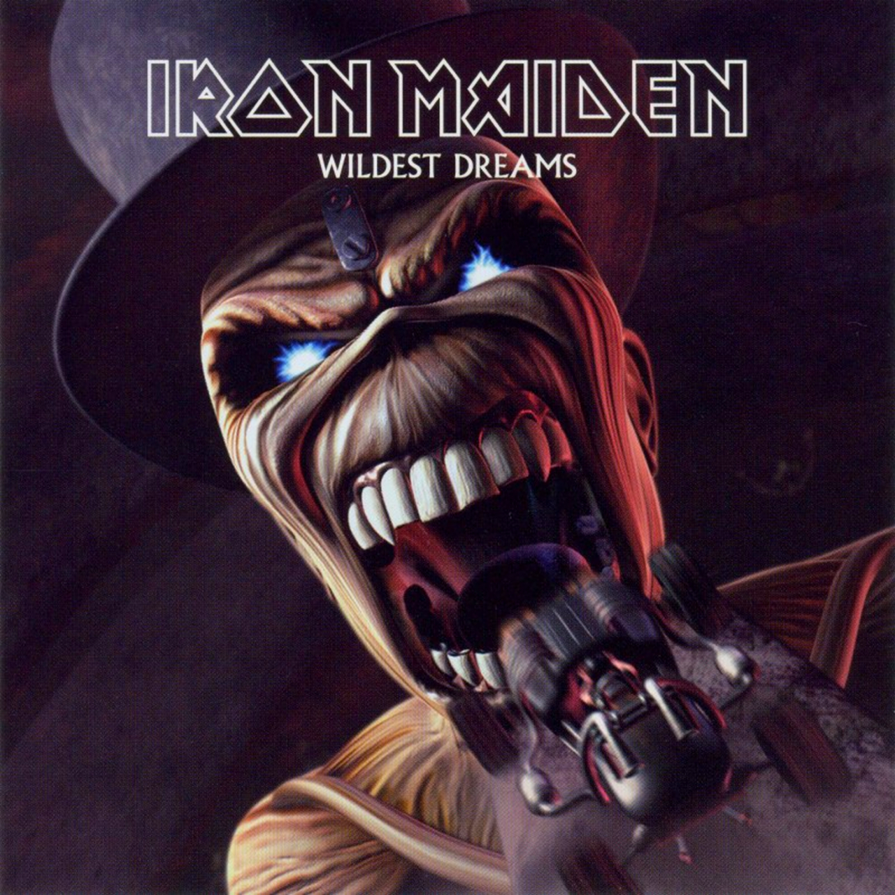
What am I supposed to say about this? It's a dated CGI Eddie, literally a screen capture from the video. The Eddie is fine, I guess, for what it is. Not sure why his collarbone is exposed. It just looks horribly out of date and cartoonish, but not in a good cartoon way. I got nothing else, guys. Eddie's wearing a top hat, but not the rest of a tux.

Your votes:
10: 0
9: 0
8: 2
7: 5
6: 5
5: 7
4: 8
3: 7
2: 17
1: 7

Overall Rankings:
77 - Wildest Dreams - single - Greenhalgh
78 - Virus - single - Unknown
79 - Dance of Death - album - Patchett
80 - Lord of the Flies - single - Syme
81 - Futureal - single - Synthetic Dimensions
82 - Virus, first alternate - single - Unknown
83 - Ed Hunter - compilation album - Synthetic Dimensions
84 - The Angel and the Gambler - single - Synthetic Dimensions
 
76. Best of the B-Sides (Wilkinson)
Overall: 3.66/10

Iron_Maiden_-_Best_Of_The_%27B%27_Sides_cover.jpg


The lowest-ranked fully hand-drawn cover, and for a good reason. It looks like Eddie is in the front of a bus, and he is mooning out of it. You know, I hate that I have to look at this longer than a heartbeat to analyze it. It's not particularly funny - mooning people is a type of insult that has gone out with the dodo in modern humour - but graphically there's some serious WTFs. Like, for example, the Best of the B Sides logo. Why is the font just an outline? At least you can read it, but it looks weird. Why does Eddie have Up The Irons tattooed on his buttocks, and why has the tattoo not mummified with the rest of his flesh? But most importantly...why is his belt so small, and why does it disappear on the right hand side of the...well..the buttocks? Just weird, bad idea, worse execution.

Your votes:
10: 1
9: 0
8: 0
7: 7
6: 6
5: 8
4: 5
3: 9
2: 8
1: 14

Overall Rankings:
78 - Best of the B-Sides - compilation album - Wilkinson
77 - Wildest Dreams - single - Greenhalgh
78 - Virus - single - Unknown
79 - Dance of Death - album - Patchett
80 - Lord of the Flies - single - Syme
81 - Futureal - single - Synthetic Dimensions
82 - Virus, first alternate - single - Unknown
83 - Ed Hunter - compilation album - Synthetic Dimensions
84 - The Angel and the Gambler - single - Synthetic Dimensions
 
LC, are you sure the second Virus image isn't by Hugh Syme. Relevant because he's known to lazily paste cheap sprites into recycled images for his album artwork submissions, which explains why Virus looks like a cheap cut and paste job.
 
LC, are you sure the second Virus image isn't by Hugh Syme. Relevant because he's known to lazily paste cheap sprites into recycled images for his album artwork submissions, which explains why Virus looks like a cheap cut and paste job.
I'm honestly not sure who made it. That's why it said Unknown. I don't have the liner notes nor could I find them during my initial research.
 
I have a physical copy of it, will check when I'm home
 
Virus, second alternate - This one I didn't rank either, being an alternate, but I like it about the same as the first alternate - around 6 - 8/10.

Wildest Dreams - #74: Absolute shite. I really like Wildest Dreams, but both the single cover and the music video can die. Second-lowest ranking on my list (out of 75), it only beats Live!! +one, which isn't included on her, so we'll skip over that crap. 2/10.

Best of the 'B' Sides - #67: Fuckin' hell. 2.5/10.
 
I'm honestly not sure who made it. That's why it said Unknown. I don't have the liner notes nor could I find them during my initial research.
CD is uncredited, but the Commentary says it's Hugh Syme and even links to the original image:
originalvirus.jpg


Also went on to Hugh Syme's website and found this HQ version of The X Factor without the logos, pretty cool:

X.Factor.jpg
 
CD is uncredited, but the Commentary says it's Hugh Syme and even links to the original image:
originalvirus.jpg

WTF?

nevermore_thisgodlessendeavor_by_nevermore_band.jpg


Is this real? Mind, Endeavor is from 2005, so did Syme actually offer the same picture to Maiden and then to Nevermore ten years later?
 
That's what he does. I believe the clown on the tightrope from A Dramatic Turn of Events was also recycled from somewhere.
 
75. The X Factor - alternate (Syme)
Overall: 3.72/10

Iron_Maiden_-_1995_-_The_X_Factor_%28alternative%29.jpg


I have to admit, this actually looks pretty cool in some ways. I like it much better than the very similar "Lord of the Flies" cover. But, there's still some weird graphical stuff. I'm not sold on the lighting and you can see the dividing line between the two sheets that form what is supposed to be a window, where they're improperly aligned. For what Maiden paid for their cover, surely they could have gotten something better than that. Still not a fan of the Iron Maiden font plate here. It's...it's okay. It's not good.

Your votes:
10: 1
9: 0
8: 2
7: 4
6: 6
5: 9
4: 6
3: 7
2: 13
1: 10

Overall Rankings:
75 - The X Factor, alternate - Syme
76 - Best of the B-Sides - compilation album - Wilkinson
77 - Wildest Dreams - single - Greenhalgh
78 - Virus, second alternate - single - Syme
79 - Dance of Death - album - Patchett
80 - Lord of the Flies - single - Syme
81 - Futureal - single - Synthetic Dimensions
82 - Virus, first alternate - single - Unknown
83 - Ed Hunter - compilation album - Synthetic Dimensions
84 - The Angel and the Gambler - single - Synthetic Dimensions
 
74. Run to the Hills - Rock in Rio single (unknown)
Overall: 3.90/10

R-3218057-1320942400.jpeg.jpg


This is another one of those times where I question your judgement. This is garbage. I don't even know where to start, so I'm just going to say this is garbage, it's a shit idea and I'm glad they've never decided to do something like it again. Terrible Eddie-head superimposed on a colour-changed Bruce body. Great.

Your votes:
10: 0
9: 1
8: 1
7: 3
6: 8
5: 8
4: 12
3: 8
2: 11
1: 6

Overall Rankings:
74 - Run to the Hills, Rock in Rio - single - Unknown
75 - The X Factor, alternate - Syme
76 - Best of the B-Sides - compilation album - Wilkinson
77 - Wildest Dreams - single - Greenhalgh
78 - Virus, second alternate - single - Syme
79 - Dance of Death - album - Patchett
80 - Lord of the Flies - single - Syme
81 - Futureal - single - Synthetic Dimensions
82 - Virus, first alternate - single - Unknown
83 - Ed Hunter - compilation album - Synthetic Dimensions
84 - The Angel and the Gambler - single - Synthetic Dimensions
 
I always thought that dividing line was part of the electric chair device, not the window.

Either way, it's nowhere near as bad as that Run to the Hills cover. Pure garbage.
 
The X Factor, alternate - Again, it's an alt so I didn't include it, but I do like this one a lot. About the same as Lord of the Flies. Well, they are similar, of course. About a 7 or 8.

Run To The Hills, Rock In Rio single - #64: A terrible idea, but it's not ALL that bad. Still very low though. And released with RTTH? Da fuq?? 3/10.
 
It's a dated CGI Eddie, literally a screen capture from the video.

I agree that's a really lazy cover this way, but I'm not sure how dated it is... it holds up better than the Ed Hunter covers, which, whisper it, are merely five years older.

Just weird, bad idea, worse execution.

I agree the execution is horrible, but I appreciate the cheeky interpretation of "B-Side".

WTF?

nevermore_thisgodlessendeavor_by_nevermore_band.jpg


Is this real? Mind, Endeavor is from 2005, so did Syme actually offer the same picture to Maiden and then to Nevermore ten years later?

I bought the album because of that cover, so it worked. I guess they thought that re-using one of three covers of a ten-year-old single from the low point of heavy metal popularity would go by unnoticed - and it did, more or less. I don't remember any outrage, merely a pointing out here or there on this board.

I have to admit, this actually looks pretty cool in some ways. I like it much better than the very similar "Lord of the Flies" cover. But, there's still some weird graphical stuff. I'm not sold on the lighting and you can see the dividing line between the two sheets that form what is supposed to be a window, where they're improperly aligned. For what Maiden paid for their cover, surely they could have gotten something better than that. Still not a fan of the Iron Maiden font plate here. It's...it's okay. It's not good.

Not sure why you dislike the Maiden name plate so much. I admit it's not always very well placed, but the idea itself is pretty neat. It's one of the items I could imagine having custom made, next to the t-shirt that Nicko was wearing at the time, saying "Eddie would go". It's just nice, angsty nineties cheese. I like this particular cover for what it is, too.

This is another one of those times where I question your judgement. This is garbage. I don't even know where to start, so I'm just going to say this is garbage, it's a shit idea and I'm glad they've never decided to do something like it again. Terrible Eddie-head superimposed on a colour-changed Bruce body. Great.

It would have been cool had it been a painting. I like the idea of Eddie dressing up as Bruce. I guess they just couldn't be arsed to put any kind of effort into the cover of a charity single.
 
79. Dance of Death (Patchett)
Overall: 3.45/10

Iron_Maiden-Dance_of_Death.jpg


I remember when the cover was revealed, and we all thought it was a big joke. The way the story goes, the CGI characters were intended to be far more complex, and the version eventually released was a mockup of what it might look like, and Steve said, "Brilliant, that's fucking the cover!" Patchett actually asked not to be credited, but this is the Internet, and we know these things. The underlying Eddie actually isn't bad, but there's so much shit tossed in here, impossible necks and weird ass stuff. I'm not going to get into the figures anymore than that - they speak for themselves - but I am going to point our three really weird things. One, what the fuck is in the flames in the background on the left, behind the hooded figures? Looks like part of a shield. Two, why does the scythe cut off the lower part of the N in Iron maiden? And three, the Dance of Death font is cool, but running over the white ground makes it not stand out well - a huge no-no. Anyway, I don't think this is the worst ever - but it feels like such a wasted opportunity.

I'm not a big fan of the execution of this cover, that's for sure - a lot should have been done, including putting more shading and texture on the figures, so that the midget doesn't look like it's floating, for example. But one thing I always thought may have been deliberate is the twisted anatomy. It's like you're being invited to a surrealistic dance, and only on second glance you see that all the people there aren't quite human, but twisting and turning their bodies like some grotesque demons. The problem is that so much of the artwork is unfinished that this appears like a glitch too - when maybe it's not.
But I agree, this cover could and should have been so much better. It's an excellent theme, and it could have been developed much further than it was. It could have spawned a number of great single covers and such as well.
 
I thought we were voting for actual Eddie rather than artwork overall.

Yeah, same here. I think we still were, there's just more to be discussed in regards to the overall artwork.

Personally, I find the Dance of Death Eddie to be pretty simplistic yet cool, whereas the cover as a whole is terrible.
 
I thought we were voting for actual Eddie rather than artwork overall.
Same here. I don't remember how I voted, but I probably gave more leeway to stuff like Dance of Death. It's a bad cover but the Eddie is ok.
 
Back
Top