Senjutsu - 3rd September 2021

I can understand that they wanted to do something different. However history showed that it was a failure thus never have seen such a cover again.

While the cover art (the initial and the alternative) of The X-Factor are definitely far from their best, I don't thin it's actually that terrible of a failure either. In fact, I'd say it lands somewhere between and interesting obscurity among Maiden album covers and being an ok cover art that somewhat fits the album and it's visual coherency very well.

I mean, as far as Maiden album covers go, I've never found TXF that bad and while it's... kinda ugly, I don't think it sticks out in a negative way. It's grotesque, but quite memorable and fits in to the visual world of the album. I mean, I appreciate it for not being super lame like No Prayer for the Dying cover, which is artistically ok and well-drawn, but not very interesting; in fact, I'd say it falls well behind most of their single covers, even. I wouldn't say it's bad, but it's probably the most meh album cover in their catalogue. The X-Factor, Dance of Death and even The Final Frontier, to some extent with it's alien-esque figure or whatever, manage to... shock or make you feel something, for better or worse. NPFTD is just... ok album cover, but absolutely nothing else. :D

Ah, apologies for getting carried away and blahblahblah, once again.

As for Senjutsu cover art, I think it's not quite as tasteful as TBOS, which sort of served as a nice parallel with debut album cover art.. oh boy what a journey Eddie has had! However, the samurai Eddie is still quite a striking figure and it does work well enough - it's just not quite as impressive as a sole album cover art, as impressive as the Eddie itself and the overall graphics and visual theme seems to be. In fact, that has been a trend for a ten years already: TFF & TBOS both have a quite strong visual theme going through the album and the booklet art, t-shirts and stage set design, but unlike in the 80's the album cover itself isn't quite as clearly the centerpiece where everything is drawn from, but just a one piece of the larger whole, if you catch my drift.

To put it short, I think Senjutsu cover art is good as it is and Eddie looks positively brutal (but thankfully not quite as funny or over the top as in TFF cover art, for example), but it's not quite as successful at pulling off the same trick TBOS did. :)
 
To put it short, I think Senjutsu cover art is good as it is and Eddie looks positively brutal (but thankfully not quite as funny or over the top as in TFF cover art, for example), but it's not quite as successful at pulling off the same trick TBOS did. :)
As you also stated Maiden had their fair share of non-so-good covers. I really like BOS and Senjutsu covers. They seem to me that they follow the same concept (Eddie seen as a worrior of ancient cultures) which is cool IMO. I wouldn't mind, in case we get another album, if this concept is conitnued.
 
As you also stated Maiden had their fair share of non-so-good covers. I really like BOS and Senjutsu covers. They seem to me that they follow the same concept (Eddie seen as a worrior of ancient cultures) which is cool IMO. I wouldn't mind, in case we get another album, if this concept is conitnued.

Yeah, I expected that Eddie and the visual concept in general would be slightly more vague, etheric and surrealistic this time, but as it turned out to be quite the contrary and following in the vein of TBOS, it might very well be that they'll do that with the next one too, hehe. Assuming we'll get to #18, anyway. :p Granted, the mentioned concept of ancient cultures and civilizations has worked brilliantly for them.
 
  • Like
Reactions: Gk1
The similar color schemes of the last two studio albums (and I suppose the live albums too) reminds me of Blue Oyster Cult’s black and white period. I wonder if there’s a conscious influence there. I do feel that The Book of Souls marks a new period for Maiden and Senjutsu seems to be following that template.

Interestingly, one of those BOC albums contains the song The Red and the Black.
 
Personally I don't think there's much thought to the new Eddie except Rod Smallwod and Maiden going "Well we really liked the last Eddie and the fanbase seemed to really like it too, can you do something similar again please Mr. Wilkinson"
 
TXF artwork is amazing in it's darkness. It's different to all previous, but still has some trademarks and like combining POM and SSOASS Eddies. Hugh Syme is great artist. FOTD is also has completely different Eddie, and VXI too. Actually all the following Eddies looks different to classic Riggs's Eddies.
 
Personally I don't think there's much thought to the new Eddie except Rod Smallwod and Maiden going "Well we really liked the last Eddie and the fanbase seemed to really like it too, can you do something similar again please Mr. Wilkinson"
I personally quite like it. Of course the entire artwork seems very promising cannot wait for the album released to check out the little booklet. It is similar to vintage samurai photos from like 100 years ago or even more. That's why there is no other background and I think it's way better than having a detailed background or something like that. I hope the album proves to be a classic too :)
 
TXF artwork is amazing in it's darkness. It's different to all previous, but still has some trademarks and like combining POM and SSOASS Eddies. Hugh Syme is great artist. FOTD is also has completely different Eddie, and VXI too. Actually all the following Eddies looks different to classic Riggs's Eddies.

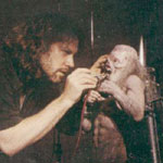
it's also amazing in the way it was done compared to all other Maiden covers before and after. Hugh Syme created a small miniature model that he then photographed for the album cover. Very cool if you ask me.

modeleddie.jpg

images
 
Maybe this has been already discussed, but I was quite surprised by Bruce's reference to Rammstein's Deutschland video as an inspiration for Maiden's. I don't really see common points, apart from a desire to tell a story. I love Rammstein's song, its lyrics, the fact that the video version is different from the album version, but I think the video is absolute bad taste.
Bruce's self content with this video is childish, as has already been said. A few years ago, he kept telling again and again how he wrote his grand oeuvre on a little piano; I guess this time, he will talk about his little rock opera.
 
it's also amazing in the way it was done compared to all other Maiden covers before and after. Hugh Syme created a small miniature model that he then photographed for the album cover. Very cool if you ask me.

modeleddie.jpg

images
Where did you find those pics ?And does somebody know where the model is now ?
 
Last edited:
I can't tell you for certain if the long gaps between Maiden albums are ambition-related, there's a lot more that factors in, but it might be part of it. But that was just meant as a throwaway example anyway, it was more about the general argument you made.
To me, the reason there were long gaps between TFF to TBOS and TBOS to now is because of extended touring(both Maiden England and LOTB have 3 legs to them), a cancer scare, and covid.
 
TXF artwork is amazing in it's darkness. It's different to all previous, but still has some trademarks and like combining POM and SSOASS Eddies. Hugh Syme is great artist. FOTD is also has completely different Eddie, and VXI too. Actually all the following Eddies looks different to classic Riggs's Eddies.

Hugh Syme might be a great artist (I really like his work with Rush and Dream Theater to name just a couple of bands he has done some great artwork for), but his work for Maiden is mediocre at best. A bit like the album if you ask me.
 
Back
Top