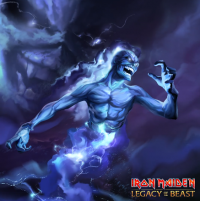
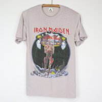
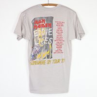
Official Iron Maiden artwork and fan drawn Eddies (no AI images please)

The inside cover has some fantastic detail but I think less (i.e. the glowing Eddie in the middle plus two Maidenheads totems) would be more better.
Actually, the artwork you talk about is the one that is included in the booklet (see here) - the more detailed one is included in the vinyl.
I wish they'll find a worthy replacement for Mark or better, they come to terms until the next one.
The obvious choice is Melvyn Grant, who is also a great artist and they worked with him for 3 album covers. Or they can choose someone they haven't worked with before.
I think Akirant Illustration would be a good choice - they worked with him for a cover of a live album and for a few tour posters and he has done some amazing additional artworks for Senjutsu. Great artist too.
 
Is this (tour?) poster or the Pharaoh Eddie for the São Paulo concert in 1996 official? If yes, who is the artist?
 

Attachments

  • monsters of rock brazil 1996.jpg
    monsters of rock brazil 1996.jpg
    108.1 KB · Views: 55
I was wondering something about the Senjutsu tour...

Will they use the album cover as a backdrop? They didn't use it for TBOS tour, although it was featured in the Mayan calendar later in the set - for all the other Reunion era albums, they used it. The only album covers that were not used as a backdrops are: TXF, NPFTD and POM (SIT Eddie was used as a backdrop for ''Heaven Can Wait'' in 1992).

Edit: And what about the alternative cover of Senjutsu? Maybe they will put it on Nicko's bass drum... the only album tours for which he had an artwork of Eddie on the bass drum were for BNW and AMOLAD (the others were for ME and GME tours). It will work well, especially if the drums are green (I hope) with maybe red Japanese characters (with the snakes from the album's booklet) on them and black/metallic cymbals.
 
Last edited:
Perhaps the backdrop for some new song will be gatefold of Senjutsu (minus Eddie) and then bang, Eddie will appear on stage as samurai?
Im not sure what song that would suit, but as for regulars and the song "Iron Maiden" particularly they must have some bigger (inflatable) Eddie as usual.
 
Perhaps the backdrop for some new song will be gatefold of Senjutsu (minus Eddie) and then bang, Eddie will appear on stage as samurai?
Im not sure what song that would suit,
I think the gatefold artwork will be used for the title track (plus Eddie, ofc) - amazing artwork that will look epic live with all the lights and stuff. Just like they used one of TBOS gatefold artworks for the title track live.
 
I think the gatefold artwork will be used for the title track (plus Eddie, ofc) - amazing artwork that will look epic live with all the lights and stuff. Just like they used one of TBOS gatefold artworks for the title track live.
Exactly, I agree. It's too good artwork to only use it only for the gatefold, so Im pretty sure that it's one of the backdops.
Damn, the show must be awesome to witness. Hope to see that show next year.
 
Last edited:
It looked very different to how it ended up because the original drawings that I did, Eddie had hair. I tried to imagine him as a witch doctor with typical 'Eddie' hair but making it even more crazy!
^ Given the explanation above, the witch doctor from one of the artworks in the album's booklet was probably the original TBOS Eddie with hair. I guess that also explains why he was included in the artwork and why the band used only him as a backdrop for ''Powerslave'' live during TBOS tour.
 

Attachments

  • witch doctor.jpg
    witch doctor.jpg
    192.7 KB · Views: 37
The tour poster for SIT would have been a great album cover too imo.

- the details are less, but the whole setting fits perfectly with the image of the Cyborg Eddie.
 

Attachments

  • sit tour poster.jpg
    sit tour poster.jpg
    709.4 KB · Views: 43
The artwork for ''Tears Of A Clown'' live is one of the best backdrops of Maiden IMO. It's also one of my favorite artworks with Eddie (I wish it was released officially). This once again shows that you can't replace the feel of the backdrops with the big screen!

Btw, this artwork was more suitable for TRATB.

toac backdrop.jpg

Only TOAC Eddie would have made a great cover for a (live) single too:

TOAC.jpg
 
The artwork for TBOS (from LOTB game) is great - it could easily have been an album cover. The details have always been key for Maiden covers.
 

Attachments

  • tbos from lotb game.jpg
    tbos from lotb game.jpg
    571.5 KB · Views: 29
Maiden could have made some really cool back covers for their albums:

Senjutsu - Samurai Eddie without a helmet, it fits but artwork with a castle (like this one) or only castle/sword would have been even better.
TBOS - a book (of souls) or something like this or this great fan art.
TFF - it's great.
AMOLAD - the cross keys symbol, it fits but this one is better imo. Or picture of the battlefield. Actually, the album cover is the perfect back cover.
DOD - a close-up of Eddie's face with a carnival mask on it would have been cool.
BNW - picture of the band watching the new world, it fits because this is the first reunion album and you can't do much outside of the album cover. Maybe a picture of planet Earth?
VXI - this one should have been much better. Maybe a futuristic landscape would have been great.
TXF - it's perfect for the album.
FOTD - the bat Eddie would be fitting. Or a dark park with benches and lamps.
NPFTD - again, you can't do much with it. I don't mind the original back cover. They could have used this artwork from the booklet though.
SSOASS - it's perfect.
SIT - it's perfect.
Powerslave - it's perfect.
POM - it's perfect.
TNOTB - it would have been better without the band members on it. You can see it here.
Killers - only one big axe would have been better, methinks. Or a picture of a dark alley.
Iron Maiden - a picture from a concert, it fits great. Or a continuation of the street.
 
Last edited:
Back
Top