You are using an out of date browser. It may not display this or other websites correctly.
You should upgrade or use an alternative browser.
You should upgrade or use an alternative browser.
Official Iron Maiden artwork and fan drawn Eddies (no AI images please)
- Thread starter Kalata
- Start date
The_7th_one
Ancient Mariner
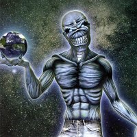
One of the bad ones…The artwork for the picture disc of ''Different World'' single:

Kalata
Out of the Silent Planet
Only the drawing of the jeans is bad (because is CGI graphic... Eddie is not, I think) - Eddie is pretty good imo. It's like POM Eddie... they used it for some artworks in 2003-2006 (this single, Wildest Dreams and These Colours Don't Run backdrop).One of the bad ones…
Kalata
Out of the Silent Planet
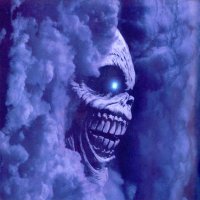
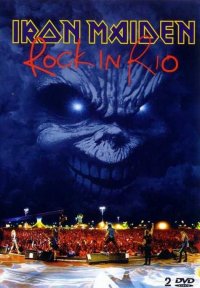
I've always liked this artwork of BNW Eddie included in the Rock In Rio booklet - the cover of the live album is nice (En Vivo! is a rather good copy of it, btw), but this one also could have been a great cover, methinks. The cover of the DVD (pic #2) is great too.
Attachments
Kalata
Out of the Silent Planet
Curious info from Melvyn Grant about Death On The Road original cover (very good artwork imo):
''The cover came to me as a sort of color sketch; it was very rough. And they had, in the background, a regular sunset sky. And I felt that they wanted me to do a rough draft to show them how I would do it. Anyway, I thought that a sunset, stormy sky is not going to be good enough for Maiden fans - so I turned the clouds into something else. Maiden liked it, and that’s how that painting came about. Otherwise, it would have been really bland.''
''The cover came to me as a sort of color sketch; it was very rough. And they had, in the background, a regular sunset sky. And I felt that they wanted me to do a rough draft to show them how I would do it. Anyway, I thought that a sunset, stormy sky is not going to be good enough for Maiden fans - so I turned the clouds into something else. Maiden liked it, and that’s how that painting came about. Otherwise, it would have been really bland.''
Dick Brucinson
The TRUE Dick Brucinson
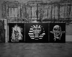
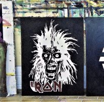
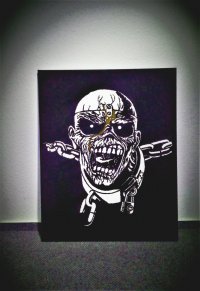
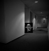
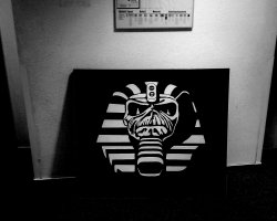
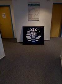
few Eddie pics I painted recently.
Powerslave was hardest btw., that one took me two months almost, doing the straight lines was killer. POM was done quickly, two weeks and that was it. debut Eddie was somewhat inbetween.
Powerslave was hardest btw., that one took me two months almost, doing the straight lines was killer. POM was done quickly, two weeks and that was it. debut Eddie was somewhat inbetween.

Attachments
-
 2.jpg938.7 KB · Views: 18
 -
 251101645_4455237587895235_2381036142368684044_n.jpg269.3 KB · Views: 18
 -
 251086734_4455236924561968_2926536528171107308_n.jpg257.8 KB · Views: 19
 -
 247078266_4420910437994617_4490058204608373490_n.jpg349.6 KB · Views: 18
 -
 247005987_4420910014661326_1834501526570125784_n.jpg211.7 KB · Views: 20
Last edited:
Dick Brucinson
The TRUE Dick Brucinson
Kalata
Out of the Silent Planet
In the link below (great interview about his whole career) Mark Wilkinson said that the inside cover of TBOS is one of his favorites - he called it ''one of the most detailed covers I've ever done'', which makes me think he's talking about this one: click here.
His artwork for ''The Great Unknown'' backdrop is great too.
-> ''The brief was to make Eddie as scary as possible''.
Btw, he seems to like simple covers (i.e. without background):
^ His two album covers for Maiden are without background and maybe he likes them a lot. The decision the covers to be without background is up to the band, I think.
 blog.discogs.com
His artwork for ''The Great Unknown'' backdrop is great too.
-> ''The brief was to make Eddie as scary as possible''.
Btw, he seems to like simple covers (i.e. without background):
''Judas Priest helped me evolve as an artist because each cover has been quite different to the previous one,. My own personal favorite cover was Angel of Retribution, which was the simplest of the lot''.
Priest: ''Mark’s metal imagination has taken Priest to amazing places. His intuitive mind and unique artistic skill have forged a special bond with us. We work together with him, giving him a rough idea, and he comes up with his magic''.
Priest: ''Mark’s metal imagination has taken Priest to amazing places. His intuitive mind and unique artistic skill have forged a special bond with us. We work together with him, giving him a rough idea, and he comes up with his magic''.

Discogs Digs | Discogs
Discogs Digs is the place to start your journey of music discovery. Explore recommendations, unique stories, guides, and more.
srfc
Ancient Mariner
The decision the covers to be without background is up to the band, I think.

Discogs Digs | Discogs
Discogs Digs is the place to start your journey of music discovery. Explore recommendations, unique stories, guides, and more.blog.discogs.com
I think the simple covers have been fantastic, but I think the reason they are going with them is not for any artistic "less is more" reason, I think it's because 1) it looks better as an avatar for music streaming sites and 2) which means they can then put the more detailed artwork on the physical copies as a "bonus" for people who buy them.
The_7th_one
Ancient Mariner
I have The masque Book. I bought long time ago. He shows the process of his paintings. It's awesome. It just covers the paintings he has made for Fish and Marillion.
Kalata
Out of the Silent Planet
Dunno about the reason, but they are fantastic indeed - it's just that the theme of both albums incline for an epic cover full of details. I think the empty background works better for the cover of Senjutsu (a jungle with a Mayan pyramid was the best possible background for TBOS imo). At least we have more detailed artworks for both albums in the booklets -> TBOS / Senjutsu.I think the simple covers have been fantastic, but I think the reason they are going with them is not for any artistic "less is more" reason, I think it's because 1) it looks better as an avatar for music streaming sites and 2) which means they can then put the more detailed artwork on the physical copies as a "bonus" for people who buy them.
Of course, not every cover should be ''busy'' with details just for the sake of them... for example, TFF cover would have been better if it was more simplistic, methinks.
Kalata
Out of the Silent Planet
Did you know that in the original cover of TBOS Eddie was with hair! - this interview is from FC Magazine #100.
Mark Wilkinson: ''I think the first visual I submitted was a black & white sketch and somebody from the Maiden office said to me that they really liked it and have I by any chance done a colour version? I said "yes"! And set about colouring it up very quickly! And I think that's the one that actually got me the job. It looked very different to how it ended up because the original drawings that I did, Eddie had hair. I tried to imagine him as a witch doctor with typical 'Eddie' hair but making it even more crazy! Rod really liked the Eddie but said to get rid of the hair and the face markings that I put on him. I think Rod maybe thought they were a bit too 'Maori'. He wanted a more 'voodoo' look, so it was a constantly evolving process''.
Too bad there is no photo. I can't imagine him with hair for this cover, it's really curious. But I think Eddie on this cover is perfect as it is.
Another curious thing were the instructions given for the cover... from the quote below it seems Maiden initially wanted to use the artwork of Eddie with the witch doctor and the pyramid in a jungle setting (this artwork can be found in the album's booklet/also used for DOG live as a backdrop):
''This Eddie had to have a voodoo, Mayan feel to him. Steve had got a book on Mayan culture and I was given one or two prints from that to look at. The sort of 'jungle' feel as well. Going on to a sacrifice to the sun with the heart. At that particular time when I first got involved they asked me to come up with an image of Eddie literally pulling his own heart out of his chest. Quite a lot to be getting on with really''.
MindRuler
Ancient Mariner
Cool! Btw are you the same Dick Brucinson from the maidenfansunited forum? I was a member there more than a decade ago, not a regular poster but the nick seems very familiar.few Eddie pics I painted recently.
Powerslave was hardest btw., that one took me two months almost, doing the straight lines was killer. POM was done quickly, two weeks and that was it. debut Eddie was somewhat inbetween.
Dick Brucinson
The TRUE Dick Brucinson
yes, that's me! it's been a while... a great pleasure to find you here!Cool! Btw are you the same Dick Brucinson from the maidenfansunited forum? I was a member there more than a decade ago, not a regular poster but the nick seems very familiar.
Samantas5855
Ancient Mariner
Samantas5855
Ancient Mariner
____no5
Free Man
In the link below (great interview about his whole career) Mark Wilkinson said that the inside cover of TBOS is one of his favorites - he called it ''one of the most detailed covers I've ever done'', which makes me think he's talking about this one: click here.
His artwork for ''The Great Unknown'' backdrop is great too.
-> ''The brief was to make Eddie as scary as possible''.
The inside cover has some fantastic detail but I think less (i.e. the glowing Eddie in the middle plus two Maidenheads totems) would be more better.
The Great Unknown is breathtaking. I think I'm gonna buy TBOS CD asap.
I think the simple covers have been fantastic, but I think the reason they are going with them is not for any artistic "less is more" reason, I think it's because 1) it looks better as an avatar for music streaming sites and 2) which means they can then put the more detailed artwork on the physical copies as a "bonus" for people who buy them.
Great explanation. The less is more approach in Maiden covers is one of the best artistic decisions they've ever made. Huge kudos.
I wish they'll find a worthy replacement for Mark or better, they come to terms until the next one.


