You are using an out of date browser. It may not display this or other websites correctly.
You should upgrade or use an alternative browser.
You should upgrade or use an alternative browser.
Official Iron Maiden artwork and fan drawn Eddies (no AI images please)
- Thread starter Kalata
- Start date
TheMercenary
Ancient Mariner
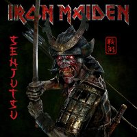
@Kalata : Moreover, the green color is a very special one in Japan. It signifies youth, eternity, vitality and energy. It's linked to Nature. And as in some parts the art of samouraï is linked to Nature and the force coming from the Nature, the green color is very appropriate to complete the artwork with this samouraï Eddie. 
Kalata
Out of the Silent Planet
What Steve thinks about Maiden's album covers (the interview is from 1996, Best Of The Beast release):
Edit: about the other band members - Adrian likes a lot Brave New World cover, Bruce thinks Powerslave cover is timeless, for Dave, Janick and Nicko, idk (there was an interview with all of them about their favorite Maiden covers, but I can't find it).
Iron Maiden - ''I think this is the best Eddie he's ever done''.
Killers - ''All the details make the cover even more interesting''.
The Number Of The Beast - ''I must admit that's far from being our strongest cover. It is still excellent, but Eddie has somehow lost this absolute madman aspect, you know, vicious and aggressive''.
Piece Of Mind - ''Derek apparently chose a much simpler style''.
Powerslave - ''This time Eddie is much more menacing, with the whole Egyptian theme giving him supernatural and almost mystical aura and I love the Trooper artwork, magnificent cover. The cover of Aces High single could also have been used for an album. Those artworks are so strong''.
Somewhere In Time - ''This is my favorite album cover. I love Stranger In A Strange Land artwork too, it was so good that it could have been an album cover, the aliens are really cool''.
Seventh Son Of A Seventh Son - ''I really like this cover''.
No Prayer For The Dying - ''To me, this is far from being his best work. In fact, Eddie is quite well made, but Derek was trying to give it some sort of 3D effect and the result is rather disappointing''.
Fear Of The Dark - ''We wanted something totally different from Derek's original idea and we even had Eddie as a Nosferatu. The cover of A Real Live One is brilliant. The original cover of Live At Donington '92 was meant to look like a bootleg, we didn't intend to release a third live album.''
The X Factor - ''Fantastic cover, Eddie looks more real and also more scary. We wanted to use a sculpture for FOTD too.''
It's curious what he thinks about the other album covers...
Best Of The Beast - ''Derek had originally done a drawing that was completely different. We wanted the cover to be like a cartoon.
There was a brilliant cover that Derek recently showed us and we were supposed to included in the compilation's booklet, but we eventually decided that it would be unfair to print it in such a small size, so we are keeping it for a future single cover.''
Edit: about the other band members - Adrian likes a lot Brave New World cover, Bruce thinks Powerslave cover is timeless, for Dave, Janick and Nicko, idk (there was an interview with all of them about their favorite Maiden covers, but I can't find it).
Last edited:
TheMercenary
Ancient Mariner
Thanks a lot for sharing this interview, @KalataWhat Steve thinks about Maiden's album covers (the interview is from 1996, Best Of The Beast release):
Iron Maiden - ''I think this is the best Eddie he's ever done''.
Killers - ''All the details make the cover even more interesting''.
The Number Of The Beast - ''I must admit that's far from being our strongest cover. It is still excellent, but Eddie has somehow lost this absolute madman aspect, you know, vicious and aggressive''.
Piece Of Mind - ''Derek apparently chose a much simpler style''.
Powerslave - ''This time Eddie is much more menacing, with the whole Egyptian theme giving him supernatural and almost mystical aura and I love the Trooper artwork, magnificent cover. The cover of Aces High single could also have been used for an album. Those artworks are so strong''.
Somewhere In Time - ''This is my favorite album cover. I love Stranger In A Strange Land artwork too, it was so good that it could have been an album cover, the aliens are really cool''.
Seventh Son Of A Seventh Son - ''I really like this cover''.
No Prayer For The Dying - ''To me, this is far from being his best work. In fact, Eddie is quite well made, but Derek was trying to give it some sort of 3D effect and the result is rather disappointing''.
Fear Of The Dark - ''We wanted something totally different from Derek's original idea and we even had Eddie as a Nosferatu. The cover of A Real Live One is brilliant. The original cover of Live At Donington '92 was meant to look like a bootleg, we didn't intend to release a third live album.''
The X Factor - ''Fantastic cover, Eddie looks more real and also more scary. We wanted to use a sculpture for FOTD too.''
It's curious what he thinks about the other album covers...
Best Of The Beast - ''Derek had originally done a drawing that was completely different. We wanted the cover to be like a cartoon.
There was a brilliant cover that Derek recently showed us and we were supposed to included in the compilation's booklet, but we eventually decided that it would be unfair to print it in such a small size, so we are keeping it for a future single cover.''
The_7th_one
Ancient Mariner
Iron Maiden commentary is the best Maiden resource site ever.
Kalata
Out of the Silent Planet
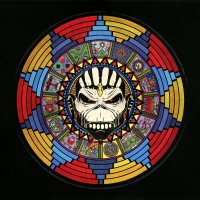
^ Here's a great colorful version/artwork from the booklet:I like how they added a Mayan artworks in TBOS: Live Chapter booklet for all of the songs in the setlist during TBOS tour (2017 leg):
Attachments
Kalata
Out of the Silent Planet
Speaking of album covers, I wonder what will be the cover of the next album. Maybe a warrior again (knight, Atlantis/sea creature/Eddie in a ship, Babylon) or some other creature... Eddie has been through so many adventures and it's difficult to come up with ideas (great idea for a thread, btw), but Eddie in Atlantis will make a great cover full of details.
Since Mark Wilkinson probably will not be the artist, I think we can expect a cover with details again - I don't think we will get a 3rd cover in a row without details and with dark background too (I expect light colours). The only cover from the previous albums that is almost without details is FOTD.
Edit: I hope for a ''rich'' booklet again (like for the last 2 albums), because we have to go back to the VXI album to find a booklet with a lot of artworks.
Last edited:
Samantas5855
Ancient Mariner
Kalata
Out of the Silent Planet
I was wondering...
Does anyone know which is Derek Riggs favorite Maiden cover? It's curious.
- he was bored drawing Eddie since the SSOASS cover, so maybe it's one of the covers before it.
While searching for info, I came across this interview with him (click here) and found an interesting idea:
Derek: ''One time Rod asked me for some original sketches, so I worked out forty original ideas.Some concepts that would just fucking blow you away. I was going to link all the album covers together into one giant picture, with all these other pictures joining them up, so they’d join up as one continuous art wall. I’d worked out half a dozen other pictures and put them together and this would’ve fucking done the fans’ heads in''.
^ This would have been amazing!
Kalata
Out of the Silent Planet
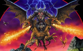
TBOS Eddie also has a dragon on his side:Senjutsu Eddie and his secret weapon - a two-headed dragon! I always wanted an artwork of Eddie with a dragon (classic metal stuff).
View attachment 21497
Attachments
Kalata
Out of the Silent Planet
Samantas5855
Ancient Mariner
They sculpted this oneTBOS Eddie also has a dragon on his side:
The_7th_one
Ancient Mariner
It was used as an event Tshirt for every gig. They just changed the city.Does anyone know the origins of this artwork of Eddie made by Derek? Is it for a tour poster or something else?
- Dave wore a shirt with this artwork in RIR 2001, if I'm not mistaken.
TheMercenary
Ancient Mariner
I know these ones. There were used in french Maiden fan-club magazines when they were published in the beginning of the 2000's.
Kalata
Out of the Silent Planet
A journey through Mark Wilkinson's artworks for Maiden (the info is from here):
Live At Donington '92 (the cover is from 1998) - Mark had been designing the poster art for the Monsters Of Rock festivals since 1987 and five years later he painted a winged Eddie when Iron Maiden headlined.
Eddie's Archive box set (2002) - Mark also illustrated the Best Of The 'B' Sides CD cover with Eddie inside a tour bus. The box itself pushed the technology for embossed metal and won a design award that year.
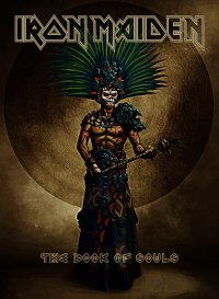
The Book Of Souls (2015) - For the 16th studio album by Iron Maiden, Mark was asked to imagine Eddie as a Mayan warrior. Steve Harris wanted simple clarity for the cover, just head and shoulders, establishing an evil presence which appears out of the blackness. The detail that fans had come to expect, is left to appear on the inside art.
-> it seems it was the band/Steve's decision the cover to be without details. The idea of ''The Great Unknown'' backdrop was also Steve's.
The Book Of Souls, the fiery temple scene - The whole scene is set in an imagined valley of the dead.
Senjutsu (2021) - Steve Harris sent Mark a collage of pictures and reference material to act as a guide to what he had in mind for Senjutsu. There were Kabuki face painting ideas and masks and creatures from the Japanese ‘Oni’ folklore. This was the illustration he started with.
Mark’s next idea was Eddie with a Samurai helmet. A mix of metal and/or leather – some had visors which Mark avoided, as you wouldn’t have seen Eddie’s face. Steve liked both ideas and in the end they used this as the front cover with the version without helmet on the back.
Senjutsu Eddie in the forest - Mark wanted to emphasise the more mystical nature of the Samurai.
Senjutsu, the Pagoda battle scene - A widescreen epic, probably the most complex illustration Mark has ever attempted. He built it up gradually, concentrating on the main figure and the Pagoda which Steve wanted him to design so it could be developed as a stage set when the band performed the album live. The landscape reference was taken from salt marshes in Shotley Peninsular (a place Mark had had in mind to use for a long time) adding Mt. Fuji and misty mountains to the horizon line. The battlefield was completed with two huge stone lanterns in the foreground to add a strong perspective.
---------------------------------------------------------------------------------------------------------------------------------------------------------------------
''The Wicker Man'' & ''Out Of The Silent Planet'' single covers are without info, unfortunately. I really wanted to read about their creation.
Kalata
Out of the Silent Planet
TheMercenary
Ancient Mariner
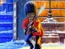
I guess they were, but I'm not sure at all... Btw, thanks for the sharing of this british soldier Eddie.I had forgotten about this artwork... does anyone know if it is official? AMOLAD songs are written on the wall.
View attachment 21622
Speaking of artworks, are those two official as well? IMFC?
Kalata
Out of the Silent Planet
While searching for some Eddie artworks, I found this interesting story (click here):
Mark Cordory, an artist hired by Maiden in 1992 to create a new Eddie for a music video (''From Here To Eternity'' video?)/album/CD photos.
He's probably one of the artists approached for the FOTD album cover (as we know from Rod, they were several... 3, iirc).
Here are his sketches:

Mark Cordory, an artist hired by Maiden in 1992 to create a new Eddie for a music video (''From Here To Eternity'' video?)/album/CD photos.
''Sanctuary Records, they want us to design and make an Eddie for Iron Maiden’s next album!
- ''I got the job of producing various concepts for them which we submitted to Sanctuary''.
''I eventually ended up talking to Bruce Dickinson on the phone where he explained that he was really inspired by the demon figure from the ‘Night On Bald Mountain’ segment in Disney’s ‘Fantasia’, so that’s where the concept went and how we ended up with a winged figure''.
^ I thought this Eddie was created by Mark Wilkinson! Although his version is different from this one.
''Bill gave me the task of sculpting the final figure, and it was cast in latex and foam-filled in sections. The following day the band arrived in their tour bus for their turn on the set and I got to meet all of them prior to the photo shoot, they seemed a genuinely nice bunch of blokes from my very brief meeting with them, I kinda wish I’d got autographs on one of the original sketches but live and learn eh?
And that’s basically how it happened. The figure eventually ended up on the CD insert and the design made it onto various promotional pieces such as tee shirts and a huge stage banner for their tour that year''.
He's probably one of the artists approached for the FOTD album cover (as we know from Rod, they were several... 3, iirc).
Here are his sketches:


