You are using an out of date browser. It may not display this or other websites correctly.
You should upgrade or use an alternative browser.
You should upgrade or use an alternative browser.
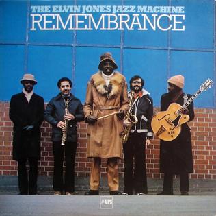
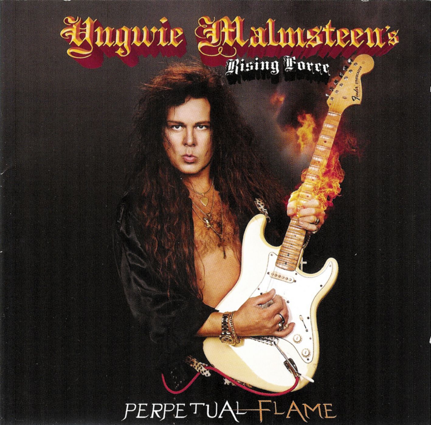
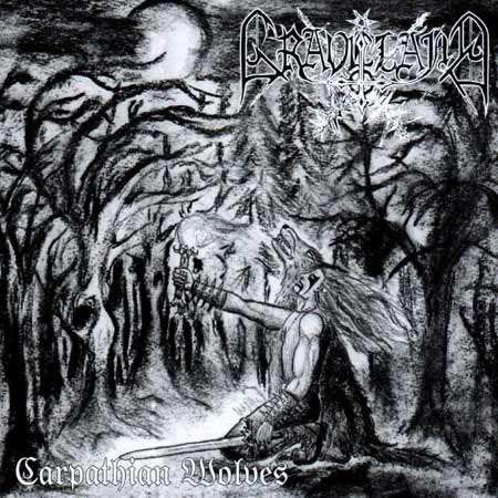
Crappy album covers
- Thread starter Forostar
- Start date


Cornfed Hick
Ancient Mariner
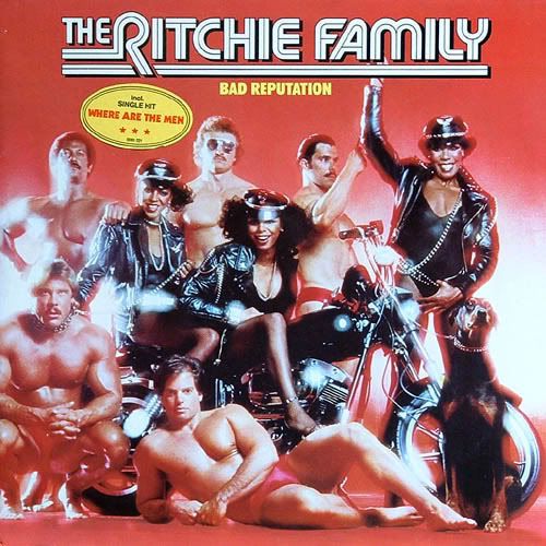
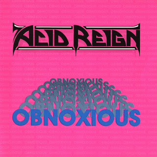
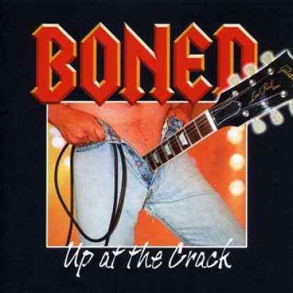
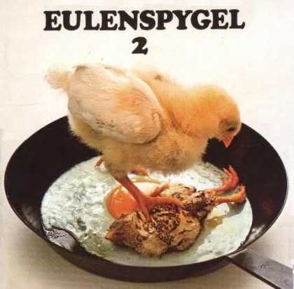
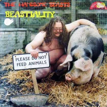
I'll admit it -- I cheated. I Googled "crappy album covers" and found this:
Forostar
Ancient Mariner
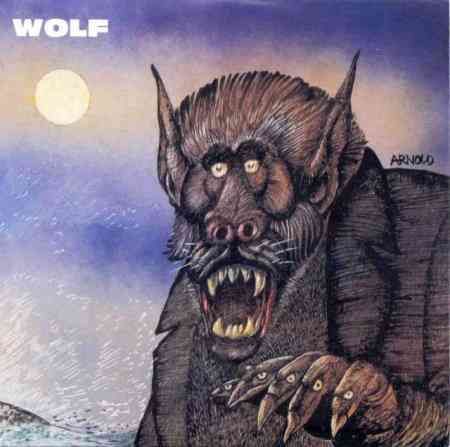
Bad Reputation! Hehehe!
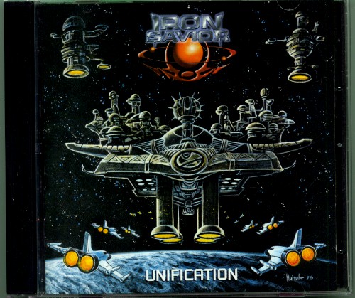
The next ones are not that ridiculous but the account explains why the bandleader doesn't like these artworks.
Quoting part of an interview with Piet Sielck (leader of Iron Savior):
The second album "Unification" and EP "Coming Home" was just a big trouble. The guy who did the artwork sent me paintings and they were completely different from what you can see on the album and EP. But the problem was that one of those paintings wound up on the Internet and it was too late to change anything since it was very close to the release date. I would have changed it if I could but...
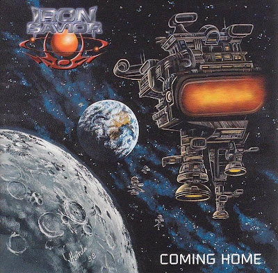


megadeoxys said:Perun, explain yourself.
That's a great cover!
What, are you serious?!
First of all, there's no way anybody can have me believe that Chapter One is written on that banner. Second, just look at how poorly all those characters are drawn. For heaven's sake. Look, I know that one bloke is supposed to be a giant, but the arm looks it's as big as the entire person it is attached to. That picture has no sense of proportion, and all the characters look like they are just pasted on. And even if it was drawn well, it would be cheesy as hell.
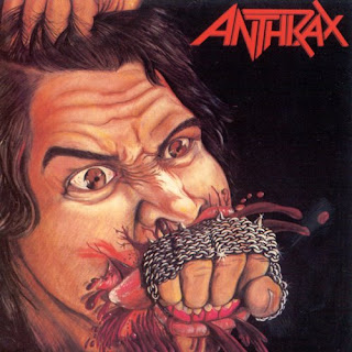
Now, the following one... I love it. I actually bought the LP just to have the cover in its original size. It's one of my favourite covers ever, I admit. But that doesn't stop it from being as amazingly ridiculous as it is. Plus, there is virtually no other album cover I know that spells out the album title so well... Fistful of Metal.
")