You are using an out of date browser. It may not display this or other websites correctly.
You should upgrade or use an alternative browser.
You should upgrade or use an alternative browser.
General album artwork appreciation
- Thread starter Perun
- Start date
MindRuler
Ancient Mariner
This isn't a metal album but it's so great in the details, you can look at it for hours. The eyes of Beastie pierce right through you.
The water dripping out of the "painting" gives it a surreal element. Also great use of colours and nice contrast between figure and background. This is art.
If I ever get a tattoo, then I want a Beastie on my left shoulder...but that's only if.

The water dripping out of the "painting" gives it a surreal element. Also great use of colours and nice contrast between figure and background. This is art.
If I ever get a tattoo, then I want a Beastie on my left shoulder...but that's only if.
Black Bart
Ancient Mariner
Not a metal album? Are you kidding? They even beat Metallica for the Grammy in 1988!This isn't a metal album but it's so great in the details, you can look at it for hours. The eyes of Beastie pierce right through you.
The water dripping out of the "painting" gives it a surreal element. Also great use of colours and nice contrast between figure and background. This is art.
If I ever get a tattoo, then I want a Beastie on my left shoulder...but that's only if.
View attachment 12726

MindRuler
Ancient Mariner
But that was with Crest Of A Knave.Not a metal album? Are you kidding? They even beat Metallica for the Grammy in 1988!

Jokes apart, their influence on metal artists cannot be put aside.


Kalata
Out of the Silent Planet
This is a great sea-themed album cover - the sea is drawn so realistic and the bright colours are in contrast with the dark petrified Poseidon, which is the best way to make the dark figure noticeable by merging the bright and dark colours properly. The details (seagulls, sharks, octopus and a sunk ship at the bottom of the sea) fits the thematic perfectly well.

JudasMyGuide
The incorrigible papist
I haven't heard the album itself yet, but I've always had a soft spot for sweet power-metalish covers (duh)

and the idea of the dichotomy is an old one and nothing really innovative, but I genuinely like the execution. It's a cliché done right, with all the red/blue contrasts and lines transforming from one side to the other...
Definitely made me want to pick it up and try it out.
and the idea of the dichotomy is an old one and nothing really innovative, but I genuinely like the execution. It's a cliché done right, with all the red/blue contrasts and lines transforming from one side to the other...
Definitely made me want to pick it up and try it out.
Cosmiceddie
Back From The Edge
Spambot
Meme Lord
I haven't heard the album itself yet, but I've always had a soft spot for sweet power-metalish covers (duh)
View attachment 13913
and the idea of the dichotomy is an old one and nothing really innovative, but I genuinely like the execution. It's a cliché done right, with all the red/blue contrasts and lines transforming from one side to the other...
Definitely made me want to pick it up and try it out.
It took me some time to realise those are not health-bars beneath their names.
Saapanael
Ancient Mariner
Sorry to be Negative Nancy but god-awful font and text size.I haven't heard the album itself yet, but I've always had a soft spot for sweet power-metalish covers (duh)
View attachment 13913
and the idea of the dichotomy is an old one and nothing really innovative, but I genuinely like the execution. It's a cliché done right, with all the red/blue contrasts and lines transforming from one side to the other...
Definitely made me want to pick it up and try it out.
Diesel 11
As you scream into the web of silence...
Really? I think it looks awesome.Sorry to be Negative Nancy but god-awful font and text size.
The Dissident
Ancient Mariner


The above 8 albums, are the first ones that came to mind when thinking about this topic. It is interesing that primarily Blue albums make up 50% of these selections
- Awaken The Guardian - I'll be honest when the title track of this album came up on my suggested listens on youtube, I didn't know much about Fates Warning except they have a song called The Eleventh Hour and they opened for Queensryche on their 2019 US tour which I didn't end up going to due to exams. This is a beautiful piece of album art, it is mystical and complete with the science fiction aspects surrounding it, I honestly would listen to the title track just to see the artwork.
- Bat Out Of Hell - For an album which frankly isn't that heavy, this album looks like that of a metal album from the 70s instead it opens into a monstrous work of art. Like the album it belongs to. That bike and the bat are epic.
- Alive In Athens - The red-blue colour contrast is amazing, and wow are those colours vibrant.
- Somewhere In Time - Connecting to the science fiction comment from earlier, this image above isn't the most vibrant rendition of the album art, my personal vinyl is more colourful, that version is so 80s I love it.
- Powerslave - This one is on my wall, it is epic, and fully deserving of the title track it represents
- Live After Death - When my dad gave me his old records this was in it, I listened to it based on the fact that 1. I knew who Maiden were by name only and run to the hills, 2. This artwork screamed listen to me I'm going to be epic... it was and well we know where that journey went...
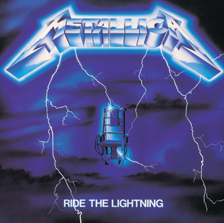
- Ride The Lightning - A more simple artwork by comparrison, the Metallica label looks great and the album has a classic feel to it. Simple and effective
- Rising - Well this is Rising after all, epic album needs an epic album cover. That is met with this masterpiece cover art, it screams Dio.

Shmoolikipod
Stranger to the Light
I knew which album this is before the image even loaded lol. But I agree it's very pretty, never really looked at it.View attachment 14235
The deep blue colours, I like landscapes, setting an atmosphere. It this certainly helped me to check out this album.

Kalata
Out of the Silent Planet
The colours are perfect for the atmosphere of the artwork (blue, black, grey). Landscape in album covers is always great.View attachment 14235
The deep blue colours, I like landscapes, setting an atmosphere. It this certainly helped me to check out this album.
This artwork certainly creates images in person's mind... - which is an important and a big bonus for album covers IMO (and somehow is a trademark for metal album covers).
Forostar
Ancient Mariner
While such a warrior may have nothing to do with the lyrical content, I really dig this beautiful striking artwork. I appreciate the warm colours. It fits well with the feel of this mid seventies music, containing some of Priest's slowest, moody songs. This collection from the first two Priest albums (plus a bonus track) was my first encounter with the band's studio material (apart from perhaps one or two songs, seen on TV).
The first Priest LP I bought was Unleashed in the East. Hero, Hero was a very fine companion. It also contained Priest's best and one of the (if not the) best logo's of all.

The first Priest LP I bought was Unleashed in the East. Hero, Hero was a very fine companion. It also contained Priest's best and one of the (if not the) best logo's of all.
Kalata
Out of the Silent Planet
This is the cover of Blind Guardian's ''Mirror Mirror'' single... (its album cover is also great).
I really like covers with warriors. A warrior wandering through this snowy/icy land is epic stuff. He is prepared for battle with the flag raised high!
This cover immediately creates images in your mind and you can feel the setting.

Btw, this is one of my favorite threads.
I really like covers with warriors. A warrior wandering through this snowy/icy land is epic stuff. He is prepared for battle with the flag raised high!
This cover immediately creates images in your mind and you can feel the setting.
Btw, this is one of my favorite threads.
MindRuler
Ancient Mariner
Reminds me of this oneThis is the cover of Blind Guardian's ''Mirror Mirror'' single... (its album cover is also great).
I really like covers with warriors. A warrior wandering through this snowy/icy land is epic stuff. He is prepared for battle with the flag raised high!
This cover immediately creates images in your mind and you can feel the setting.
View attachment 16814
Btw, this is one of my favorite threads.
