

You are using an out of date browser. It may not display this or other websites correctly.
You should upgrade or use an alternative browser.
You should upgrade or use an alternative browser.
Official Iron Maiden artwork and fan drawn Eddies (no AI images please)
- Thread starter Kalata
- Start date

CA Bryers
Ancient Mariner
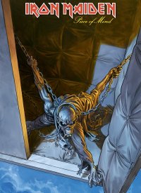
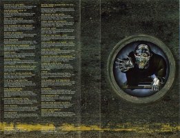
Not colorful because he's more or less painted in whitish-gray tones by moonlight in his weird floating padded cell.New POM art that we missed from the comic book.
It's like a continuation of the album cover, Eddie looking through the cell (for Icarus!). I like it, but why Eddie isn't colorful?

Randalf
Ancient Mariner
Btw, VOB Eddie on the cover is not that bad CGI.
Yeah, the quality of the CGI on Visions of the Beast probably isn't horrible, especially when compared to some other CG imagery on Maiden releases around the late 90's - early 00's. It's merely the design of that particular Eddie itself, and the overall lack of "Maiden world" immersion, that makes these CGI cover attempts a bit lousy.


Kalata
Out of the Silent Planet
A thought:
The pose and approach of TBOS Eddie on the cover would have still been impactful if it was with one of the booklet's arts (the jungle setting). Or just a subtle details (the pyramid's entrance, for example) and shadows for even more impact (unlike SJ's). The actual cover is a perfect back cover.
The pose and approach of TBOS Eddie on the cover would have still been impactful if it was with one of the booklet's arts (the jungle setting). Or just a subtle details (the pyramid's entrance, for example) and shadows for even more impact (unlike SJ's). The actual cover is a perfect back cover.
CA Bryers
Ancient Mariner
I miss the old, fuller style of covers that took advantage of the size of vinyl or even CD. It's a bummer they're prioritizing simplistic black background covers that (might) work better for little Spotify thumbnails or whatever. The thinking behind it is just...weird. I understand trying to adapt to more prevalent forms of media consumption, but at this late stage of the game, is going simple on the art really going to move the dial sales-wise even a little?A thought:
The pose and approach of TBOS Eddie on the cover would have still been impactful if it was with one of the booklet's arts (the jungle setting). Or just a subtle details (the pyramid's entrance, for example) and shadows for even more impact (unlike SJ's). The actual cover is a perfect back cover.
But here we are. Two albums in a row, I open it up and see an image that would've been 1000x more striking than what they put that on the cover instead. Oh well.
Kalata
Out of the Silent Planet
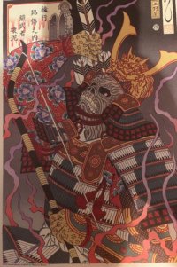
A samurai art with Eddie from SJ's box set- I'm seeing it for the first time. Nice and fitting to have such an art style for the album, the anniv book also has a similar art for the album. I couldn't find it in better quality. It reminds me of Bruce's TM aesthetics.
Attachments
Kalata
Out of the Silent Planet
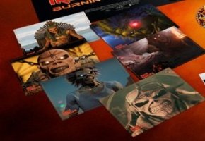
New CGI posters (close-up) of Eddie from BA DVD. No Trooper!
The one with Pharaoh Eddie and his throne has a curious choice of background. For TNOTB Eddie it fits. Which Eddie should be above it? Something from SSOASS, since those are tour related, or RFYL Eddie?
Curious to see, but you just can't beat a drawing.
The one with Pharaoh Eddie and his throne has a curious choice of background. For TNOTB Eddie it fits. Which Eddie should be above it? Something from SSOASS, since those are tour related, or RFYL Eddie?
Curious to see, but you just can't beat a drawing.
Attachments

Abas
Jester with no tears
What an amazing image - I saw this in the Infinite Dreams book too. What a great image that wasn't used for anything, I thoughtA samurai art with Eddie from SJ's box set- I'm seeing it for the first time. Nice and fitting to have such an art style for the album, the anniv book also has a similar art for the album. I couldn't find it in better quality. It reminds me of Bruce's TM aesthetics.
Randalf
Ancient Mariner
New CGI posters (close-up) of Eddie from BA DVD. No Trooper!
The one with Pharaoh Eddie and his throne has a curious choice of background. For TNOTB Eddie it fits. Which Eddie should be above it? Something from SSOASS, since those are tour related, or RFYL Eddie?
Curious to see, but you just can't beat a drawing.
Well those little posters include all the CGI Eddies seen in the film, as far as I remember. I think those shots are directly from the animations, actually.