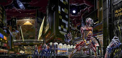
On the one hand, you’re thrilled to be working for such an iconic band and then you think oh, God, the fans! They love Derek Riggs with good reason. He created such an enduring character which is known world wide. I remember doing some work for Star Wars once - they sent me a style guide with dos and don’ts. They sent profiles, front and back line drawings that you could not deviate from or reinterpret. With Maiden, it felt almost the same as that. The band didn’t give me any hassle, but I knew the fans might! You mess with Eddie at your peril!
When it came to doing the last two album covers, obviously, it had to look like Eddie, of course it had. But I thought the only thing I can think of is to make him even more monstrous and so realistic that you see every heightened detail - like a modern monster horror film. They said great, let’s see what you come up with. I was dealing with management, and they would forward it to Steve. In the end, they said, Why don’t you just work directly with Steve? He encouraged me to go a bit further, go a bit further, go a bit further, make it even more monstrous. On one occasion, he went, Oh, perhaps dial that back a bit, might be a bit too much! But he really liked the general direction.
He especially liked the treatment of the skin. I played around with a 3D programme to get the textures right. I sent him a version of it on just plain black but I planned to add a lot more detail in the background: torn vines, shrunken heads - the whole Mayan vibe. When he saw it though, he said he wanted to keep that plain black background as it would be different to what they’d had before. He suggested having the big triptych reveal on the inside of the gatefold. I knew that would be contentious and as expected got some flak for it initially when the Maiden fans thought the cover was all they were going to get...like “where’s the detail??” Which of course was on the inside.
My phone lit up when the cover went public and the management sent me a message asking if I’d been checking it all out online, and I said no. And then, when I scrolled through, it was quite funny because the first few comments were about why the cover had a plain black background. Where’s the detail? And then when the album was released, the tone changed, “Oh, I’ve just seen the inside cover; makes sense now.
Q: The band must have been pleased with the black because that is what happened with Senjutsu too, with the reveal on the inside.
Yeah. Again, I wanted to do something different. I did the face-on version to begin with and Steve really liked that. He said let’s just keep it on black and I said, “Really Steve? I’m going to get into trouble again” and he laughed. The inside illustration took me the longest time I’ve ever spent on a piece of art. It took months. Four months, maybe five months. A long, long time for me to get it right.
Steve and I got on really well. I sent him visual developments and when I changed something Steve could tell because he would overlay them. He would say, “You have changed something and I know exactly what it is! Why do you keep changing things I haven’t asked you to (laughing)?" He said he’d got me on speed-dial as ‘The Tinkerer’!


")