You are using an out of date browser. It may not display this or other websites correctly.
You should upgrade or use an alternative browser.
You should upgrade or use an alternative browser.
Official Iron Maiden artwork and fan drawn Eddies (no AI images please)
- Thread starter Kalata
- Start date
fredo96993
Eddie dressed as a hill.
Great version of the Eddie. I am tempted to say that Mayan Eddie is the most consistently outstanding Eddie.
Kalata
Out of the Silent Planet
I like Grant’s VXI and loved FOTD, but I thought TFF was an abomination. I also loved his Eldorado sleeve, it would have served much better as the album cover.
I’m also a fan of Marillion artist Mark Wilkinson who designed TBOS.
However I will always stand by the notion Derek Riggs should be the only artist who paints Eddie.
I dislike Rod Smallwood attitude towards him over the years, as if he’s just another artist who can be disposed of as they see fit.
Although I acknowledge Derek wasn’t putting much effort into his Eddies from NPFTD onwards..
One of Rigg’s biggest gripes was that Rod wouldn’t give him sufficient time and notice to paint or come up with an idea...
I loved it in the 80s when kids adopted Riggs logo as also the bands logo and they would scribe the logo on school books
I agree about the FOTD and VXI album covers - they're awesome. TFF cover is 50/50 for me.
Mark Wilkinson was a long time artist for the Judas Priest albums 'till the new album. Great Eddie on TBOS cover, but the background should had been more detail-ish - a Mayan pyramid with jungle surround it behind Eddie would have been fantastic !
Derek Riggs is so good. Now he works with computers (CG form) for his pictures - and he's not doing very well ! The Eddies he created are timeless. Probably his worst Eddie on the album cover (If I dare to choose, because they're all awesome) is the one for the NPFTD album - it's still good, but as you said he wasn't putting much effort on the Eddies from NPFTD onwards.
I quite like the album cover for the BNW album - well, he done only the cloud, but is still great !
Ziggyplayedguitar
Educated Fool
His alternate TAILGUNNER sleeve was great for NPFTD ..
I love it I think this artwork is awesomeI've recently found a tour poster from the AMOLAD tour and for me it is better than the actual album cover ! One of the reasons is that Eddie is the main thing on the cover (the focus is on him), as it should be - not at the back of the cover ! Also, this poster has the tank on the background - good detail.
But, for the actual album cover, I think the tank is done well - only Eddie should have been at the front of the cover and the skeleton soldiers to be at the back or around the tank - then it would be much better album cover.
Guys, what are your thoughts about the tour poster artwork ?
View attachment 6793
I personally think Derek Riggs is the best artist that Maiden has had and still wish he was drawing for MaidenThis is the poster that came along with the single for the Futureal song and was done by Derek Riggs, but for some reason didn't make the cover. Instead, they used the artwork with the copy SIT Eddie and it was in CG form- nothing can beat the drawing of picture where the talent of the artist is shown in full - this is proven by Derek Riggs not once !
View attachment 6745
Kalata
Out of the Silent Planet
That is pretty cool one indeed, but I still prefer the cover we got.
"Remastered" (completed...) DoD cover would be interesting though! And much more appropriate than the unnecessary digital version of the first album cover in '98 remaster release.
Yeah, the remastered album cover for the first album in '98 was really unnecessary (though is still looking good. I'm wondering if Derek Riggs done it
On the other hand, the remastered version for the NPFTD album was as good (if not better) as the original album cover !
The remastered/alternative cover for The X Factor album was basically the back cover of the CD - the full artwork for the album.
* not my favorite version of Eddie, but I always wondering why Maiden do not asked Melvyn Grant to do the cover for TXF album, since his FOTD cover is a masterpiece and my favorite of all. For the cover for VXI album they again used Melvyn Grant and it is another good looking album cover !
Welsh Phantom
Ancient Mariner
The backdrop for the song These Colours Don't Run is another example of a good album cover which can replace the actual AMOLAD cover.
- maybe Maiden should release a remastered/alternative version of the DOD album cover !
View attachment 6796
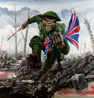
It's really good, but just a little too much like The Trooper artwork to be an album cover.
Kalata
Out of the Silent Planet
Still unsure as to why this wasn't the actual TBOS cover

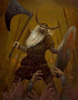
Great artwork that was used as a backdrop for Death Or Glory
 The Mayan pyramid is cool with the jungle and the shaman, are all very good details !
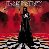
I've posted about the TBOS cover before, and find the bleak blackness and no frills approach relevant to the album. Especially in contrast to TFFs loud artwork. There's a lot of stuff about oblivion and extinction on it, whereas the embellished artwork comes across as a more fun, cheap horror theme, and puts the focus purely on Mayan stuff.Still unsure as to why this wasn't the actual TBOS cover

While Powerslave is a memorable cover, I always think it stands out that the Ancient Egypt thing relates entirely to one song. It's more like a single cover. It doesn't represent the rest of the album well.
Wogmidget
Shitpost bot
I've posted about the TBOS cover before, and find the bleak blackness and no frills approach relevant to the album. Especially in contrast to TFFs loud artwork. There's a lot of stuff about oblivion and extinction on it, whereas the embellished artwork comes across as a more fun, cheap horror theme, and puts the focus purely on Mayan stuff.
While Powerslave is a memorable cover, I always think it stands out that the Ancient Egypt thing relates entirely to one song. It's more like a single cover. It doesn't represent the rest of the album well.
The same could be said of SIT and BNW - doesn't change the fact that they're great looking pieces of album art.
And anyway, with TBOS they could've stayed within the more vague arena of death and destruction whilst still putting something in the background
Black Bart
Ancient Mariner
Two interesting links:
https://www.pinterest.fr/pin/296956169151703835/ (Hervé Monjeaud on Pinterest)
http://web.archive.org/web/20110429103332/http://www.derekriggs.com/ (a retrieval of Derek Riggs's website)
https://www.pinterest.fr/pin/296956169151703835/ (Hervé Monjeaud on Pinterest)
http://web.archive.org/web/20110429103332/http://www.derekriggs.com/ (a retrieval of Derek Riggs's website)
It's more nothingness than death and destruction. Oblivion, emptiness.The same could be said of SIT and BNW - doesn't change the fact that they're great looking pieces of album art.
And anyway, with TBOS they could've stayed within the more vague arena of death and destruction whilst still putting something in the background
I find BNW and SITs covers more relevant to the full album, in terms of sound for one and concept for the other.
Wogmidget
Shitpost bot
It's more nothingness than death and destruction. Oblivion, emptiness.
Even so, the background need not be entirely devoid of any content whatsoever. It looks to me as if the designer spent so much time and energy on Eddie that they didn't have anything left for the rest of the cover
I find BNW and SITs covers more relevant to the full album, in terms of sound for one and concept for the other.
Why? neither album has much in the way of a common theme throughout every song
Kalata
Out of the Silent Planet
Two interesting links:
https://www.pinterest.fr/pin/296956169151703835/ (Hervé Monjeaud on Pinterest)
http://web.archive.org/web/20110429103332/http://www.derekriggs.com/ (a retrieval of Derek Riggs's website)
Great links
 It have thousands of Eddie artworks around the web.
Even so, the background need not be entirely devoid of any content whatsoever. It looks to me as if the designer spent so much time and energy on Eddie that they didn't have anything left for the rest of the cover
I think every artist will always find an idea to add more details to some artwork
 and btw, I have read an interview with Mark Wilkinson (the creator of TBOS cover) who says: ''You never finish a painting, you just walk away from it'....
He is a big fan of Derek Riggs and for him he is a genius ! His favorite album covers are Killers and A Real Live Dead One.
Last edited:


