Lots of restored pics on Derek Riggs website. Worthwhile checking!

Forostar

Ancient Mariner
I thought you guys might like to check this out:

http://www.derekriggs.com

Many artworks are brilliantly restored, back to what the original painting colors were. Really beautiful.
They've been recently restored by Derek, and you'll find that the new images are larger, and higher quality!

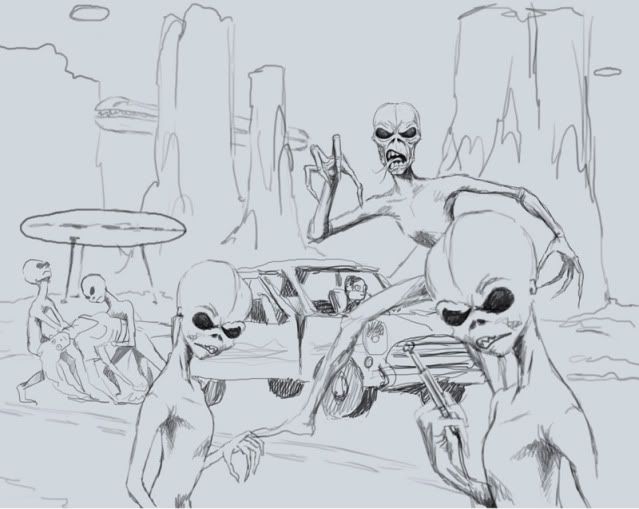
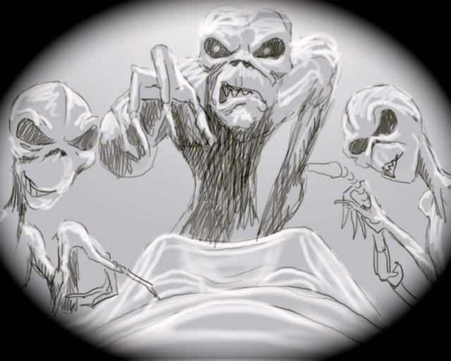
At times, the comments by Riggs are also interesting to read. E.g. check the NOTB artwork, accompanied by this info:

I finally got a copy good enough to work on... The colours have NEVER been right on any released version. The printers always got the colours wrong and over time the paints faded as well, so now even the original is a bit colourless. I put it back to what it looked like when I painted it. We used to have a horrible time with printers back in the 1980's. they never got the colours right on about half of what we did. This may be the first time you have ever seen it in colour. The devil figure was supposed to be deformed and twisted looking, but I didn't have enought time to work it out, so it just looks like bad anatomy instead... This was done in a rush over a weekend (two days and nights without sleep) for the "number of the beast" first single cover. When the manager saw it he kept it for the album and had me do another one for the single.

I really like the LAD plus this one as well. Awesome colours.
 
What I like the most are the descriptions and the comments on each drawing - I had some good laughing, last night - though he does sound a bit resented about Maiden.

These original colours for The Number Of The Beast are really amazing.
 
Thanks for the link, mate! I especially like the insight he's giving on the individual paintings. And I've never seen the Tailgunner artwork in it's entirety before... I didn't even know there was more to it.
 
Woah, that Number of the Beast artwork is amazing!  I've never seen it that big before, and he's right, the colours are way better.

Nice to read about the stories behind the artwork, but Riggs sure doesn't like Maiden.
 
You're welcome guys!

I really thought this one was a hilarious comment:

This is a record label. Do you remember records? They are the big black things that sound like shit... they are fashionable again amongst the groovy (and musically deaf) crowd. The spindle in the middle of the turntable came out through his mouth. I always wanted to do a record label that was an Eddie version of that Leonardo DaVinci picture of a man with his arms and legs spread out, it's a diagram of human dimensions. But the spindle is eddie's Penis. Did I mention that I have a fucked up sense of humor? I mentioned it to maiden but they chickened out (again)
 
Really cool comments on Flight 666 (and the closeup), I had no idea that the pictures are so detailed!
 
That is a great find, Foro. Yes, Riggs is not very happy with Maiden, but he is a painter, not a fan, and the last thing you want to tell an artist is how to do his art. Imagine how Maiden would have felt if someone came in and told them exactly what music to make? I can completely understand his dislike for the band.
 
This is some interesting stuff. I spent about 10 minutes last night studying Somewhere In Time all over again, finding every nugget.
 
LooseCannon said:
That is a great find, Foro. Yes, Riggs is not very happy with Maiden, but he is a painter, not a fan, and the last thing you want to tell an artist is how to do his art. Imagine how Maiden would have felt if someone came in and told them exactly what music to make? I can completely understand his dislike for the band.
Where do you get the idea that Riggs isn't happy with Maiden?
 
A guy (Puckfiend) from another Maiden forum met Derek Riggs and his wife, on saturday, during The Iron Maidens gig and she was wearing a t-shirt with the artwork he did for The Final Frontier, which won't be used by the band sadly, and told him it was ok to post it for others to check out (the comments on the drawings are originally by Puckfiend):

Abductionrev.jpg

Front cover: Imagine this all filled in with details...

Abductedrev.jpg

Rear cover: Cartman gets an anal probe. :D

My comments: it seems the album has a The X File undetone to the concept. I really love what Derek's art hints at. :wub:
 
fonzbear2000 said:
Where do you get the idea that Riggs isn't happy with Maiden?

Just read the comments for the artworks.  It might not be apparent in any individual one, but once you've read ten you might see what I mean.  Read between the lines. :)
 
LooseCannon said:
That is a great find, Foro. Yes, Riggs is not very happy with Maiden, but he is a painter, not a fan, and the last thing you want to tell an artist is how to do his art. Imagine how Maiden would have felt if someone came in and told them exactly what music to make? I can completely understand his dislike for the band.
I understand Riggs' dislike for the Maiden camp, but I think it is for different reasons. I don't quite think it is because he didn't want to be told how to create his illustrations... he is after all, an artist for hire. From what I've read/heard/been told, it seems more that Riggs eventually got tired of Maiden (Rod and Steve specifically) who were supposedly very picky/fussy about how they wanted pictures to look, as well as unrealistic working deadlines and things of that sort.
 
fonzbear2000 said:
There's quite a bit of stuff on his site. What exactly am I looking for?
Click on Pictures, then Iron Maiden. Here's a few examples:

http://derek.server311.com/riggsart/Pag ... ht666.html
http://derek.server311.com/riggsart/Pag ... ast03.html
http://derek.server311.com/riggsart/Pag ... yer03.html
http://derek.server311.com/riggsart/Pag ... son03.html
http://derek.server311.com/riggsart/Pag ... son02.html

And so on... Practically every picture from SIT onwards has a comment about the management and the requests he got for the images.
 
Every picture has a second comment as well. Take this one for example. Click

I am talking about the line on top of the window. The annoying thing is that these are incomplete sentences.
Was this done on purpose or just a strange mistake?
 
Those comments are provoking. They make me curious. But since this is done in such a "sneaky" and distorted way it's maybe better to ignore them.

If the comments are true in his vision, why not put these with the rest of the text...
 
Back
Top