You are using an out of date browser. It may not display this or other websites correctly.
You should upgrade or use an alternative browser.
You should upgrade or use an alternative browser.
IRON MAIDEN STUDIO ALBUM COVERS SURVIVOR 2015: Results -> Somewhere In Time wins!
- Thread starter Night Prowler
- Start date
I might be going to hell about saying this about my favourite album of all-time...but no votes for Powerslave is over-rating it a little bit, right?
I'm voting the hell out of Powerslave once AMOLAD and Killers are gone. It's a great cover, but I can't see how people could think it's better than Piece of Mind. The latter is the best thing Riggs ever did.
The Somewhere in Time one is, if I dare say so, a bit overloaded.
Visually, yes. I'm with you on that one. The bombardment of the senses is not unlike the effect the music has on me. I think SIT is very likely to win, though. People like the futuristic theme and modern style, they like the fact it fits the music, and they little the masses of detail and little references to Maiden 'history' incorporated in it. SIT's cover, a bit like Powerslave's is one you sit and look at, not bold statement or eye-catching pop art.
I stick with my earlier comments, in the SIT Album Discussion thread, that SIT could well be the first Maiden album cover that has a theme applicable in some shape or form to the full album.
For reference - AMOLAD is my #3 cover. I can appreciate that it will go out at 5 - that's about 5 higher than I expected.
MrK
clap hands
For reference - AMOLAD is my #3 cover. I can appreciate that it will go out at 5 - that's about 5 higher than I expected.
Considering how much everyone was attacking it just about 4-5 pages ago, I also expected it to go out much sooner. I like the cover quite a bit, but I'd kill it early to save BNW any day. Oh well.
I'm voting the hell out of Powerslave once AMOLAD and Killers are gone. It's a great cover, but I can't see how people could think it's better than Piece of Mind. The latter is the best thing Riggs ever did.
I like the composition and Eddie, and I especially like it when the wraparound is included.
But it's too monochromatic, and I'm not a huge fan of that colour
SixesAlltheway
Ancient Mariner
I'm voting the hell out of Powerslave once AMOLAD and Killers are gone. It's a great cover, but I can't see how people could think it's better than Piece of Mind. The latter is the best thing Riggs ever did.
I agree. Personally I think Killers might be better than the Piece of Mind cover but they're both better than Powerslave IMO. POM cover is even better when you look at the full artwork (ie the back of the CD/vinyl) that shows the door to the cell open and apparently floating in the sky somewhere...
Saapanael
Ancient Mariner
Eddie is floating inside a cube that can be seen on the top left of the Flight of Icarus cover.

As for SiT, the cover is one of my favourites (but not #1) not because of the immense detail but rather the atmosphere it provides. Whenever I listen to the SiT songs I imagine a nocturnal cityscape, as portrayed on the cover. It makes the songs more meaningful for me.
As for SiT, the cover is one of my favourites (but not #1) not because of the immense detail but rather the atmosphere it provides. Whenever I listen to the SiT songs I imagine a nocturnal cityscape, as portrayed on the cover. It makes the songs more meaningful for me.
SixesAlltheway
Ancient Mariner
I try when judging this, to remove the artwork as far away from the music as possible to truly judge the artwork on its own merits. Riggs also created these pieces without ever hearing a single note of Maiden music. We're judging the art and the pieces themselves...but I know it's almost impossible to NOT connect the artwork to the music on these albums....
See, I'm the opposite, which is one of the reasons AMOLAD is so high for me, and why Powerslave is #1. Powerslave the cover + Powerslave the song = just awesome experience.
SIT is very close, but I think my overall feeling of the album affects the cover. Plus I find the background work to be a little less inspired than on Powerslave. If we were comparing Eddies, it might be a different thing altogether.
SIT is very close, but I think my overall feeling of the album affects the cover. Plus I find the background work to be a little less inspired than on Powerslave. If we were comparing Eddies, it might be a different thing altogether.
But it's too monochromatic, and I'm not a huge fan of that colour
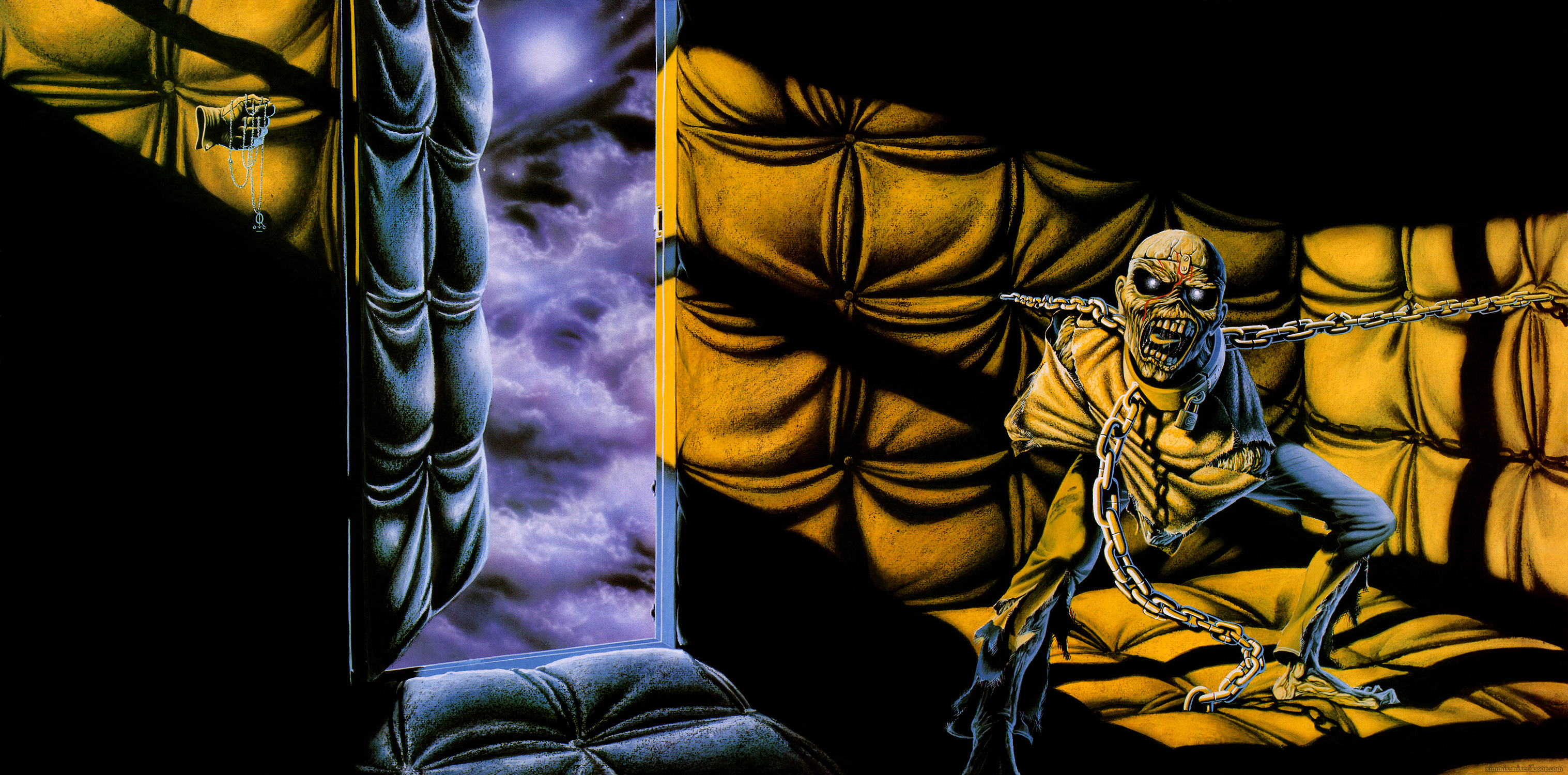
Funnily, it's the exact opposite to me. I love the colours and the fact that it's monochromatic. By limiting its colour palette, it creates a uniquely dense atmosphere. It's dark and brooding, it coneys a feeling of bleakness and desperation that sets a perfect background for the lunacy and madness that Eddie is reduced to. Eddie here has been turned into a bleak, brainless monster that is alien to the world of his observer. He sees everything around himself as a threat now, and with the chains and straightjacket, he has been turned into a powerless creature, aggressive but ultimately self-destroying, unlike the rogue danger he was on the first two albums, or the evil spirit he was in the NOTB era. What if the Powerslave cover is something that takes place in his head? A sad, lonely creature, dehumanised and locked away forever, having to retreat to his own fantasy of power and mortality, visualising a monument set for himself that he is buried in... talk about reading into things.

SixesAlltheway
Ancient Mariner
@LooseCannon Which is why sometimes these survivors can be tricky  I agree with you that Maiden has always been a great "listen to the album - stare at the cover" kind of band. They've truly been blessed with some great covers throughout the 80s.
The way I interpret the survivor is not which album cover best reflects or enhances the music on that album. I'm just looking exclusively at the covers (or trying too) when I make my votes.
I wonder if Killers has so many votes now because of the actual artwork or because people don't feel the connection to the music as much.... Because the artwork is fucking kick-ass, if you ask me
As soon as we start thinking about the music on these albums then it's no longer an artwork survivor - then it's just about the music.
I agree with you that Maiden has always been a great "listen to the album - stare at the cover" kind of band. They've truly been blessed with some great covers throughout the 80s.The way I interpret the survivor is not which album cover best reflects or enhances the music on that album. I'm just looking exclusively at the covers (or trying too) when I make my votes.
I wonder if Killers has so many votes now because of the actual artwork or because people don't feel the connection to the music as much.... Because the artwork is fucking kick-ass, if you ask me
As soon as we start thinking about the music on these albums then it's no longer an artwork survivor - then it's just about the music.
Last edited:
It's very difficult to separate artwork from music. I'd like to think I've done that when voting in this, (eg I would have had FOTD very high and NOTB top, although they're not my favourite albums). Although the artists didn't, as far as we know, hear the albums first, they will have been set particular guidelines to tie in with the whole package in terms of marketing. Something like: "Somewhere in Time, make it futuristic but with lots of references to Maiden's past." Or: "Fear of the Dark. Eddie doesn't have to be traditional, keep the design no-frills." The production of the artwork isn't completely divorced from the music and intended feel of each album. In one interview, Bruce talks about having his say on minor detail of the (unfinished?) TFF artwork, before realising he was getting into it way too far.
I find FOTD and NOTB the best in terms of colour, Killers and POM are a little too dominated by black/grey and yellow for my liking, although I do like the striking and plain Eddie-dominated design. Yellow does look hectic and maddening, like glaring artificial light, so it does fit POM, I just don't find it good to look at. I actually find Powerslave one of the worst in terms of colour - earth tone tan, light blue, pale yellow....not enough contrast all round for my liking, and colours that clash. Good contrast to what came before, though. DoD also has good use of colour, with the sharp black and white detail and dark/bright reds, but they screwed up with the design of those figures. AMOLAD is strange in terms of colour. The colours are a range of realistic colours, but there's an overall impression of brownness.
I find FOTD and NOTB the best in terms of colour, Killers and POM are a little too dominated by black/grey and yellow for my liking, although I do like the striking and plain Eddie-dominated design. Yellow does look hectic and maddening, like glaring artificial light, so it does fit POM, I just don't find it good to look at. I actually find Powerslave one of the worst in terms of colour - earth tone tan, light blue, pale yellow....not enough contrast all round for my liking, and colours that clash. Good contrast to what came before, though. DoD also has good use of colour, with the sharp black and white detail and dark/bright reds, but they screwed up with the design of those figures. AMOLAD is strange in terms of colour. The colours are a range of realistic colours, but there's an overall impression of brownness.
SixesAlltheway
Ancient Mariner
Although the artists didn't, as far as we know, hear the albums first, they will have been set particular guidelines to tie in with the whole package in terms of marketing.
Yup, very true. In his book "Run For Cover" Riggs talks about his, although he would rarely talk to the band but just Rod Smallwood that they were looking for so and so for the next artwork. And then he had to send them drafts. He also talks about how, when he first started to work for Maiden, he was invited to a show (this would have been around 1980 or so) and he hated the music
Very recommended reading for Maiden fans. He basically walks the reader through his experience with working with Maiden and painting the covers for every Maiden album he did. Lots of great stories and insightful details.
Last edited:
RTC
Libera et impera!
For me, Powerslave's cover represents the music perfectly, which is why I placed it at #2, but in terms of actual design, I'd argue it's on the same level as Killers. The easter eggs are clever, it looks grand and majestic and it has a lovely colour scheme, but it's a little too zoomed-out for me personally, as well as looking like Eddie's giving birth to a flight of stairs.
About musical representation: It's very easy to get an impression about a certain song based on its album cover. For example, if I told a Megadeth fan about Devil's Island, chances are their mind is not going to jump to this:

But rather, this:

About musical representation: It's very easy to get an impression about a certain song based on its album cover. For example, if I told a Megadeth fan about Devil's Island, chances are their mind is not going to jump to this:
But rather, this:
Black Wizard
Pleb Hunter
I agree. It is very...busy.The Somewhere in Time one is, if I dare say so, a bit overloaded.
Yes, it is. It works well as a curio, but a little less so as a coherent piece of art.I agree. It is very...busy.
Top 15
01.
02.
03.
04.
05. A Matter Of Life & Death
06. Brave New World
07. Seventh Son Of A Seventh Son
08. The Number Of The Beast
09. Fear Of The Dark
10. Iron Maiden
11. No Prayer For The Dying
12. The Final Frontier
13. Virtual XI
14. The X Factor
15. Dance Of Death
01.
02.
03.
04.
05. A Matter Of Life & Death
06. Brave New World
07. Seventh Son Of A Seventh Son
08. The Number Of The Beast
09. Fear Of The Dark
10. Iron Maiden
11. No Prayer For The Dying
12. The Final Frontier
13. Virtual XI
14. The X Factor
15. Dance Of Death
Killers (gtfo already) and Piece Of Mind.