CriedWhenBrucieLeft
Meme Only Account
Did you just post a list?! 
NeverWhen do the single covers come in?

Then I don't like this game, sir, I don't like this game one bit!Never

Yeh, that's the problem I have with some of the later covers too; DoD especially. It literally looks like someone put that together in half an hour. Looks amateurish.Another aspect: I don't find it well done. I don't like the technique. I prefer work with more detail and atmosphere.
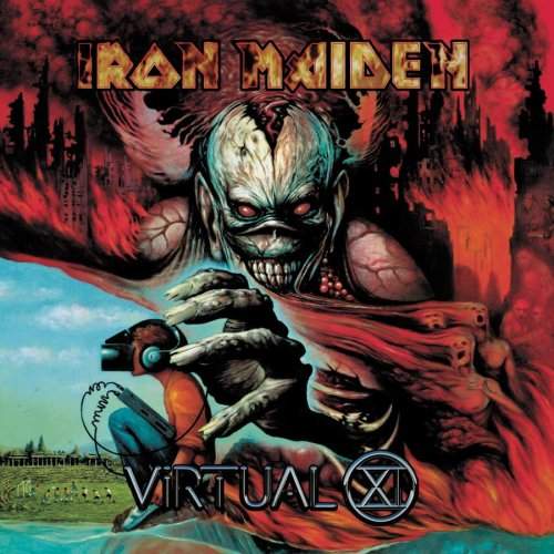
Eddie is the smallest and the simplest from all albums.