Kalata
Out of the Silent Planet
Ohhh, this is so bland and lazy.
Ohhh, this is so bland and lazy.

Well my comment was partially tongue-in-cheek, but to me it screams bad taste on more than one level. Don't want to impose my perception though, cheers.But why ?
Well my comment was partially tongue-in-cheek, but to me it screams bad taste on more than one level. Don't want to impose my perception though, cheers.

Glad you like it mate, what can I say?It's a bloody good artwork, isn't it ?
Glad you like it mate, what can I say?

It's just a mirror with slight photoshop work (mainly in the mouth area). As for cover montage I made it in less than 20 minutes. But with due time I could easily make it look "natural".I like your current avatar. Tbh, the cropped head seems to fit the actual album cover strangely enough...
Found the file containing this... a brief experiment on Eddie's mugg I did some time ago (pretty incomplete... especially the teeth)
I really want the backdrop for SOTC live (from LOTB tour) to be released as a full artwork - such a genius piece of art.
 Like the self-titled song which only needs the big Eddie.
Thanks mate but I can't see it happening in the near future due to lack of time. Well I kinda have time... but I work as a webdesigner so in my spare time I try to get away as much as possible from my "working tools".I think you should finish this artwork, mate.
Well, the LOTB tour also gave us other fantastic backdrops that are not with Eddie, but their are done around the theme of the specific song. The ones for WED, Revelations/FTGGOG, TNOTB and FOTD/TETMD/HBTN are awesome. Not to mention the ones for AH and FOI which are superb.
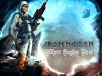
Only one eagle is missing in the backdrop for WED.
The stained glass windows and the whole backdrop (with West Ham's emblem) for Revelations and FTGGOG is one of the best backdrops that Maiden ever had.
The stage looks like hell during TNOTB and on the backdrop have a lot of lava/magma - the maw is amazing at the back of the artwork.
The backdrop is the same for FOTD, TETMD and HBTN, but it is good though. Maybe for FOTD they should have added some kind of a park and Eddie from the album cover to attack from inside the tree (that's my favorite album cover of all time and if I was in Maiden's place I will use it as a backdrop on every tour, I think Maiden only used it as a backdrop during FOTD tour). The single cover for TETMD was also good variant, but they already have used it during ME tour. HBTN doesn't need any backdrop, aside from a rope and a cell...Like the self-titled song which only needs the big Eddie.
Btw, I've found a fan art made artwork for Where Eagles Dare which was inspired by the current tour backdrop - looks great.
View attachment 8086

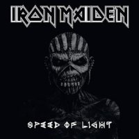
''Speed Of Light'' is the only single that do not have a proper cover art ! I'm still mad about that. Maiden have a big tradition with covers for singles, but they seems to be lazy nowadays (see Live Chapter reused tour poster). There is a cover for SOL in Wikipedia (https://en.wikipedia.org/wiki/Speed_of_Light_(Iron_Maiden_song)), but not on the Maiden official site and it is just the same as TBOS album cover - just darker and the name of the song was added - bland and lazy ! EOTC also was released as a second single and it has a killer artwork. I hope for the new album's single to have a prover cover art.
Even some images from the video would have made a good cover art for SOL like:
View attachment 8127

Simple:

Different, arcade game stylized, pretty cool for a single.
It didn't cut down on the repetition though, only the song length, which means less of the verses. It's a poor editing job.The 4 minutes version on the official video is great and obviously they should had used it instead of the almost 10 minutes version that made the album

It didn't cut down on the repetition though, only the song length, which means less of the verses. It's a poor editing job.
And no way should they have used the video edit. I agree with Diesel and many others about it keeping the repetition in play and cutting out one of the strongest aspects of the song, the third verse. Just my opinion of course. The album version is indeed quite stretched, but I don't find the video edit as a big improvement anyway.

All three TAATG covers are okay but poor for Maiden.
