Iron Maiden - artworks with Eddie

Kalata

Out of the Silent Planet
Since I failed with my previous idea about Eddie artworks :D, I decided to post this thread:

Well, I think in this thread, we can post Eddie pictures that are not official release and in general, everything about Eddie, including the official artworks too !

EDIT: All artists that have created album covers for Maiden:

Derek Riggs
- all album covers from the debut album to 1990 (+ Eddie's head in the BNW album cover).
Melvyn Grant - FOTD, VXI and TFF album covers.
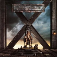
Hugh Syme - TXF album cover.
Steve Stone - designed the futuristic London in the BNW album cover.
David Patchett - DOD album cover.
Tim Bradstreet - AMOLAD album cover.
Mark Wilkinson - TBOS and Senjutsu album covers.

For info about the other artworks artists: click here
 
Last edited:

Kalata

Out of the Silent Planet
I'll start with that:

This was in very early stages of the artwork for the Virtual XI album. The working title at that time was: Virtual Insanity (pretty good title). This picture do not have the football pitch, but anyway, I think that the cover for the VXI album is a very cool piece of artwork !

virtual xi.png
 
Last edited:

fredo96993

Eddie dressed as a hill.
Do you think maybe they purposefully toned down the gore a little, especially after the problems with The X Factor? Edit: nevermind, I hadn’t realised the rib cage and extended brain were on the final version. Pretty gruesome, I prfer the final version because it is darker and gives more meaning to the boy with the VR.
 

Kalata

Out of the Silent Planet
Do you think maybe they purposefully toned down the gore a little, especially after the problems with The X Factor? Edit: nevermind, I hadn’t realised the rib cage and extended brain were on the final version. Pretty gruesome, I prfer the final version because it is darker and gives more meaning to the boy with the VR.

I'm sorry, but what were the problems with The X Factor artwork ? I'm not familiar with that.
 

Kalata

Out of the Silent Planet
Edit: nevermind, I hadn’t realised the rib cage and extended brain were on the final version. Pretty gruesome, I prfer the final version because it is darker and gives more meaning to the boy with the VR.

I like both versions. The final version is more complete and I don't care if it was without the football pitch. This album cover is one of my favorites versions of Eddie - superb work from Melvyn Grant, who also done the FOTD album cover, which is my all time favorite cover and Eddie !
 

fredo96993

Eddie dressed as a hill.
Why is Grant so obssessed with Eddie being green? ;)
Iirc TXF was originally a close up of Eddie on the table but it was deemed too graphic so they had to add a zoomed out cover to get some places to sell it.
 

Kalata

Out of the Silent Planet
Why is Grant so obssessed with Eddie being green? ;)
Iirc TXF was originally a close up of Eddie on the table but it was deemed too graphic so they had to add a zoomed out cover to get some places to sell it.

The 3 album covers that are done by Melvyn Grant (FOTD, VXI and TFF) are all very good !
I think this was the alternative version of the cover for The X Factor album:
 

Attachments

  • txf.jpg
    txf.jpg
    160.3 KB · Views: 75

Kalata

Out of the Silent Planet
This is the rejected artwork done by Derek Riggs for The Wicker Man single. Well, I see why it was rejected - the original version (that single has one more artwork with the band members on it) is way better ! Maiden used it as a backdrop for TWM in 2011.
 

Attachments

  • twm1.jpg
    twm1.jpg
    102.2 KB · Views: 157
  • twm2.jpg
    twm2.jpg
    58.8 KB · Views: 149
  • twm3.jpg
    twm3.jpg
    608.6 KB · Views: 150
  • twm4.jpg
    twm4.jpg
    542.4 KB · Views: 151
Last edited:

Kalata

Out of the Silent Planet
This is the poster that came along with the single for the Futureal song and was done by Derek Riggs, but for some reason didn't make the cover. Instead, they used the artwork with the copy SIT Eddie and it was in CGI form :mad: - nothing can beat the drawing of a picture where the talent of the artist is shown in full - this is proven by Derek Riggs not once !

futureal.jpg
 
Last edited:

Kalata

Out of the Silent Planet
I've recently found a tour poster from the AMOLAD tour and for me it is better than the actual album cover ! One of the reasons is that Eddie is the main thing on the cover (the focus is on him), as it should be - not at the back of the cover ! Also, this poster has the tank on the background - good detail.

But, for the actual album cover, I think the tank is done well - only Eddie should have been at the front of the cover and the skeleton soldiers to be at the back or around the tank - then it would be much better album cover.

Guys, what are your thoughts about the tour poster artwork ?

amolad'06.jpg
 
D

Deleted member 7164

Guest
Only thing wrong with AMOLAD graphics is the rifle, the one whose barrel is 2 inch with a foot long ignition pin.
 

Kalata

Out of the Silent Planet
It's very nice, but I thought the actual cover looked more serious and less cartoony. That album wasn't meant to be too much fun.

Yes that's true, but the focus should be on Eddie not the tank (or the skeleton soldiers) ! To me, this tour poster don't look like cartoony too and maybe they should had used it as a single cover
 
Last edited:

SixesAlltheway

Ancient Mariner
this tour poster don't look like cartoony too and maybe they should had used it as a single album cover

Except that it wasn't a tour poster back in 2006. It's a fan made artwork maybe made around that time but it's not official. Iron Maiden did have a couple of AMOLAD tour variants like these, which are all official artwork:

The official tour book:

tourbook14_amolad.jpg


A couple of alternative AMOLAD Eddie shirts:

0a5469a91b17159431c6f368eb8c600b.jpg


f19ac711caf7f94913bdd769e7cdaecf.jpg
 

Randalf

Ancient Mariner
Yes that's true, but the focus should be on Eddie not the tank (or the skeleton soldiers) ! To me, this tour poster don't look like cartoony too and maybe they should had used it as a single album cover

I prefer the album cover we got, but that tour poster artwork would have been a great choice for live album cover (if they ever released one). Cool artwork anyway!

Except that it wasn't a tour poster back in 2006. It's a fan made artwork maybe made around that time but it's not official.

Oh, well, anyway. :D
 

srfc

Ancient Mariner
This is the poster that came along with the single for the Futureal song and was done by Derek Riggs, but for some reason didn't make the cover. Instead, they used the artwork with the copy SIT Eddie and it was in CG form :mad: - nothing can beat the drawing of picture where the talent of the artist is shown in full - this is proven by Derek Riggs not once !

View attachment 6745

It was supposed to be for the 7 inch picture disc, that was never released.
 

Kalata

Out of the Silent Planet
Except that it wasn't a tour poster back in 2006. It's a fan made artwork maybe made around that time but it's not official.

Oh, OK then.
Maybe I was mistaken by the inscription: ''A Matter of Life and Death Europe tour 2006'' o_O Anyway, this artwork is very awesome !
 

Ziggyplayedguitar

Educated Fool
I like Grant’s VXI and loved FOTD, but I thought TFF was an abomination. I also loved his Eldorado sleeve, it would have served much better as the album cover.

I’m also a fan of Marillion artist Mark Wilkinson who designed TBOS.

However I will always stand by the notion Derek Riggs should be the only artist who paints Eddie.

I dislike Rod Smallwood attitude towards him over the years, as if he’s just another artist who can be disposed of as they see fit.

Although I acknowledge Derek wasn’t putting much effort into his Eddies from NPFTD onwards..

One of Rigg’s biggest gripes was that Rod wouldn’t give him sufficient time and notice to paint or come up with an idea...

I loved it in the 80s when kids adopted Riggs logo as also the bands logo and they would scribe the logo on school books
 
Last edited:
Top