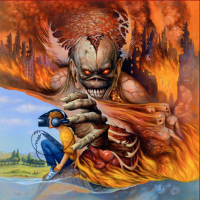
I remastered Iron Maiden's album covers for quality and consistency

Iron-Maiden.jpg

TL;DR - I made a set of consistent Iron Maiden album cover art, which can be downloaded here:

https://www.coverwhiz.com/music/iron-maiden

When I’m bored, I occasionally create and edit movie and tv poster collections. Recently I turned my attention to Iron Maiden instead. I‘ve been a fan for over 15 years, but it’s really hard finding high quality definitive album covers, and I’m always marginally annoyed by the random variations in logo placement.

So I decided to do something about it, and put together this collection - all pretty good quality, with consistently placed logos. Purists may hate, but hopefully some of you might make use of some or all of these - they look amazing together in iTunes or Plex!

I found the highest quality version of every cover that I could, and tweaked colours, contrast, and a few other things to create what I thought looked best. I then edited the logos into the same consistent locations. They aren’t all perfect, but I think they’re pretty good interpretations.

A lot were just a simple case of aligning things properly, some are obviously quite drastic changes (Powerslave, Fear of the Dark, X Factor) and a couple required a ton of editing to move the logos (Virtual XI, A Matter of Life and Death, Flight 666, Live at Donnington).

Let me know if there’s any albums I’ve missed, or if anyone can provided higher res versions of any of the artwork - some seem impossible to find. Hope you enjoy!
 
Absolutely superb!

That's my pet hate with some of the album covers, as the logo looks fantastic when it's big and bold stretched from left to right. Powerslave in particular is a huge improvement.
 
Powerslave in particular is a huge improvement.
Agreed. It looks downright monumental here. I will say I prefer Fear Of The Dark’s original look, I think it was more menacing and I liked the novelty of the logo being on the side like that. But even then the editing here is very well done and the albums look gorgeous.
 
Yeah I've no real issue with the official FOTD either. The X Factor version here is great.

Some of the ones look so well that I can't remember for certain if the official version has a different logo, e.g. BNW :lol:
 
Great job. :ok:

I always wondered why the Powerslave logo was small - the version you've done is amazing. You also made the VXI and BNW logos larger.

Your version of the logo on TXF album cover is great, but so is the original - maybe if the logo was painted in red (in the original), it would have been better - I guess they wanted that cover to be dark (like the album itself) with no light colours.

I must say that I like the original FOTD album cover (with the logo on the left) - you can see more of the tree.
 
I remember I saw the Fear of the Dark cover (along with new releases) in MH magazine one month before the album was released and it was much better than the final one. It was like the Live After Death yellow and transparent logo above as always and the illustration filling the whole cover…no black on the side. I would prefer it to the album released.
 
View attachment 12415

TL;DR - I made a set of consistent Iron Maiden album cover art, which can be downloaded here:

https://www.coverwhiz.com/music/iron-maiden

When I’m bored, I occasionally create and edit movie and tv poster collections. Recently I turned my attention to Iron Maiden instead. I‘ve been a fan for over 15 years, but it’s really hard finding high quality definitive album covers, and I’m always marginally annoyed by the random variations in logo placement.

So I decided to do something about it, and put together this collection - all pretty good quality, with consistently placed logos. Purists may hate, but hopefully some of you might make use of some or all of these - they look amazing together in iTunes or Plex!

I found the highest quality version of every cover that I could, and tweaked colours, contrast, and a few other things to create what I thought looked best. I then edited the logos into the same consistent locations. They aren’t all perfect, but I think they’re pretty good interpretations.

A lot were just a simple case of aligning things properly, some are obviously quite drastic changes (Powerslave, Fear of the Dark, X Factor) and a couple required a ton of editing to move the logos (Virtual XI, A Matter of Life and Death, Flight 666, Live at Donnington).

Let me know if there’s any albums I’ve missed, or if anyone can provided higher res versions of any of the artwork - some seem impossible to find. Hope you enjoy!

Nice!

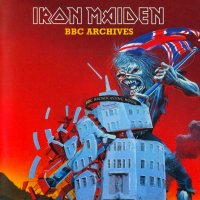
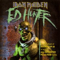
I guess you could include these 2 as well, as they were official releases also

album_iron_maiden_bbc_archive.jpg


album_iron_maiden_ed_hunter.jpg
 
I really like what you did. I wish there was a way to redo the later album covers with the original "spikey" Maiden logo. The ones used in the late 90s up until 2015 are so plain and boring.
 
I cannot share the enthousiasm about wanting to have all logos (positioned) the same. One of the beautiful aspects of the Powerslave artwork, for example, is that the logo is small and positioned in the corner. That's not being purist, it's called having appreciation and a sense for balance and art. Just a matter of paying and death attention to (what fits in) the artwork itself. However, I see that it works for people into using small pictures for e.g. iTunes. That is, if they cannot recognize the album art, or the band. Now they can read the band name.
 
Last edited:
I cannot share the enthousiasm about wanting to have all logos (positioned) the same. One of the beautiful aspects of the Powerslave artwork, for example, is that the logo is small and positioned in the corner. That's not being purist, it's called having appreciation and a sense for balance and art. Just a matter of paying and death attention to (what fits in) the artwork itself. However, I see that it works for people into using small pictures for e.g. iTunes. That is, if they cannot recognize the album art, or the band. Now they can read the band name. Yay.

I generally agree with you, although I wouldn't put it quite in these terms, especially the part about "having appreciation and a sense for balance and art" - that can be very subjective even if we don't have to talk about "purism".
Personally, I don't really see why these edits are necessary, but it would interest me why other people think so. There are a lot of positive comments here and I'd honestly (and without judgement or analysis) like to know why.
 
Personally, I don't really see why these edits are necessary, but it would interest me why other people think so. There are a lot of positive comments here and I'd honestly (and without judgement or analysis) like to know why.

I think the logo looks better big and bold, it's a great logo, the best in Metal, and needs to be dominant on the album cover.

Saying that, it's just a fun look at an alternate reality, it's no big deal that some of the real album covers have a small logo, or castrated R, N and M's. I don't cry myself to sleep at night because Powerslave has a small logo.:lol:
 
"having appreciation and a sense for balance and art" - that can be very subjective even if we don't have to talk about "purism".

Foro is right, looking at this with objective eye, there are two monumental things in the composition which is not good. Because the main accent should be on the pyramid.

I also don't like the BNW rendition because I don't think the huge maiden logo fits the evil serenity of the cover itself, it is too in your face.

Maybe I've overlooked something but the rest of them are pretty good so huge props to the author.
 
Back
Top