You are using an out of date browser. It may not display this or other websites correctly.
You should upgrade or use an alternative browser.
You should upgrade or use an alternative browser.
The Book of Souls Album Cover...
- Thread starter Perun
- Start date

I think I like the black background better. This is nice but doesn't really add much for me. If this had been the cover, I think we'd all be focused on Eddie anyway.
Bloody Lord Whatshisname
Invader
It's not a huge difference from the original, but I feel like it goes along with most previous IM covers. Most of them had a background of some sort - not to mention the moon, creepy trees and skulls are constant themes, too.
The original looks like Eddie is looming out of the shadows. More creepy.
Bloody Lord Whatshisname
Invader
The original looks like Eddie is looming out of the shadows. More creepy.
Good point.
nuno_c
A hollow universe in space
The simplicity is what strikes me in the released album cover: You have Eddie, out of the dark, looking at you. Nightmarish. Direct. It's the only Maiden album cover where you simply (and this is in NO WAY an attack against covers like SIT) have Eddie looking at you and vice-versa. There's no escaping or distractions, Eddie just looks at everybody with menace. It's a refreshing take on Maiden's album covers, i think.
nuno_c
A hollow universe in space
I totally get your point, but with this album (and i hope this helps you with having an association between artwork and music with this album) i think the mainly dark cover 100% reflects the somewhat dark sound of the songs. I don't know, the first sound we hear on the album is quite dark, so i made the association with the album cover immediatlyThe cover is still my biggest, but slight, gripe with the new album. Of the 15 before it, I can associate the music with the art, as if the art gives the album an extra bit of character.
Sadly not that easy to do with The Book of Souls.

It colours or accompanies your perception, I think. Dark. No frills, just music.
nuno_c
A hollow universe in space
Interesting. Could you elaborate?It colours or accompanies your perception, I think. Dark. No frills, just music.
Totally agreed. TFF had some really colorful imagery that accompanied the music and I still associate the colors and images in the booklets with the songs when I listen to them. Same with a lot of the 80s stuff. This album has none of that, so the songs just stand on their own. It's cool and different.It colours or accompanies your perception, I think. Dark. No frills, just music.
Travis The Dragon
AFTERGLOW!!!
We've had more than enough covers with lots of artwork so I don't mind Maiden going to something simple like this.
Srogyy
Ancient Mariner
Regarding the one in the opening post - Eddie looks pasted, it doesn't work to me.
I have mixed feelings about the actual cover. On one hand it's very aesthetic and features the greatest post-reunion Eddie. He's worth the focus. On the other hand, the theme of the album was such a good opportunity to go crazy with the artwork (and even the deluxe edition didn't deliver as it should). Thus, it feels underwhealming in the end. I started leaning towards the thought that the greenish artwork with Eddie holding out a heart would be much better as the cover. The shaman would be on the back of the booklet then. In that case, the black cover could be used for the deluxe book slipcase exclusively. Maybe that was an idea, but the image was considered too graphic? Now we know this one also created some minor controversy, so perhaps it could be worse...
It just occurred to me that I could try to make something cool - my custom 1 CD cut of the album, that I came up with today, with the layout I pitched. For personal use only, of course! Lots of work, though.
nuno_c
A hollow universe in space
Could you post some pics? I sure as hell would love to see that!Regarding the one in the opening post - Eddie looks pasted, it doesn't work to me.
I have mixed feelings about the actual cover. On one hand it's very aesthetic and features the greatest post-reunion Eddie. He's worth the focus. On the other hand, the theme of the album was such a good opportunity to go crazy with the artwork (and even the deluxe edition didn't deliver as it should). Thus, it feels underwhealming in the end. I started leaning towards the thought that the greenish artwork with Eddie holding out a heart would be much better as the cover. The shaman would be on the back of the booklet then. In that case, the black cover could be used for the deluxe book slipcase exclusively. Maybe that was an idea, but the image was considered too graphic? Now we know this one also created some minor controversy, so perhaps it could be worse...
It just occurred to me that I could try to make something cool - my custom 1 CD cut of the album, that I came up with today, with the layout I pitched. For personal use only, of course! Lots of work, though.

The Nomad
Nomad
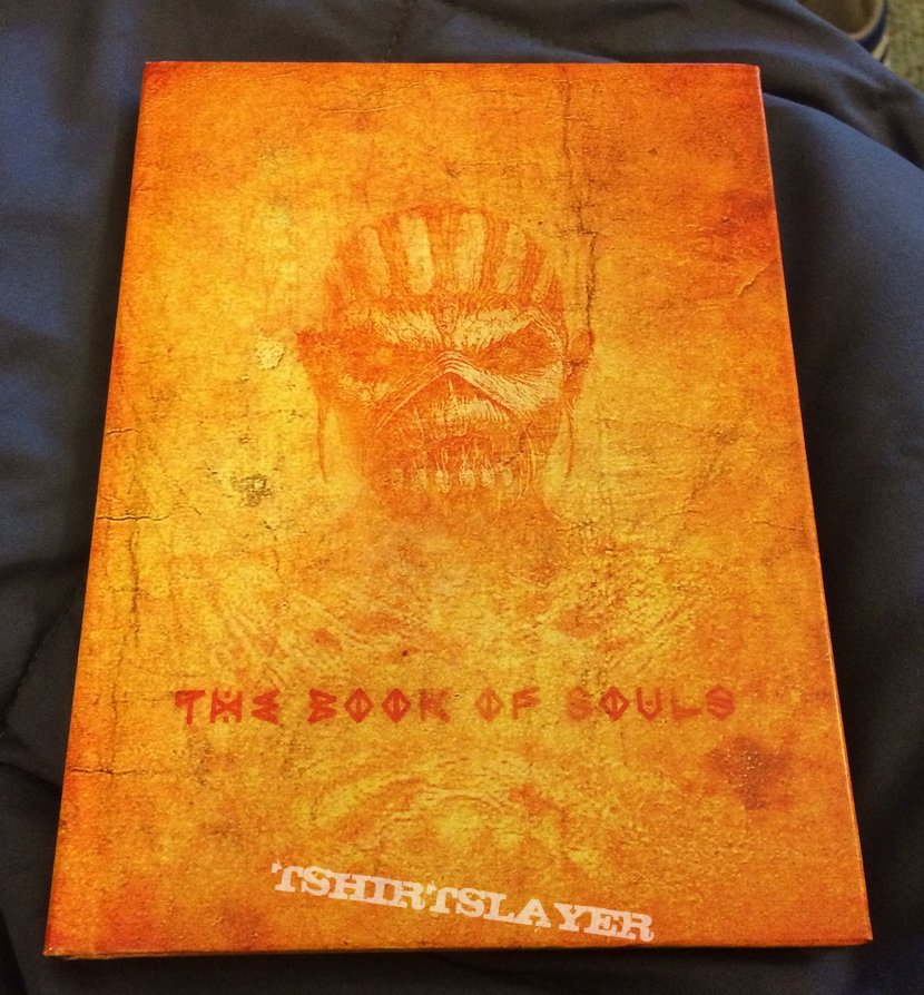
I would have preferred if the cover of the 'book' inside the deluxe edition have been the official cover.
This one:
Imagine the words 'Iron Maiden' at the top with the same faded out 'old' style in orange at the top. Would look so good.
Or as an alternate option even the picture on the CD:

or even this:

With the shadow or without. Wow this would have been so mystical.
The black cover with an ugly 'eddie' incarnation which is just pasted on doesn't grab me. It's so bland, an easy photoshop paste job on a black background. Like Srogyy pointed out. The comments about 'eddie' staring from the shadows doesn't work for me since there is no trace of him actually standing in the dark. If he had shades of shadow on him and was standing a bit more back this could have worked.
And another gripe is the way 'eddie' is posing facing forward, all zoomed in and motionless, as if he's taking a picture for his driver's license.
Notice I keep putting 'eddie' in quotes because from my perspective I don't count him as a real eddie. Last real eddie was the one on the AMOLAD cover. The Final Frontier 'eddie' was bad ass well. They feel more like fan art visualisations of how eddie can look like.
This one:
Imagine the words 'Iron Maiden' at the top with the same faded out 'old' style in orange at the top. Would look so good.
Or as an alternate option even the picture on the CD:
or even this:
With the shadow or without. Wow this would have been so mystical.
The black cover with an ugly 'eddie' incarnation which is just pasted on doesn't grab me. It's so bland, an easy photoshop paste job on a black background. Like Srogyy pointed out. The comments about 'eddie' staring from the shadows doesn't work for me since there is no trace of him actually standing in the dark. If he had shades of shadow on him and was standing a bit more back this could have worked.
And another gripe is the way 'eddie' is posing facing forward, all zoomed in and motionless, as if he's taking a picture for his driver's license.
Notice I keep putting 'eddie' in quotes because from my perspective I don't count him as a real eddie. Last real eddie was the one on the AMOLAD cover. The Final Frontier 'eddie' was bad ass well. They feel more like fan art visualisations of how eddie can look like.
Srogyy
Ancient Mariner
If I'll eventually get down to it - sureCould you post some pics? I sure as hell would love to see that!
") But I'm such a lazy person...
But I'm such a lazy person...  Anyway the idea is very tempting! I would print the disc image somehow too, to make it look real... I could also buy the standard edition to get the piece of layout from under the tray, but then the track listing at the back wouldn't fit my 1 CD cut. I would have to scan and edit it... Haha, we'll see, planning stuff is always very easy and fun...
 frus
Barbed Wire Hen
The black cover with an ugly 'eddie' incarnation which is just pasted on doesn't grab me.
Some would say it "fits with the mood on the album"
