You are using an out of date browser. It may not display this or other websites correctly.
You should upgrade or use an alternative browser.
You should upgrade or use an alternative browser.
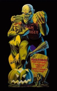
Official Iron Maiden artwork and fan drawn Eddies (no AI images please)
- Thread starter Kalata
- Start date
TheMercenary
Ancient Mariner
chaosapiant
Ancient Marinade
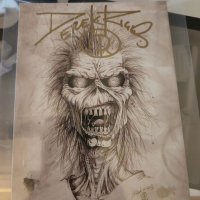
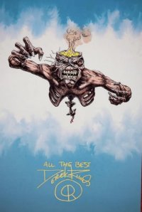
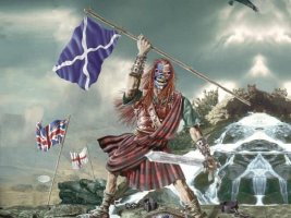
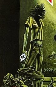
There's something about Derek's Eddies that almost no one else can capture. I'm not fluent enough in art to know what specifically it is, but the proportions and such are almost always perfect. The only artwork not of Derek's that could fool me into thinking it was Derek's is Wilkinson's BOS artwork. The Mayan Eddie looks very Derek to me.
TheMercenary
Ancient Mariner
TheMercenary
Ancient Mariner
TheMercenary
Ancient Mariner
TheMercenary
Ancient Mariner
The_7th_one
Ancient Mariner
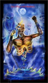
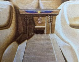
That's the reason why Derek Riggs is a geniusI've never noticed before today that the organ behind Eddie is actually another Eddie...
View attachment 36587
Kalata
Out of the Silent Planet
Agreed about Derek's style.There's something about Derek's Eddies that almost no one else can capture. I'm not fluent enough in art to know what specifically it is, but the proportions and such are almost always perfect. The only artwork not of Derek's that could fool me into thinking it was Derek's is Wilkinson's BOS artwork. The Mayan Eddie looks very Derek to me.
Come to think of it now, he would have done wonders with a cover like DOD (with background inside a castle and no cgi stuff). Or with TXF. I also want to see another attempt with NPFTD cover - but with a background full of details. Btw, didn't he mention somewhere that TNOTB cover is unfinished?
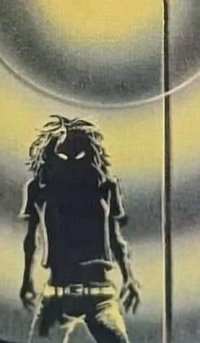
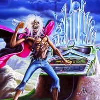
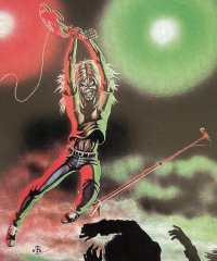
That's an art inside the debut album booklet, right? Cool nod to Running Free and the actual cover.
TheMercenary
Ancient Mariner
TheMercenary
Ancient Mariner
TheMercenary
Ancient Mariner
TheMercenary
Ancient Mariner
Derek is more than a genius, he's a god.That's the reason why Derek Riggs is a genius
From https://www.ironmaiden-bg.com/web/index.php/no-prayer-for-the-dying-artworkAgreed about Derek's style.
Come to think of it now, he would have done wonders with a cover like DOD (with background inside a castle and no cgi stuff). Or with TXF. I also want to see another attempt with NPFTD cover - but with a background full of details. Btw, didn't he mention somewhere that TNOTB cover is unfinished?
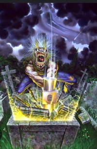
"No Prayer For The Dying has an original form, featuring a tired looking man, none too appealing in any way, shape or form. Rod had the good sense to recognize this, and requested changes for the 1998 reissue of the album.
"I did that as a painting," explains Derek. "The first version with the man standing next to the gravestone is all painting — gouache, watercolor. Later on, they did a reissue of it, and Rod said he would quite like to change it. Because he never really liked the guy; he didn't think the man worked very well. So at that time I was working digitally. You couldn't have done this any other way. I took it off. I patched up the gaps where the man was, and patched up all the faulty bits which were left from taking the guy off. And then from that, I constructed a new background, which was skeletons lying on a stone floor, and they're all lying in piles of dust — they're turned to dust. That was the background. I replaced the whole thing. I basically had to re-draw 70, 80, 90% of it. It took a lot of removing. Because there was more of it than you see in the final new cover. I had to basically slice it apart and put it back together again. It's the original painted Eddie. I've taken him digitally out of the artwork, the standing artwork, and patched it together with the bits I had, and re-created the background."
Eddie's looking a bit nastier in the reissue as well, a combination of a few touch-ups, like the red eyes, as well as the print job itself.
"The printing can make a hell of a lot of difference to the perception of the artwork — it really can. You color-shift it even a little bit and you can change the whole mood of the picture. Like these skeletons in the background look really rough. But they're not really rough! The blue is more subtle than that in the original. In fact, the slide they sent me, the blue was shifted right up, and I took it back, and the one on my site is closer to the original. As you blast the color out, it loses its subtlety. Whereas, if you take them back to where they should be, OK, so it's not bright blue anymore, but the colors... it actually looks like a nicer picture, more like how I wanted, rather than this luminous crap."
I think so.That's an art inside the debut album booklet, right? Cool nod to Running Free and the actual cover.


