Official Iron Maiden artwork and fan drawn Eddies (no AI images please)

Of course. Sadly, the big Maiden tradition with the covers was interrupted. At least they redeemed themselves with TWOTW single cover.

I agree that it's a nice tradition to have an artwork, preferably an unique one, for every single release as well, physical or not. :) But it's not quite as significant now when they're not releasing them physically etc. And the suggested Speed of Light artworks, or even The Writing on the Wall one, aren't anything I'd like to see in tour backdrops either, so it's not too big of a deal - fortunately. :P
 
or even The Writing on the Wall one, aren't anything I'd like to see in tour backdrops either
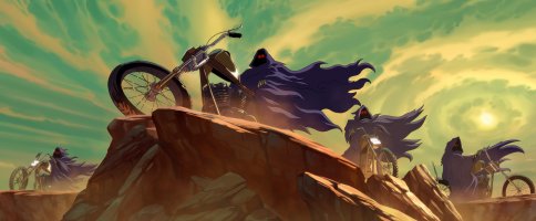
The rider from TWOTW single cover will be a great backdrop (especially given the colours of the artwork) imo.

Or they can use this artwork from the music video (the four horsemen Eddies):
 

Attachments

  • four horsemen.jpg
    four horsemen.jpg
    788.4 KB · Views: 21
The rider from TWOTW single cover will be a great backdrop (especially given the colours of the artwork) imo.

Or they can use this artwork from the music video (the four horsemen Eddies):

Oh, I think it wouldn't work as an backdrop that well, but we'll see... If the song is going to have it's own backdrop and it has anything to do with the video, I'd prefer some bigger landscape, such as desert and that tower there, instead of that, but yeah, we shall see. Overall, I prefer the landscape backdrops that extend and add depth to the stage set, rather than just Eddies and other figures, but naturally some of those are quite great too!
 
If the song is going to have it's own backdrop
I think it will be the cover of the single.

Let's see all backdrops for the debut singles from the reunion era:

''Speed of Light'' - no single cover.
''El Dorado'' - they used a different backdrop from the single cover.
''Different World'' - they used a different backdrop from the single cover.
''Wildest Dreams'' - they used a different backdrop from the single cover for DOD tour. But they used the single cover in 2010.
''The Wicker Man'' - they used the album cover for BNW tour. But they used the single cover in 2011 and for LOTB tour...(*not for DOD tour).

- as for the second singles from the reunion era: the backdrop was also different for TFF, Rainmaker and OOTSP, but not for TROBB...(*EOTC is not played live).

bonus:
''The Angel and the Gambler'' - they used it.
''Man on the Edge'' - they used it.
''Be Quick or be Dead'' - they used a different backdrop from the single cover.
''Holy Smoke'' - they used it.

and so on....
 
Apart from Senjutsu, The Book Of Souls, ''The Wicker Man'', ''Out Of The Silent Planet'' and Live At Donington '92 (1998 remastered edition) covers ->

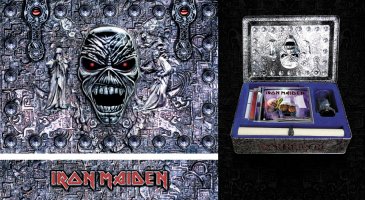
Mark Wilkinson also designed the Eddie's Archive box set [2002].

eddie's archive box set.jpg
 
This is the poster that came along with the single for the Futureal song and was done by Derek Riggs, but for some reason didn't make the cover. Instead, they used the artwork with the copy SIT Eddie and it was in CGI form :mad: - nothing can beat the drawing of a picture where the talent of the artist is shown in full - this is proven by Derek Riggs not once !

View attachment 6745
I like this.
 
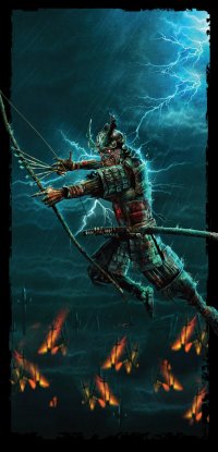
Look how cool is that consistent blue/rainy environment that Eddie is in. It's really beyond me how they decided not to go with something like this for the background on the album cover. Anyway, I think that samurai Eddie is growing on me. I absolutely love that drawing from the Stratego cover. Eddie's face on it (which is supposed to be a mask, I guess?) isn't overly grotesque, I like it.
 
The artwork makes total sense to me. If you buy a physical product like the CD or vinyl, you get additional artwork as a bonus. If you don't the album cover is cool enough as it is.
 
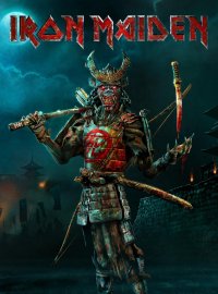
I'm not a fan of Senjutsu Eddie. In fact, I'd say only TFF Eddie is worse. I believe that Eddie is a (former) human being. He started out with long hair, blue jeans and a t-shirt, wielding a bloody ax or toying with the devil, just like many of us. Had some time travel adventures and anatomical mishaps, but was still human into the 90s. Then someone made him into a tree, and he's been everything else and the kitchen sink since ... but his face has always remained human. You can tell by the teeth. It's an evil grin, but still an evil human grin. As a fan, it matters to me that in some way, Eddie is one of us, not just some random monster.

Senjutsu and TFF both turned up Eddie's teeth to eleven. Why do two of the new Eddie's lower teeth go through his lip like piercings? Why do some of his teeth point out of his mouth? That's just gonna make for some messy chewing. I know they want Eddie to look mean and scary, but Derek Riggs never had to throw away Eddie's humanity to do that. (Except for some of that Seventh Son stuff, like Eddie as hovering meatbag.)

Eddie looks best when he looks human. Killers. AMOLAD. SIT. TBOS. Appears to me that this cycle of Eddies won't be up there.
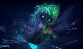
Wasnt the creature on TFF's cover supposed to be not eddie?
 
Back
Top