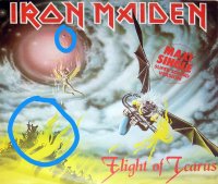
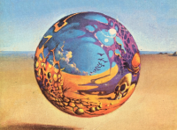
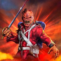
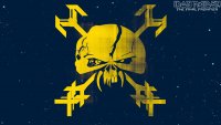
Dan Mumford returns with some sweet new Maiden art, based off Revelations and Flight of Icarus. I really like the Revelations one, but not so keen on FOI.
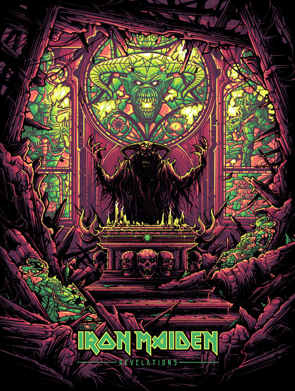
I'm not getting the falling cube and the cult on the cliff. What am I missing?
These are not new - they are from 2018 (the start of the LOTB tour). Dave wears the FOI shirt this tour.
I'm not getting the falling cube and the cult on the cliff. What am I missing?
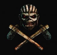
From the same poster/shirt:
T-shirt is Riggs drawing, first picture is a remake from the T-shirt and made by Hervé Monjeaud (It is his signature). If you look at his facebook account (https://www.facebook.com/herve.monjeaud/media_set?set=a.10200703879232118&type=3) you can see a lot of pictures he made for event shirts.
View attachment 8514
It's probably Eddie's padded cell from the POM cover, which is also seen featured as a "box" in the sky on the original Flight of Icarus single cover art. The same goes for the "cult", it's probably a reference to the original art by Riggs.
View attachment 10560
that padded cell on the cover of Flight Of Icarus, it's the place where the cover of the album Piece Of Mind happens.
Anybody knows if the cell appears in the Somewhere in Time cover?
I thought this is a well known fact.
Good thing. I know my history about Derek's drawings but still hear new details.It is and surely we've all seen them old Derek Riggs-pages that can still be accessed via waybackmachine.
Anyways, I decided to mention those things as some newer pals around here might not know all the funny and interesting stuff about the arts.
Does anybody have hi quality files of new Eddie, LOTB 2020 tour artwork?
Thanks. Good, but not enough quality for anything else than web.
Thanks. I'm checking their site from time to time.check the Akirant Illustration site
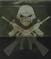
I've recently found a tour poster from the AMOLAD tour and for me it is better than the actual album cover ! One of the reasons is that Eddie is the main thing on the cover (the focus is on him), as it should be - not at the back of the cover ! Also, this poster has the tank on the background - good detail.
But, for the actual album cover, I think the tank is done well - only Eddie should have been at the front of the cover and the skeleton soldiers to be at the back or around the tank - then it would be much better album cover.
Guys, what are your thoughts about the tour poster artwork ?
View attachment 6793