LIVE ALBUMS
Live After Death -> timeless artwork and a perfect continuation of the
Powerslave cover.
A Real Live One -> the artwork is really fitting for the title and is great. Eddie is on the stage! I like his face and (in contrast to the cover above) the background is red (a trademark for this era).
A Real Dead One -> Eddie as a radio host! This is just an awesome idea and cover.
Live At Donington ('98 cover) -> bat Eddie? This goes so well with the album cover. Perfect idea.
Rock In Rio -> I like it, it's authentic, but Eddie's mouth (and hands) could have been shown above the stage. I would have made him with a full body approaching from the sky/clouds (and a city in the sky) with thunder in one hand...
something like that.
BBC Archives -> nice artwork, especially for the title of the live album.
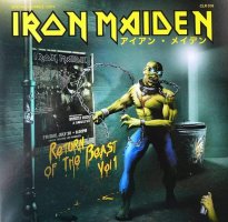
Beast Over Hammersmith -> nice colours, but this is the 1982 tour poster in a small window. It should have been something different (RIR cover is a good fit for it).
Death On The Road -> now that's a great cover and Eddie. I personally would have made the background a dark forest.
Flight 666 -> it fits the movie aspect of the release, but where's Eddie? Derek's cover with Eddie above the plane is a good fit.
En Vivo! -> a wasted opportunity. Although very good, the cover is still a lazy copy of the RIR one. This cover should have been TFF Eddie piloting his space ship (view from inside).
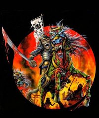
Maiden England '88 (2013 cover) -> Trooper revisited, but it's a great artwork. It kind of fits the title. The army and the horse are great details.
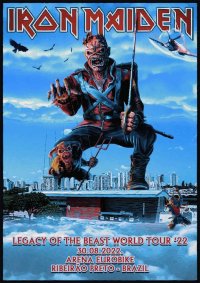
The Book Of Souls: Live Chapter -> a reused tour poster (again)! This should have been Eddie in front of (or inside) a Mayan pyramid in the jungle! Eddie and the background are great though.
Nights Of The Dead -> a reused tour poster (x3)! It's not bad, but the original one is much better. Eddie should have been with a hat. The cover is cool for a live album though.
COMPILATIONS ALBUMS
Best Of The Beast -> great idea and great artwork. SSOASS Eddie should also have been added though.
Ed Hunter -> POM Eddie lives on! I like this green Eddie, but the background could have been better (a dungeon or a better made maze). Decent cover.
Best Of The 'B' Sides -> I'm not a fan of this artwork. A close-up of Eddie's face would have been a better cover.
Edward The Great -> the drawing could have been better, but I like the look of Eddie a lot. Only two wolves/dogs would have been enough.
Somwhere Back In Time - The Best Of: 1980-1989 -> lazy cover, wasted opportunity.
From Fear To Eternity: The Best Of: 1990-2010 -> great idea and Eddie. The details of every album cover are well done. The cover above should have had the same idea.
SINGLES
Running Free -> Eddie in the dark alley, great idea (not showing his face too). Nice details. This cover is the continuation of the debut album cover.
Sanctuary -> I like the face of Eddie a lot, but it could have been something different, I think. The cover is a sort of continuation of the ''Running Free'' one (and foreshadows the
Killers cover).
Purgatory -> perfect cover for the title of the song. I'm curious what the background would have been.
Twilight Zone -> again, a fitting cover for the title of the song. Charlotte and Eddie! The details are perfect for the scene.
Run To The Hills -> Eddie fighting his eternal enemy in hell, I mean it's cool but it's a missed opportunity to make Eddie as an Indian. Those wierd figures lol.
The Number Of The Beast -> the result from the previous cover is shown here. I really like the colours and Eddie. Great cover that could have been the actual album cover.
Flight Of Icarus -> awesome cover with great details and background.
The Trooper -> timeless cover.
Aces High -> perfect cover. A close-up of Eddie was the best decision. The background is epic.
2 Minutes To Midnight -> a cover that can make you ''feel'' the setting is a great cover. Masterful artwork.
Run To The Hills (live single 1985) -> they combined POTO and RTTH in one cover, it's great but this should have been the Indian Eddie. Really cool details and (especially) Eddie though.
Wasted Years -> a close-up of a time machine, great idea. It looks cool. The title of the song was a difficult one to make a cover of it.
Stranger In A Strange Land -> amazing and perfect cover for the song. The details and Eddie are top-notch.
Can I Play With Madness -> a fitting cover for the title of the song. Strange vibes.
The Evil That Men Do -> even better cover than the one above. It's mystical and magical.
The Clairvoyant -> masterful idea and cover.
Infinite Dreams (live single 1989) -> not a very fitting cover for the song, but it's cool (motorbike, Eddie, colours). For
Maiden England is better.
Holy Smoke -> not one of my favorites but a decent cover that is very fitting for the theme of the song. The drawing is so good.
Bring Your Daughter... To The Slaughter -> the cover is perfect for the song. All those creatures and little details are so ''wild''. Classic Eddie too. The 2nd cover of the song is very good for the album.
Tailgunner -> I know it's not an official single, but both covers are just great (especially Eddie).
Be Quick Or Be Dead -> not one of my favorite covers. Eddie is cool, but the background is not. This should have been a cover that is not related to the theme of the song (like RTTH) imo. Eddie on top of a building (music video) chasing some (skull) bankers, for example.
From Here To Eternity -> no Eddie! Not a good decision. The title of the song and even the music video could have inspired a great cover. Strange decision, Derek was missing. The Picture Disc cover could have been a good fit (with the face of Eddie, ofc) and with the setting from the music video.
Wasting Love -> the title is not great for a cover idea, but no Eddie again - unacceptable.
Fear Of The Dark (live single 1993) -> Steve as Eddie - awesome!
Hallowed Be Thy Name (live single 1993) -> not a very fitting cover for the song (for TNOTB album is great though). This great Eddie (and the whole artwork) should have been used for the cover of
Raising Hell. HBTN Eddie from
LOTB game is perfect.
Man On The Edge -> interesting sight of Eddie... I mean, it's not bad but it's not that great either.
Lord Of The Flies -> the cover is good for the song, but it's (basically) the back cover of the album. They should have made Eddie (with the robe) ride a big fly in the same background imo.
The Angel And The Gambler -> the main cover is not bad (it should have been Eddie in full length holding a dice), but the 2nd and 3rd ones are great. The 2nd one is one of my favorite covers with Eddie.
Futureal -> lazy cover. What is the point of it? SIT Eddie? A low point for the band. Derek's poster is perfect for the song. I love the fantasy style of it.
The Wicker Man -> great cover, Eddie, colours and details. One of my favorites.
Out Of The Silent Planet -> Eddie gives a press conference about the planets, he has his classic face and the cover is good-looking, but it would have been so cool if Eddie was made in an isolated planet with lots of details.
Run To The Hills (live single 2001) -> Bruce as Eddie - it's cool for a live single. I like it.
Wildest Dreams -> Eddie could have been in full length, but still it's very good. The car was an important detail.
Rainmaker -> this is just bad. The cover should have been Eddie (from the music video, a drawing not CGI) with the dancing figures in a rainy valley. It's simple.
The Reincarnation Of Benjamin Breeg -> an artwork of the highest level. NPFTD cover should have been like this. Great Eddie, colours and details.
Different World -> underrated cover imo. Eddie from the music video and the colours are very good.
El Dorado -> the idea for TFF singles was cool and this is a great cover and setting. If it was just Eddie and El Dorado, then the cover would have been for the next album.
Satellite 15... The Final Frontier -> again, a great and perfect cover for the song. The ''key''!
Coming Home -> see above. Eddie in full length! The details are great for all 3 covers.
Speed Of Light -> this is just... next level laziness. I still can't get over it. They should have used Eddie from the music video (the one that travels through space and time) or the one that comes out of the video game.
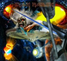
Empire Of The Clouds -> awesome cover and background. The airship should have been a drawing though.
The Writing On The Wall -> it's CGI (unfortunately) but the colours are great and the view is perfect. I wish the rider's/Eddie's face was shown.
Stratego -> awesome cover, colours and Eddie's head. One of my favorites for sure.
EP's
The Soundhouse Tapes -> no Eddie, but for this cover it is allowed. I can't add more.
Maiden Japan -> cool cover & Eddie, the ''vibe'' from it is great. The spotlights are a fitting background.
No More Lies -> interesting alternative vestion of the DOD album cover - the floor and only Eddie. I like it, it's nice and colorful. It could have been the actual album cover.
BOX SETS
The First Ten Years -> it's like a football team emblem. Cool.
Eddie's Archive -> Eddie's head and the engraved figures and symbols are really fitting for this box. It's mystical and looks ancient.
VIDEO ALBUMS
Live At Rainbow -> Eddie attacks from the stage with a guitar - curious idea for the ''wild'' early days of the band. The red & green spotlights are great.
12 Wasted Years -> not a good cover.
Raising Hell -> it should have been something different, it's basically FOTD live single artwork. I personally would have made all of the band members on stage or Eddie rising from the depths of hell.
Visions Of The Beast -> Eddie is sneaky and the background should have been a mirror. Then it would have been awesome.
The History Of Iron Maiden - Part 1: The Early Days -> it should have been a drawing (not CGI), but this cover is great. Eddie, tour posters in a room and alley.

