You are using an out of date browser. It may not display this or other websites correctly.
You should upgrade or use an alternative browser.
You should upgrade or use an alternative browser.
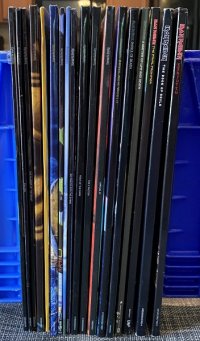
I got a turntable, so I bought some Maiden vinyl.
- Thread starter SinisterMinisterX
- Start date
PieceofMind89
Ancient Mariner
Far out dude! 
Ascendingthethrone
Ancient Mariner
Nice! I have the compete set of the new 12 inch vinyls including live albums. Rock in Rio is presented beautifully.
Randalf
Ancient Mariner
I have been this forum's living embodiment of Live After Death for the last twenty years. I (along with Eddie, H.P. Lovecraft and Winston Churchill) laugh with maximum derision at all other live recordings. Rock In Rio has no songs about opening curtains!
Dick Brucinson
The TRUE Dick Brucinson
I'm doing the same and buy their vinyls one by one, most often one in a two months. My TNOTB looks a bit strange. The cover looks like a complete paint over the original. And the back print is different to the original from the 1980s (slightly different band photo). One other thing really annyos me about the vinyl remakes: There's always something cut off the edge of the covers (or inner covers). With a large picture like the inside picture from POM it's not really a problem, but the small prints from the inner cover of LAD are all cut off at least one third. So it seems as if the cover prints were not made from an original matrix but more like a bad copy.
Dick Brucinson
The TRUE Dick Brucinson
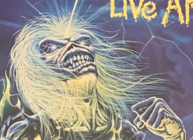
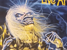
First is a pic taken from the original from 1985, the second pic is the up-to-date vinyl edition. More than that all the pictures are not clear like in the originals but terribly blurry, the fonds and writings - like lyrics and credits - are also not sharp but totally washy, uncontrasted and blurry. But the worst thing is really the cut off.


The_7th_one
Ancient Mariner
Is the remaster vinyl?First is a pic taken from the original from 1985, the second pic is the up-to-date vinyl edition. More than that all the pictures are not clear like in the originals but terribly blurry, the fonds and writings - like lyrics and credits - are also not sharp but totally washy, uncontrasted and blurry. But the worst thing is really the cut off.
View attachment 21868View attachment 21869
Dick Brucinson
The TRUE Dick Brucinson
I wish I knew it. It's actually those vinyls that are availabe at all. When I pre-order them I have no choices between different editions, so it's the regular 2022 availabe edition. Remastered? I have no idea.Is the remaster vinyl?
The_7th_one
Ancient Mariner
Mr. Newton must be on the credits.
I hoe the booklet is included
I hoe the booklet is included
Samantas5855
Ancient Mariner
The new vinyls are bad, originals all the fucking way
Ironalice
Ancient Mariner
the only exception to that is all the albums that were originally only released on picture disk are now on pure black vinyl, (anything from the last 22 years) those all sound better than there original versionsThe new vinyls are bad, originals all the fucking way
Samantas5855
Ancient Mariner
I was talking about the 80s albumsthe only exception to that is all the albums that were originally only released on picture disk are now on pure black vinyl, (anything from the last 22 years) those all sound better than there original versions
Let us investigate further.First is a pic taken from the original from 1985, the second pic is the up-to-date vinyl edition. More than that all the pictures are not clear like in the originals but terribly blurry, the fonds and writings - like lyrics and credits - are also not sharp but totally washy, uncontrasted and blurry. But the worst thing is really the cut off.
Let's look at the entire sleeve. For those without a Live After Death vinyl handy ... first, shame on you ... second, we're talking about the disc 2 inner sleeve. Which is lucky for me, because my disc 1 sleeve got lost back in the 90s.
Old sleeve (purchased January 1986) on top, new sleeve (unsealed about 3 weeks ago) on bottom.

The new sleeve is just slightly wider, about 2mm. One could argue, they should have simply reprinted the original size image with a 1mm black border around it. Instead, they filled the extra space by enlarging the entire image. That's why all the edges are cropped. But they actually enlarged it intelligently: they actually reduced the blue borders between images by about a half millimeter. Every picture on the sleeve is individually enlarged a tiny bit.
Here's the vertical view, the left edges of the same sleeves. 1986 on the left, 2022 on the right. You can see it's stretched away from the center in the same way.

And now we know why the new version is slightly blurry: image software doing image enlargement. Unless you're processing from the original negative (or by other analog methods), there's no way a computer can enlarge any image just a slight amount without losing definition.
So, maybe we give them a pass on this one. They tried to give us bigger pictures. They meant well, right? Besides, we're only talking about inner sleeves here. <To be read in the tone of "we talkin' 'bout practice".> Not the cover. Not the cover. We talkin' 'bout inner sleeves, right?

Again, it's 1986 on the left and 2022 on the right. At first, I thought the difference was simply the old one fading due to age. But nope, the new version is recolored. Blues are deeper, yellows bolder. But in the process, they destroyed image clarity. Check out how much sharper the text on the tombstone is in the old version. That ain't my camera screwin' around, that's real. Just look what did to "me": (old then new)


The new version looked like it got smashed flat as a pancake somewhere along the line. Derek Riggs must be rolling in his grave.
No pictures for this one... on the old version, the trees on the left side of the back cover have a hint of green in their color. It made the scene feel more real, less comic-book. The new coloring took that out: everything is now a shade of blue, or yellow. It feels monochrome now, a substitute for black and white. The subtlety of Rigg's original color choices was entirely lost.
However: none of this (except maybe the lack of color on the cover) is immediately noticed if you're just holding the new one in hand. It's still Live After Death, the beast whose numbers make you say "doctor, Long Beach fucked up my hearing for good".
Dick Brucinson
The TRUE Dick Brucinson
He is pretty much still alive...Derek Riggs must be rolling in his grave.
Of course he is. Dead people don't roll, except in earthquakes. Derek Riggs is alive, and should get down and start rolling in his grave.He is pretty much still alive...

The perfect beginning to a vinyl collection. Now get all of Frank Zappa's albums.
My old man's got almost every Zappa album on vinyl, but they're pretty beat up. Probably because he got them as they came out and was respinning them as he altered his mind chemically, for a stronger experience.


