Font used by Iron Maiden and others

Forostar

Ancient Mariner
That's funny, today I came across this folk/progressive rock album, recorded in 1978. Also I found out something else (read on).

Title: Fear of the Dark
audio part 1
audio part 2
(beautiful music by the way!)

According to allmusic.com Steve Harris co-wrote the title track (which is nonsense, the site must have mixed up his 1992 song).

More important: check the logo of the artist on the cover:

e11198of9kc.jpg


I am pretty sure Steve Harris' inspiration for the Iron Maiden logo must have come from one of Gordon Giltrap's albums. Big chance it might have been this earlier, 1976 album Visionary.

e08254nf5it.jpg


.. on which the music is inspired by the words of poet William Blake(!)

Maybe some of you already knew this, but I can't imagine 'Arry hadn't seen this record sleeve. He surely was into such music, and this stuff came out around the time Maiden started playing concerts.

Of course this whole theory is wrong if we can find out if Steve had created the band's logo before the album came out. I don't know the exact release date of Visionary, only that it must have come out in 1976 (probably in the second half of that year).

I also tend to believe that Bruce might have known this artist, who maybe increased his interest for William Blake.  
Charming detail: On Visionary we can find "Revelation" (audio link) and "Jerusalem" (audio link). ;)

More on Giltrap from wiki:

Gordon Giltrap (born 6 April 1948, at the British Home for Mothers and Babies, Brenchley, Kent) is an English acoustic and electric guitarist and composer, whose musical styles cross multiple genres, including folk, blues, folk rock, pop, classical and rock.

Giltrap started to learn the guitar at the age of twelve. Never receiving any formal tuition on the instrument, he gradually developed his own style and technique.

His musical career started to take off in the 1960s, when he played the folk scene in London alongside contemporaries such as Bert Jansch, John Renbourn and Mike Oldfield. Giltrap cites Jansch as a great influence....

... While popular on the folk and university circuit, Giltrap reached a turning point and received much greater recognition during the 1970s. During this time Giltrap started to concentrate on more purely instrumental pieces, and in 1976 released the album Visionary, based on the art and poetry of William Blake.

The success of this album prompted Giltrap to move on from the singer-songwriter approach and form the Gordon Giltrap Band, which toured extensively in the UK at that time.
 
Re: Fear of the Dark / Gordon Giltrap / Iron Maiden logo inspiration!

Here's some more information on this subject. This post in particular should interest you. There was originally a picture in the first post of his Fear of the Dark album cover. :)
 
Re: Fear of the Dark / Gordon Giltrap / Iron Maiden logo inspiration!

Cheers mate!

edit: I already saw the logo comparison. And ABandOn might have been more enthusiastic if he knew that Giltrap made earlier albums with that logo (but he didn't research well enough).

Conors comment is interesting as well, I'll search more aon that film.
 
Re: Fear of the Dark / Gordon Giltrap / Iron Maiden logo inspiration!

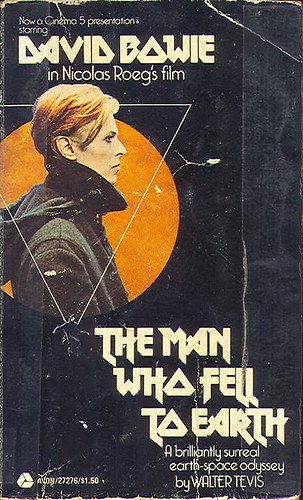
As for the logo font, I've always been of the belief that Steve borrowed it from the David Bowie movie, "The Man Who Fell to Earth" but since both the Bowie movie and the Gordon Giltrap album came out in 1976, I don't know who was first..

2968529337_c95fb64453.jpg
 
Re: Fear of the Dark / Gordon Giltrap / Iron Maiden logo inspiration!

@Thanks Sixes, this one looks more like Maiden's font. E.g., the m and o.
 
Re: Fear of the Dark / Gordon Giltrap / Iron Maiden logo inspiration!

I personally think that it's all just a major coincidence: Steve and Giltrap lifting the logo from Bowie's film unaware of each other, both having the same album title, and Nicko having done work with Giltrap in the past. Remember we're talking about a time frame of decades without every information being readily available to everyone as it is nowadays. It's a funny anecdote, definitely worth sharing, but we shouldn't read too much into it.

It certainly had me giving the Giltrap song a listen though, and I seem to recall liking it.
 
Re: Fear of the Dark / Gordon Giltrap / Iron Maiden logo inspiration!

Steve took the font from the movie poster, not from Giltrap.

1. IIRC, Steve has said so.
2. The movie poster contains all the letters in "Iron Maiden"; Giltrap's name does not.
3. As Foro pointed out, Steve used the movie-poster O. And the R, too.
 
I love those FOTD soundclips, and Simon Phillips is on that album!

Another funny anecdote: a bonus track on the CD release of Fear of the Dark is called "Smiler" (old band of Steve Harris). The circle is round again. ;)

@SMX: agreed.

Some additional info:
Release of the film: 18 March 1976 (and Maiden started playing gigs 44 days later, on 1 May 1976).

Maiden used their famous logo for some gigs scheduled in October 1976 (see 5th scrap book pic from above, and check those dates in the tour dates segment). Check (probably the logo was used earlier but I didn't find pics yet).
 
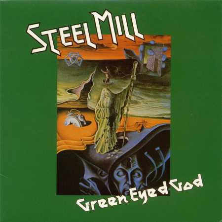
There is some discussion going on, on the Derek Riggs facebook page, about the Maiden logo and who designed it. As a result of it, other albums have appeared with this font. At this point, it looks like the album cover of Steel Mill is the earliest! I am not aiming to make this a complete overview. Most interesting I find the early ones. Here goes:


1975
Steel Mill

http://www.discogs.com/Steel-Mill-Green-Eyed-God/release/4813763
Original UK pressing released in 1975, three years after the German issue which had a different cover and different font.
steel-mill-green-eyed-god-20110705030638.jpg


1976
Various posters for film: The Man Who Fell To Earth.
The film was first released in March 1976

1976
Gordon Giltrap
. The album was recorded between October 1975 and June 1976, so it probably came out after the film.
gordon-giltrap-visionary-15-1393788557.jpg

It took a while before it appeared but here is the full album on YouTube! Really great guitar work. Epic as well. With a very young Simon Phillips on drums!
The font was used on two other Giltrap albums as well. Visionary was the first.


1977
Iron Maiden
(according to Dennis Wilcock designed by him, and not by Steve Harris), probably in 1977. The reasoning behind 1977 is the following.
By Lira (also a member from this board)
As far as i know it was designed by Den Wilcock's agency at the time he sang in the band. We start to see this font in 1977 (the ads).


12541052_10153891147371079_8475948500372035234_n.jpg


1978
Nana Mouskouri

12512795_10153891554931079_7686495557528959864_n.jpg


1980
Mama's Boys

Their first album from 1980 sports the font, but they might have had it earlier, don't know when they first used it (they formed in 1978).
mamasboys81ob-front-320x320.jpg
 
Last edited:
Could it just have come from a database of fonts?

Was Steve not working as a draughtsman and would therefore have access to such a database?
 
According to allmusic.com Steve Harris co-wrote the title track (which is nonsense, the site must have mixed up his 1992 song).

@Forostar, yes I'm replying to 5 year old post :) Allmusic is bullshit. Check out Steve Harris page. He's listed as player in some anonymous 80s/90s bands, but not mentioned in those band's biographies.
 
That's quite nonsensical indeed. Still you can come across crazy things that are real. I remember I was in a Stockholm music shop and it had a an album by Steve Harris, being the drummer of the presented music! Just another Steve Harris. ;-)
 
Sorry for raising an old topic.

The whole logo "controversy" seems to be due to a fuck-up by Garry Bushell, author of Running Free, who mixed Maiden's first logo - designed by Steve Harris indeed - with the one we all know. The first is the one in Blackletter (or Old English font or whatever you call it) and the ghost-like thing that can be seen on a 1976 poster. For the second one, Dennis Willcock simply used a font (already available) that caught his eye, so a) Steve Harris did not design this logo; b) nobody actually "designed" the logo from scratch, Dennis chose a font that was already there; c) there is nothing surprising in the fact that this font has been used by other artists before.
Yes, it would be interesting to know the actual name of the font, and perhaps even its creator, but both have little to do with Maiden.

Edit: Dennis did design the blood spurting lips though (Bushell calls it a "symbol" but perhaps it might be called a logo, I'm not a native speaker so I'm not sure). This might have added to the mess.
 
Last edited:
Yes, it would be interesting to know the actual name of the font, and perhaps even its creator, but both have little to do with Maiden.

It's known as "metal lord" on modern computers, I wouldn't be surprised if that was the actual name of the font back in the 70's. Notice that some of the Maiden letters have been altered slightly, presumably by Maiden to compliment the letters in the words "Iron Maiden", whereas the letters used by David Bowie and Gordon Giltrap are I think the exact same as the metal lord font.
 
Replying to an old thread to add a reference: According to Talking Maiden podcast, 22:43 Dennis Wilcock has created the modern Maiden logo from a pre-existing font. Art director of the design studio at the time Ray Hollingsworth emailed the guys and confirmed that.
 
Does anyone have access to this book:
Headley, Gwyn. The Encyclopaedia of Fonts

According to a review I found it seems like this book would have the information we're looking for. Unfortunately, none of the libraries I have access to have it.
 
Back
Top