Album covers: alternate versions, different Eddies?

I very much appreciate the visual consistency and overall style of the The Book of Souls and Senjutsu albums and their representative media, so I kind of wish The Final Frontier also went with that. The album cover isn't the best, but I don't hate it either. The comic-book style "single covers" are absolutely brilliant and I really like the booklet imagery; that Starblind/The Talisman page spread is beautiful!

However, all of the mentioned visual elements are totally different from each other and I think it would have been pretty cool if it all was a bit more stylistically overarching.

The other side of the coin is, admittedly, that the versatility & variation kind of appropriately underlined the sci-fi adventure vibe of the The Final Frontier era!

Anyway, it's not like I'd specifically fancy a brand new, alternative visual package for that album, but I think it'd be speculatively very interesting if they went all-out with the retro sci-fi comic book imagery at the time! It would certainly stand out quite colourfully between the grim A Matter of Life and Death & The Book of Souls.

(...kind of related to the topic, right?)
 
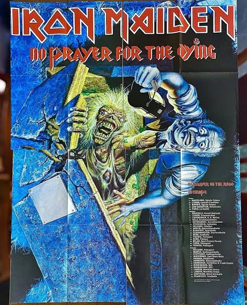
Continuing my unorthodox opinions, I prefer the 98 versions of Iron Maiden and No Prayer For The Dying. The X Factor cover with Eddie on the electric chair (that's the back of the cd isn't it? Or was it the cover for Lord Of The Flies?) is much better than the official TXF cover we got. DOD is obviously better without all the unfinished CGI, though it's hilarious so it's almost a shame to miss it. The TBOS artwork is nice, but I prefer the Eddie on the cover, though it's sorely lacking a background. The SNJ alternate cover is super ugly to me and I never enjoyed it.

As for the live albums the LAD cover we got is one of the most iconic pieces and I adore it. The original is neat, but also a bit goofy in comparison. Maiden England isn't the best looking, but I prefer it to the motor cycle Eddie at least. Donington is awesome, ARLDO's unused cover doesn't do anything for me and the Flight 666 Riggs one is pretty ugly as well.

Go fuck yourself scammer, ban this user
It's kinda hilarious that we keep getting these scam accounts every few months. It's not like this forum has the highest traffic comparatively, so I'm not sure why they keep trying. Can't really be worth the effort, can it? lol
 
LIVE ALBUMS:

Live After Death (1985) - the original cover.

View attachment 20619

Maiden England (1989) - the cover for the 2013 DVD of the concert.

View attachment 20623

Live At Donington (1992) - 1998 remastered edition cover.

View attachment 20622

A Real Live Dead One (1993) - unused cover made by Derek Riggs.

View attachment 20620

Flight 666 (2009) - I'm not 100% sure if it's official, but this artwork is made by Derek Riggs.

View attachment 20621
That live after death pic looks like an advert for LAD, but how could it exist?
Derek has said that painting couldn't be photographed because it's so shiny or something.
 
IMG-6069.jpg
Uncropped NPFTD, poster issued at the time.
 
Virtual XI (1998) - the original cover without the football pitch and orange is the dominant colour (not red).
Hi Kalata.
Ever since I saw your post I have extensively hunted for the Virtual XI album without the football pitch and orange is the dominant colour (not red). I cannot seem to find a copy or any information that it ever existed. I have 3 friends who also have first presses of the album from 1998 and none of them feather any from your statement. Can you shed some light as to whether the album was ever released with no football pitch with orange as dominant colour ?? Thanks in advance. Simon
Hello. You can read the info from Melvyn Grant in this interview:


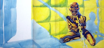
The interview is probably from 2003. Btw, some of the sketches shared (the wall, big bat Eddie, Eddie with fish) look like for FOTD? He produced a few drawings for Maiden to choose from. And he wanted to redesign the look of Eddie quite extensively, which could explain the art called ''the wall''. Wow.

It's also interesting to see one of his additional TFF artworks - which I never thought Maiden would consider for a cover.
 
I very much appreciate the visual consistency and overall style of the The Book of Souls and Senjutsu albums and their representative media, so I kind of wish The Final Frontier also went with that. The album cover isn't the best, but I don't hate it either. The comic-book style "single covers" are absolutely brilliant and I really like the booklet imagery; that Starblind/The Talisman page spread is beautiful!
However, all of the mentioned visual elements are totally different from each other and I think it would have been pretty cool if it all was a bit more stylistically overarching.
The other side of the coin is, admittedly, that the versatility & variation kind of appropriately underlined the sci-fi adventure vibe of the The Final Frontier era!
Anyway, it's not like I'd specifically fancy a brand new, alternative visual package for that album, but I think it'd be speculatively very interesting if they went all-out with the retro sci-fi comic book imagery at the time! It would certainly stand out quite colourfully between the grim A Matter of Life and Death & The Book of Souls.
They really nailed the visuals for the last 2 albums, but the sci-fi stuff in TFF's booklet was a must given the theme. The comic-book style was a very good idea for the singles (something different for the band), but both are combining nice imo. I'd say - Maiden need more colorful arts since BNW album.
Continuing my unorthodox opinions, I prefer the 98 versions of Iron Maiden and No Prayer For The Dying. The X Factor cover with Eddie on the electric chair (that's the back of the cd isn't it? Or was it the cover for Lord Of The Flies?) is much better than the official TXF cover we got. DOD is obviously better without all the unfinished CGI, though it's hilarious so it's almost a shame to miss it. The TBOS artwork is nice, but I prefer the Eddie on the cover, though it's sorely lacking a background. The SNJ alternate cover is super ugly to me and I never enjoyed it.
As for the live albums the LAD cover we got is one of the most iconic pieces and I adore it. The original is neat, but also a bit goofy in comparison. Maiden England isn't the best looking, but I prefer it to the motor cycle Eddie at least. Donington is awesome, ARLDO's unused cover doesn't do anything for me and the Flight 666 Riggs one is pretty ugly as well.
I generally agree with you on the takes, especially about Maiden England (motor cycle Eddie is cool, but like from/for a different album and theme - plus they could have made something interesting for Infinite Dreams live single) and Flight (although it was a movie). Maybe they thought the 2013 art of the former would be similar in a way to Trooper?

I will always prefer covers with details (looking at you TBOS and SJ, although the former is striking, while a cover like FOTD doesn't need one imo), and the ones for the last 2 albums are great (not SJ's back cover), but TXF's alternative cover, while good idea, Eddie can't be seen well, which is probably why it wasn't chosen. They did that for AMOLAD. Also, DOD cover needs the figures, they just should have been drawn.
 
The X Factor cover with Eddie on the electric chair (that's the back of the cd isn't it? Or was it the cover for Lord Of The Flies?) is much better than the official TXF cover we got.

The X Factor (1995) - alternative album cover/the back cover.

View attachment 20611

Seen a few mentions of this being the back cover of the CD, here and in another thread recently.

Is it not the front cover of the CD? i.e. the LP has the ugly eddie as the cover, and the CD has that Eddie on the back of the booklet, and the electric chair on the front?

Or have I just had the booklet in backwards for 30 years:lol:
 
Speaking about alternative versions of covers, I hope one day if they band releases something special for the FOTD album (it also seems they have quite a few sketches/ideas for the cover from some artists that they could share), we would get a proper cover with Eddie for the 2 singles without him from the album. LOTB game is no more (at least we did got for Rainmaker and Speed Of Light from it).
 
Seen a few mentions of this being the back cover of the CD, here and in another thread recently.

Is it not the front cover of the CD? i.e. the LP has the ugly eddie as the cover, and the CD has that Eddie on the back of the booklet, and the electric chair on the front?

Or have I just had the booklet in backwards for 30 years:lol:
I'm pretty sure you've had it backwards the whole time lol

TXF was the first CD I ever bought myself and I remember hiding it under my shirt when I came home because I was worried that my dad would see the cover and yell at me :D
 
Seen a few mentions of this being the back cover of the CD, here and in another thread recently.

Is it not the front cover of the CD? i.e. the LP has the ugly eddie as the cover, and the CD has that Eddie on the back of the booklet, and the electric chair on the front?

Or have I just had the booklet in backwards for 30 years:lol:
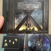
I posted this in another thread a week or so ago, but there were versions released with the electric chair cover as THE cover. The dissection cover isn't in the booklet at all. I'm pretty sure I got my copy of it from BMG.
CD14E486-B7B4-4597-96C8-175BC6EEF92A.jpeg
 
Back
Top