IRON MAIDEN STUDIO ALBUM COVERS SURVIVOR 2015: Results -> Somewhere In Time wins!

Satisfied with the results?


  • Total voters
    12
Yeah, I thought it was unthinkable as well, Night Prowler.

However, it has Eddie at his most iconic (that is a major pro; as if this is a very dominant aspect), it is more popular than The Number of the Beast (a concurrent when it comes to that aspect). And I have seen very, very enthousiastic posts. The simplicity of the artwork is praised several times. Perhaps in this regard, Piece of Mind can still be a worthy opponent.

Not many people seem to be bothered (enough) by its violent and blunt approach, when they put it in their top selection.

Of course, we still have Powerslave and Somewhere in Time as concurrents, but their success will depend on how (united) people who (dis)like details in adventurous/bombastic artwork will vote.

The Clairvoyant has spoken.
 
Last edited:
Oh no it's the best vs favorite again....

You can think SiT and Powerslave are the better covers because there's all these hidden meanings and details on those covers, so they're obviously the most artistic, well crafted artworks right?! Wrong. :p
 
Killers is a cool artwork but it's definitely not their best. Not even Top 5.

I guess I'm the only one who really likes the TFF cover.
 
No prayer for the final maiden.

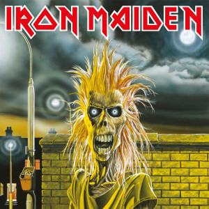
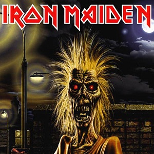
The debut Eddie feels "unfinished" and the other two I simply don't find very cool.

A cover I can't decide whether I like or not is Brave New World - the cloud Eddie is brilliant, but the CGI city sort of ruins it.
A rare Wingman sighting in a survivor!
 
There's some good arguing in this article from metalsucks.com and I definitely agree about the Killers album. That lightning and that atmosphere just screams early Maiden.

"Look at the cracked out corpse Eddie started out as and how, as on the Killers cover, the primary lighting source is a street lamp that bathes him in this really unpleasant, sulfuric yellow (a design theme which started with Eddie first almost-appearance, in Riggs’ art for the single “Running Free”):

Also agree with him about this to a certain extent. Eddies was really at his most menacing on the early covers:

" I think that a lot of the covers since Powerslave have been too schticky to really feel menacing, which makes sense, because by this point a) the band really had to have him on ever cover, even if no one had a good idea for what the fuck to do with him, and b) he was consequently going to become kind of a lovable mascot, the same way all great monsters seem to lose their mystery and become a joke after awhile (all the old Universal Monsters, Freddy, Jason, Chucky, Pinhead, Hannibal Lecter, George W. Bush, etc., etc.)."

http://www.metalsucks.net/2010/06/10/lets-argue-about-iron-maiden-album-art/
 
There's some good arguing in this article from metalsucks.com and I definitely agree about the Killers album. That lightning and that atmosphere just screams early Maiden.

"Look at the cracked out corpse Eddie started out as and how, as on the Killers cover, the primary lighting source is a street lamp that bathes him in this really unpleasant, sulfuric yellow (a design theme which started with Eddie first almost-appearance, in Riggs’ art for the single “Running Free”):
So menacing (EVOLLL!) is a big deal when looking at favourite Maiden covers.
Also agree with him about this to a certain extent. Eddies was really at his most menacing on the early covers:

" I think that a lot of the covers since Powerslave have been too schticky to really feel menacing, which makes sense, because by this point a) the band really had to have him on ever cover, even if no one had a good idea for what the fuck to do with him, and b) he was consequently going to become kind of a lovable mascot, the same way all great monsters seem to lose their mystery and become a joke after awhile (all the old Universal Monsters, Freddy, Jason, Chucky, Pinhead, Hannibal Lecter, George W. Bush, etc., etc.)."

http://www.metalsucks.net/2010/06/10/lets-argue-about-iron-maiden-album-art/
Sorry, but when artwork becomes that fantastic as on e.g. Powerslave, I don't mind that no one had a good idea about what to do with him (which I don't think is true anyway). That's inferior.
 
Which do you prefer?

Iron_Maiden_%28album%29_cover.jpg


Iron_Maiden_-_Iron_Maiden.jpg
 
I actually prefer the second. In the first, the yellow wash of the light makes it look like Eddie was just caught peeping through a window or stealing a 40 oz. from a liquor store. It's part of the reason why I hate the first album cover: Eddie looks like an amateur doing amateur things.

The second one, though still the same image, works better. Eddie looks more menacing and sinister due to the enhanced shadows. Almost like a rabid zombie looking for a victim.
 
The 2nd is so ugly. I hate it.

I like the TFF cover too. In fact, after giving it some thought, I've decided that I at least prefer it to Brave New World. If it somehow survives another round, I won't be voting for it.
 
Top 15
01.
02.
03.
04.
05.
06.
07.
08.
09.
10.
11.
12.
The Final Frontier
13. Virtual XI
14. The X Factor
15. Dance Of Death
 
Just ran across something interesting... Riggs based the original Eddie painting (which later wound up as the debut album cover) on a photo of a decapitated US soldier's rotting head hanging from a Vietnamese tank. Here's the photo:

article-2221657-15A0EA26000005DC-812_634x812.jpg
 
Back
Top