'The Mandrake Project' artwork brings together the three periods : it's an original creation, with a previous idea that already exists on 'The Book Of Souls' and 'Senjutsu' (by putting the most important element on a dark background) but is still a shitty idea which doesn't do justice to the content of the new album.
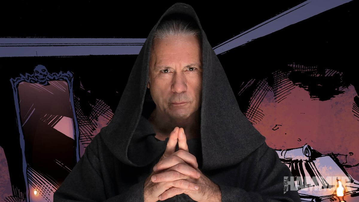
Bruce's covers have never been anything special, but TMP cover (dark background aside) is perfect for the idea and theme of the album. The background options are probably only a garden or a forest? Not having a mascot works for him, and he has different (not that cool) creatures for the albums, which is cool imo. Some views about the covers:
Tattooed Millionaire - only the dragon would have been cooler, but this was not a serious album. Even Bruce admits it. Still, his official debut solo to have him on the cover is kind of expected, and the Japanese graphics on it at least adds some significance.
Balls To Picasso - really bad title. Even with Bruce's original intended title (Laughing In The Hiding Bush), or cover, I doubt it would have been different. Tears Of The Dragon would have made a great metal album cover, but it wouldn't have done justice to the material on it, which was really fun (I admit) but very experimental. Maybe just the dragon's eye with the magic tear. Yeah. Gods Of War is also a cool album title that probably would have made a ''right'' cover for the album.
Skunkworks - not a fan on this one but it kind of fits the album and in a way most of the great lyrics (BTP has strong ones too, btw). It's a cover for the mind, which is always a good idea.
Accident Of Birth - it seems Bruce wanted a mascot for one album, but Derek could have done a lot better. With a bit of a background, too. Not a big fan of this one, although it's somehow attention-grabbing. The album title is difficult for a cover.
The Chemical Wedding - this is his best cover. Whatever painting he had chosen would have worked great. It's mystical and fits the theme & tone of the album.
Tyranny Of Souls - it fits very well, but I think it would have been much more spectacular with an artist's imagination for a background. I like it though (that face...), it's strange in a nice way. I would have added some ''souls'' to it.
The Mandrake Project - I like it, the ancient vibe fits, but then again, it could have been great with a background. Or one of Bruce's characters from the concept. Idk, finding this medallion inside a pyramid (as a painting; the
promo poster for the album has a pyramid? maybe more will be revealed in the booklet) or in an ancient city with a dark setting. Cool.

en.wikipedia.org
") But, if it's not an original creation, I consider it to be a personal transposition from the original painting, as the one on 'The Chemical Wedding' artwork is a little bit different.
But, if it's not an original creation, I consider it to be a personal transposition from the original painting, as the one on 'The Chemical Wedding' artwork is a little bit different. ")
 Then again, just like with the previous album, a variety of different paintings would've worked quite well with this one.